
The Last Crack of(at) Thunder
After a few weeks of feedback from the interwebs, I have taken the most popular of my ideas and the best suggestions and combined them into my final* version of my Thunder rebrand.
Logos
Let's start with a new main logo, the Thunder Ball.
As an homage to the city they used to be from and the team they used to be, the new main Thunder logo incorporates the old SuperSonics logo as well as the new preferred color scheme (gray and black with yellow and red/orange highlights) and the new thundercloud theme. And of course, it's a basketball because apparently all NBA teams have to have a basketball somewhere in one of their logos...
The red/orange behind the cityscape symbolizes an Oklahoma sunset in the distance as the clouds roll in over head.
The new typeface is derived from the Oklahoma state flag, which tries to make up for the loss of the state flag's blue in the color scheme. Many people hated the old Thunder typeface (I didn't but that's just me) but this new type helps to further the correlation between the team and Oklahoma.
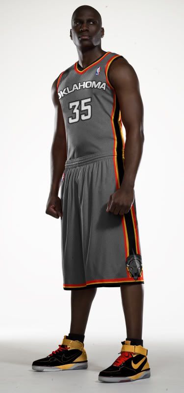
The team has also been renamed the Oklahoma Thunder (this was a popular request). However, the cityscape is still of OKC, the town the 'Thunder Dome' still calls home, so there is a bit of compromise.
![]()
The secondary logo is the Bison Cloud logo I originally came up with but in the monotone gray/black color scheme and accent colors. I decided not to keep the bison brown so that it would not confuse the color scheme and so it would appear like an image in the clouds.
So maybe Rumble the Bison should change his coat.
![]()
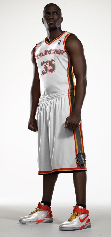
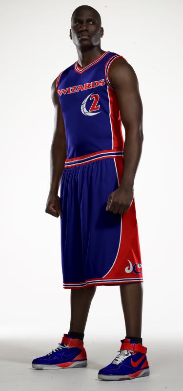
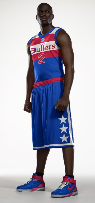
Uniforms
'Fixing' the typeface and removing the word 'CITY' from the road uniform was pretty much the only change to these uniforms. the logo on the shorts remains the Bison Cloud logo because the Thunder Ball logo doesn't really work as anything other than a main chest logo (think current Golden State unis).
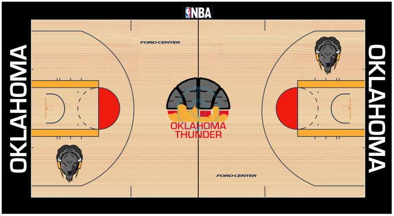
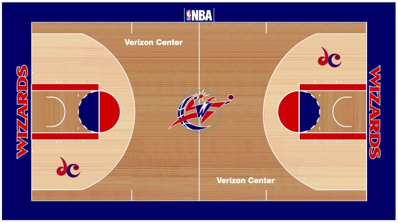
Court
The court hasn't changed much since my last incarnation. The logos have all been updated to their current appearance and the baseline wordmarks has changed to fit the new font and team name.
And with all that, you have yourself a rebrand. Feel free to tell me what you think in the comments.
*for now. Let's be honest, I'll probably mess around with this again.
 Tim E. O'Brien


