Tuesday
Feb082011
Basketball Jones
Check out the new uniform concept page for basketball jerseys.

If you have any uniform concept requests, feel free to contact me.

Check out the new uniform concept page for basketball jerseys.
If you have any uniform concept requests, feel free to contact me.
 Since I first posted my concepts for Indiana's football team, I have found a better template and have updated my ideas.
First I have the Home and Away look with the candy striped pants.
Next, I tried the same look with a white helmet, Home and Away.
I decided to take the striping to a whole new level, Home and Away.
But to make Indiana's Helmet more original and unique, I tried a front of the helmet placement for the interlocking IU logo, Home and Away.
finally, since this is the Nike Pro Combat line and Nike is so fond of black uniforms for the sake of black, I tried a black alternate uniform (although because black is one of Purdue's colors, the Hoosiers should never wear black) and I tried a gray uniform like the Oregon Nikes Ducks are so fond of.
 Click to see all my uniform concepts as a slideshow
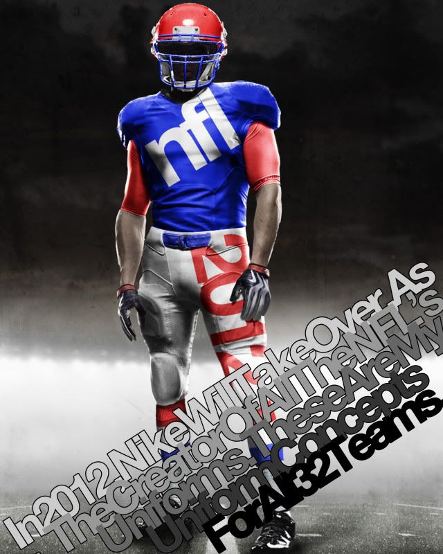
In 2012, Nike will take over as the official licensee of all NFL apparel - including the team uniforms.
With this change comes the reputation Nike has earned in the collegiate game over the past few years, of creative and unusual design.
Much of this 'creativity' comes from Nike's new Pro Combat Uniform style. This new style incorporates an undershirt that can allow uniform designers to bring back arm stripes that have disappeared in recent years.
With this in mind, I recently decided to embark on a project to design new uniforms - using the Nike Pro Combat template - for all 32 NFL teams. Some team's uniforms change drastically, some almost don't change at all but what follows are the 120 uniform combinations I would like to see in the NFL.
Teams are in alphabetical order and include a brief description of what I did. Also, if I altered a team's logo, it will appear in the linked uniform designs (Some old logos are included as well for no particular reason).
49ers: Home, Road - Not too much changed here but this is the perfect example of what the compression undershirt can do for sleeve stripes. Ever since the 9ers moved from back to this Montana-era look, the only thing wrong has been the lack of proper stripes. So voila...
Bears: Home, Road, Road Alt, Throwback - My Bears. These are one of the best uniforms in the league and a pure classic. I threw in the white pants with the white jersey cause they pop up every few seasons and they used to be the norm in the 70s and 80s and I also brought back the gray facemask 'cause it just looks good. I also kept this year's throwback because that shit is baller. Add the retro brown pants and the white 'C' on the helmet and, baby, you've got yourself a stew goin'...
Bengals: Home, Road, Road Alt, Orange Alt - This was my first real test. In order to make the uniform design feel viable, I tried to make sure the stripped area of the jersey was contained withing the shoulder segments of the uniform. The Bengals' lid is classic and Ochocinco made the uni number font iconic so those stayed. The pants stripping is similar to the current pants only it isn't truncated and is only orange and black.
Bills: Home, Road, Road Alt, Red Alt, Patriotic Alt - This one is kind of retro. While I took the modern logo and flipped the colors to echo the old logo, the uniform comes almost directly from the past. I threw in a red alternate for good measure though.
Broncos: Home, Road, Road Alt - The Broncos are supposed to wear orange. And check out those stripes...
Browns: Home, Road, Home Alt, Road Alt - These are almost unchanged, just more room for the stripes. I brought back orange pants but I can't remember how they turned out in real life but I thought I'd give 'em a shot as the alternate.
Buccaneers: Home, Road, Alternate - Everyone seems to love the 'Creamsicles' but I think they were uglier than some choose to remember. I did add the creamy orange to the great modern logo (check out the football in the logo) and added it as a secondary color. I kept the modern helmet and pants (although now they're sans-stripe) because they remind me more of a swashbuckler's pantaloons than a freeze pop, and I think that's a good thing.
Cardinals: Home, Road - This one is old school. The pants stripping is super old. The helmet is really old. The Arizona flag is kinda old. Combine all the elements with super thin stripes and you have a really modern yet classic uniform.
Chargers: Home, Road, Road Alt, Dark Alt - San Diego, which is German for 'a whale's vagina', got it right with when they went back to the white helmets and the powder blues. Unfortunately, those are the Chargers current alternates. I switch them to the main uniforms and leave them pretty much unchanged.
Chiefs: Home, Road, Road Alt - Just wider stripes on the sleeves and socks as well as incorporating yellow into the logo.
Colts: Home, Road - Classic uniform. All I added were some sock stripes.
Cowboys: Home, Road, Alternate - I went a bit retro here. The Boys wear white at home and blue when forced to on the road so I went back to a 60s look for a more classic appeal. However, Dallas has this weird idiosyncratic uniform quirk where their pants paired with their white jersey have a teal tint to them and don't match their helmet. I like that quirk, so I kept it. But then I got rid of it in the alternate...
Dolphins: Home, Road, Home Alt, Road Alt, Orange Alt 1, Orange Alt 2 - This is an instance where I dropped the drop shadow. Miami has classic Floridian uniforms, so I brought them back to their peak of greatness when Marino was just beginning to do his thang. I also tweaked the logo so there was no more dark blue in it (which was also taken out of the uni striping).
Eagles: Home, Road, Home Alt, Road Alt 1, Road Alt 2, Road Alt 3 - Everyone loved the Iggles throwbacks this year, so I say drop the drop shadow, keep the number font, logo and new age helmet wings and add the Kelly green. Then I found these sleeves from the Ron Jaworski era - how can you not love 'em?
Falcons: Home, Road, Road Alt, Red Alt - Simple. Go back to the throwback. Keep the modern logo, just add a gold beak to match the retro helmet (Georgia's colors are red, white and black and the Falcons didn't want to disrespect Georgia Tech, so they added gold piping to their helmet stripe) and you have a perfect logo for a great uniform.
Giants: Home, Road, Alternate - Same as they wear today. No stripes on either color jersey and big red Northwestern stripe on the white one.
Jaguars: Home, Road, Home Alt, Road Alt, Black Alt 1, Black Alt 2 - This one was one of the last I did. I knew I wanted to do something interesting with them but I just wasn't sure what. The shoulder stripes arise from the whiskers on the logo jaguar's face and the spots - well, those are self explanatory. I'm not sure even I like the spots all that much, but its an interesting idea for a compression shirt.
Jets: Home, Road, Home Alt, Road Alt - The Jets, in recent years, have made their green darker. My concept reverses that trend. And since we're going back to old school colors, why don't we go back to the old school stripes - they're so damn funky.
Lions: Home, Road - Barry Sanders colors (No Black.) with Ndamukong Suh rounded numbers (well, without the weird cutaways in the number like at the top of the inside of the 0 and 9). Same goes for the logo's colors.
Packers: Home, Road - With the full compression sleeves, the Pack can go back to their classic sleeve stripes and sock stripes. Here's my inspiration: Home, Road.
Panthers: Home, Road, Home Alt, Road Alt, Blue Alt 1, Blue Alt 2 - I love that the Panthers' logo is an all black panther outlined in that blue. In that vein, I made the Panthers all black outlined in blue at home. I also kept the Panthers' semi-iconic shoulder stripes.
Patriots: Home, Road, Alternate - Everyone love Patriot Pat and his old school uniforms. Stop fighting it New England, go back to them. I even gave you a blue alternate.
Raiders: Home, Road, Road Alt - Classic. Can't improve on perfection.
Rams: Home, Road, Road Alt - The old school Rams uniforms were so great and with the maze and blue, they remind you of Michigan. It just doesn't get more 'classic football' than that.
Ravens: Home, Road, Home Alt, Road Alt, Black Alt 1, Black Alt 2 - I did not drop the drop shadow. There's just something about Poe and Ravens - the shadow fits. I made the helmet stripe solid and purple and added a solid purple stripe to the black pants.
Redskins: Home, Road, Home Throwback, Road Throwback - The Skins got it right with the yellow pants this year, now they just need put the asymmetrical stripe on their helmet and back to wearing those killer throwbacks.
Saints: Home, Road, Home Alt, Road Alt - Pretty much unchanged except that the black pants manage to maintain the helmet and gold pants striping by adding a gold piping around it.
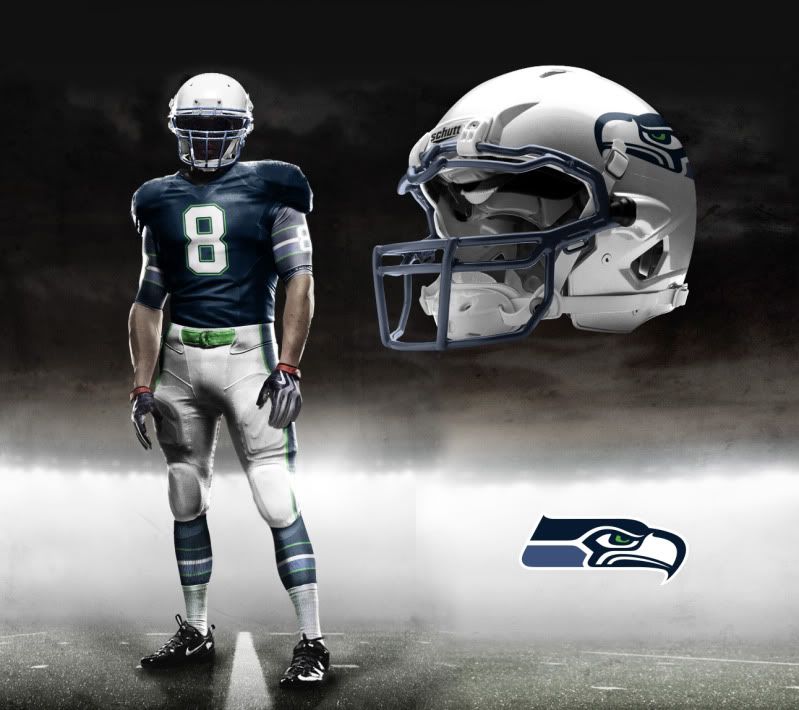
Seahawks: Home, Road, Dark Alt - A major overhaul while keeping the modern logo. The home jersey color comes from the lighter color on the logo and the sleeve, pants and sock stripping comes from the neck of the seahawk but is outlined in the emerald from his eye (I mean it is the Emerald City).
Steelers: Home, Road, Throwback - Perfect unis. Even their throwbacks are great.
Texans: Home, Road, Road Alt, Red Alt - I don't think I'm the first to say the Texans should have a white helmet (that logo was built for a white helmet) and I don't think I'll be the last. Hopefully they'll take the hint. As for the jerseys, I got rid of the stupid modern stripe and - since it is the Lone Star State - I added a lone star to each sleeve.
Titans: Home, Road, Home Alt, Road Alt, Sky Blue Alt 1, Sky Blue Alt 2 - A lot of people would say, go back to the Houston Oilers jerseys. I say, the Houston Oilers sucked and the Tennessee Titans have had much more success in their short history in these modern classics. Just go back to the dark blue with light blue highlights as the home jersey and maybe throw in some modern socks and we has a great set of unis.
Vikings: Home, Road, Road Alt - A throwback to a classic is never a bad idea, home or away.
 Uniform Concepts
 At my 'day job' over at JVBackups.com, the site's owner and operator, Brendan 'Booz' Langen, decided to do highlight some of his favorites from 2010. Being that imitation is a form a flattery, allow me to flatter my boss.
The Age of Adz - Sufjan Stevens: Sufjan Stevens has fairly and unfairly been compared to Bob Dylan. The  new age master of Hipster Folk pulled a Dylan in 2010 and plugged in. Some synths, some auto tuning and a song that includes the audio definition of cacophony later and Stevens proves folk can can be more than a banjo and whispered lyrics.
This Is Happening - LCD Soundsystem: James Murphy proves yet again that dance music can have a  soul. Murphy's third try at perfecting his electro sound takes a So-Cal feel and dances it's way through a range of emotions while remaining pertinent, poetic and irreverent.
False Priest - Of Montreal: If it weren't for Kevin Barnes, James  Murphy or Sufjan Stevens would be my favorite musician. Barnes latest record shows his willingness to evolve his sound from record to record. His two collaborations with soulful sistas Solange Knowles and Janelle Monae take this already outrageously funky pop fiesta to a new level. The dude is a mad genius and creates the most innovative psychedelic dance pop this side of 1976.
My Beautiful Dark Twisted Fantasy - Kanye West: Say what you will about ol' fish-sticks, he makes  the best hip hop albums of his generation. After a very poor showing in a depression laced and over-auto tuned fourth album, Kanye got back to doing what he does best: innovating rather than imitating. It is rare that the louder and closer you listen to a hip hop album, the better it gets but that is precisely the case with the arrangements that sprinkle MBDTF. Only Kanye can make such layered hip hop with such amazing hooks, lyrics and guest artists.
Odd Blood - Yeasayer: Not everything on this album is great, but the best is  amazing and the worst still shows signs of untapped potential. It's danceable, complex and unique all while maintaining a feel that something greater should be coming down the pipe from this young band. I hope they can keep together for a while, their upside is up there with Hockey and MGMT (whose 2010 release, Congratulations, was good but just a little too intentionally inaccessible for my tastes).
Phoenix - Lollapalooza: Finally consummated my French love affair. This band is one of my favorites and meant a lot to me in college. After waiting almost a year and a half to finally see them, I was able to catch my French Connection at my yearly excursion to Grant Park.
Cyprus Hill - Lollapalooza: Because of this cloud of smoke and this amazing kid. That's all you need to know. That and they kicked out the mother fucking jams...
Of Montreal / Janelle Monae - The Riv: An Of concert is always a great concert, they try to play as many songs in their allotted time possible and it's always a dance party, but the Michael Jackson medley featuring all of Of and all of Janelle Monae and her band as the encore was A.MAZE.ING.
Best part: the 40 year old guy in front of me who tried to Shazam PYT. Dude, you're twice my age, you should know what PYT is... idiot.
Hockey - Lollapalooza: It was just a super fun, super chill concert for one of the best bands I discovered in 2010.
LCD Soundsystem - Pitchfork: I didn't stay for more than a handful of songs, but I danced to my heart's content for the the 30-45 minutes I stayed for.
•Flaming Lips - IU Auditorium: Best concert I payed for and never went to. Hawks win, Hawks win...
All Of The Lights - Kanye West: Talk about your all star anthem... Just a well layered hip hop jam with a great hook and a really cool horn fanfare.
Runaway - Kanye West: This is what Kanye does that no one can emulate. Watching Kanye perform this surprisingly simple, yet wonderfully complex song at the MTV music awards was amazing. Listening to it at full volume with headphones on makes it better.
All I Want - LCD Soundsystem: James Murphy does sincere well because he maintains vitality and fun. Even when he's at his least exciting and fun, he's still danceable and/or masterful.
I Can Change - LCD Soundsystem: He's also one of my favorite lyricists.
ONE - Yeasayer: If the chorus don't move you (pun sort-of intended), the bubbly dance beat will. It's like some bizarre combo of Afrocentricity and electronica and I want more
Tighten Up - The Black Keys: The best thing to come out of Akron since... well, let's not talk about that.
Enemy Gene - Of Montreal: Kevin Barnes + low end base + Janelle Monae = the best moody, funky soul jam in decades.
Sex Karma - Of Montreal: This is a love song only Barnes could write:
"I know that you want to scream / Run and touch my everything / Because I look like a playground to you, playa / Close your eyes and count to three / I'll kiss you where I shouldn't be / Because you look like a playground to me, playa"
I Want To Be Well - Sufjan Stevens: It's pretty rare to hear the somewhat overtly-religious Stevens say the f word, which is why hearing him repeat it like 16 times is a bit of a shock to the system. Something tells me he's not fucking around...
Get Real Get Right - Sufjan Stevens: As said before, Stevens' foray into the electric goes very well, and this song brings his compositional prowess to the forefront of Adz. And Sufjan is seems to be learning himself somethin' fierce.
"I must do myself a favor and get real / Get right with the Lord"
•Cousins - Vampire Weekend: Close to the top 10 but the single was released in 2009 while the album was released in 2010. Still, it's just too much fun. This is dance-pop I want from VW.
This isn't even a competition. This is the best music video in years. I have no idea what's happening or why, and I'm not sure anyone else does either:
 The Hoosiers are known for the candy stripes, I think they could work in Memorial Stadium...
I found a new template for creating football uniforms yesterday, so I've been busy.
First I figured I would see what I could do with the new template by just doing something fun so I took a whack at creating a fictional unifrom set
Well, that went so well that I decided to see how much stuff I could get away with.
And after all that I decided to turn my sights to my Hoosiers, and finalize a design I've been toying with for some time.
...I have a problem.