
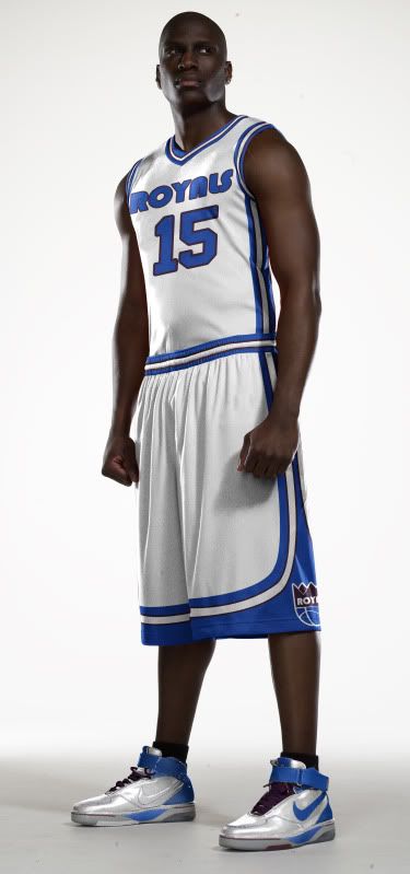
Orange You Glad I Didn't Say Royals?
It's official, Anaheim is trying to attract an NBA team.
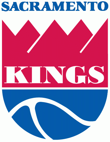
What isn't official is what team they're trying to pursue, but it's pretty clear that it's the Sacramento Kings. However, since Anaheim is so close to Los Angeles and LA already has a team named the Kings, Anaheim wants to change the Kings' name to the Royals.
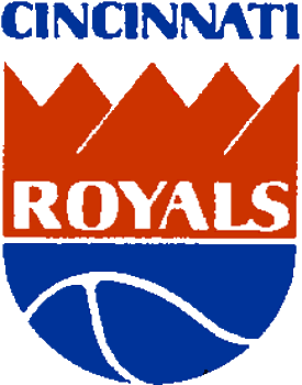
While that name has precedent in that organization, it sure doesn't make a statement about the Anaheim area. And the old color scheme of the old Royals was red and blue, which there is way too much of in the NBA these days - including nearby LA.
It's just another generic team name and color scheme.
That being said, if Anaheim wants to rebrand the Kings for their new home, I say go the full monty and change everything.
So where do you go with Anaheim? Well, someone suggested the Anaheim Lion Kings. Unfortunately, Disney might have a problem with that one. What I noticed was how Anaheim is in the O.C. (don't call it that) Orange County, and there is a color lacking a strong presence in the NBA that deserves to be recognized.
Without further adieu - and a little local inspiration - I give you The Anaheim Orange:
Logos
There aren't enough fun cartoon logos in the NBA anymore. Not everything has to be angry, it's only a game. The name Orange obviously derives from Orange County, so I decided to create the most logical logo - an orange. And with this team name, a color scheme was easy to pick.
![]()
Now, a less literal interpretation of the name orange could represent a different orange colored sphere...
![]()
With the secondary logos, I just removed all the lettering and kept the designs. Here you can clearly see that both logos have the part of the orange that used to have the stem (the nipple?) to further link the images.
![]()
![]()
Next, a tertiary logo allows all the people who love calling Orange County 'the O.C.' a chance to give the new team a similar nickname, 'the A.O."
![]()
![]()
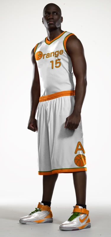
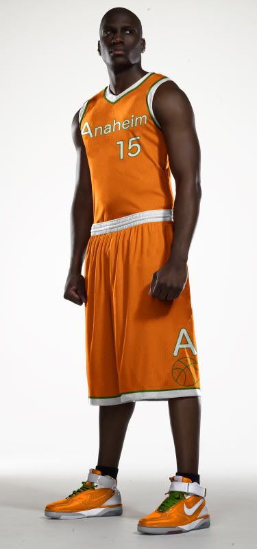
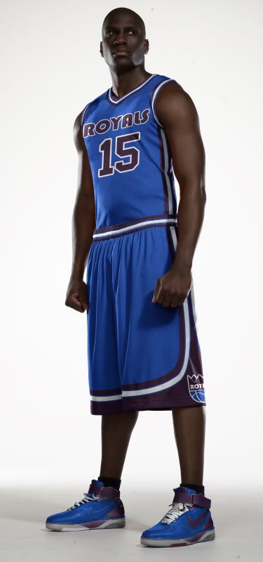
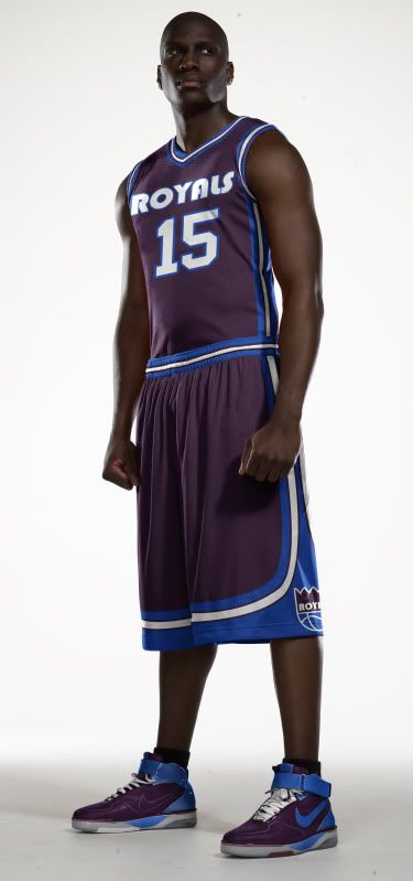
Uniforms
With the uniforms I wanted to keep the design as simple as possible. The cartoon logo and the color scheme are loud enough, no need to go crazy.
With the road alternate, I did feel a bit of orange needed to be added to the jersey (I mean, they are the Orange) so I placed the uni number inside a faceless orange.
Not sure if I'm in love with the designs, but they're simple enough where I don't think I'll be criticized for over-designing them, haha.

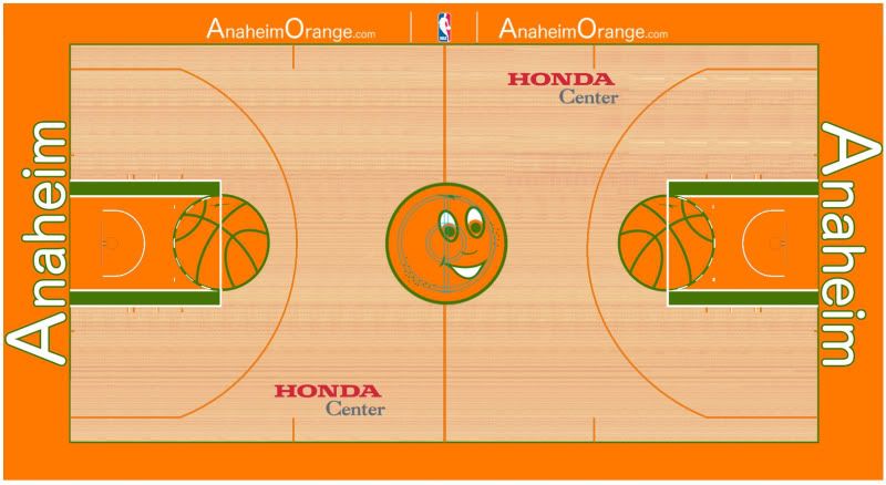
Court
Finally, the Honda Center has hosted basketball games (see: 2011 NCAA Tournament) but a court for an NBA team would be brand new, so I say, "Go bold."
I hope you like this design. If you really like, remember that I just opened up my own shop where you can purchase any of my original designs in t-shirt form. If you have any merchandize or design requests, please drop me an email.
Until then, leave it in the comments.
 Uniform Concepts


