Quatro De Mayo Update
Hola.
So, I haven't been updating this site as much as I have over the past couple of weeks and today I'm going to try and make up for that by posting so much goodness, you won't know what to do with yourself.
While two weeks ago was a bit of a week off for me, I have been doing many requests and concepts or designs that don't really fit into the larger categories I normally post here.
Take this for example:
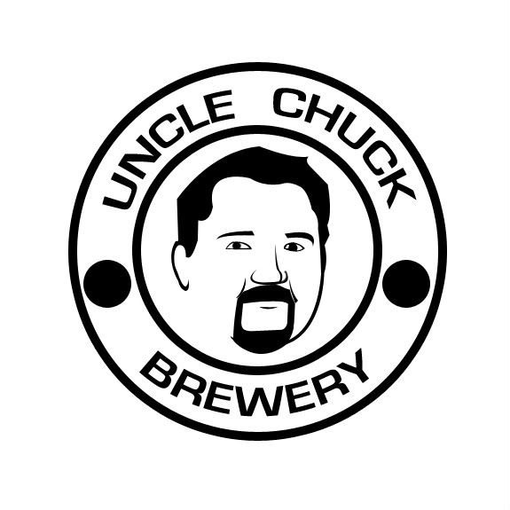
This logo is something I came up with a while back upon remembering that my uncle, Charles Brown (no joke), brews his own beer. This was a project of my own undertaking to try and create a logo for a beer and to see if I could do a face logo.
I think it turned out pretty well.
As far as the sports world is concerned, I did this little diddy for an Oklahoma fan:
![]()
This is a logo of the Oklahoma Schooner - whatever that is - from the front.
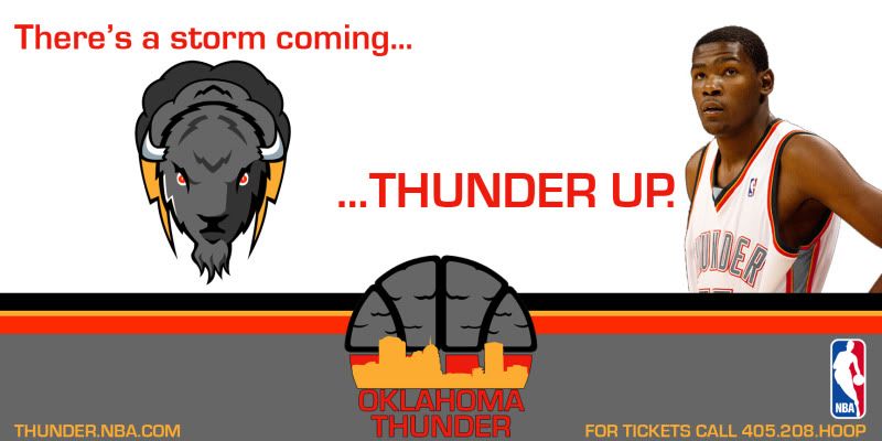
Returning to something I seem to return to once a month, I have yet again been fooling around with the Oklahoma City Thunder. This time, however, I was recoloring real photos to go with my gray Thunder redesign.
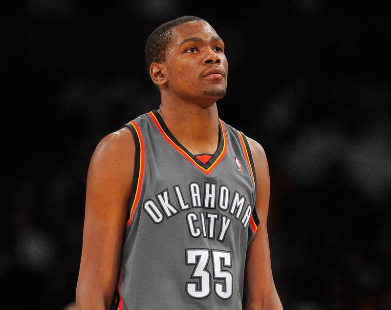
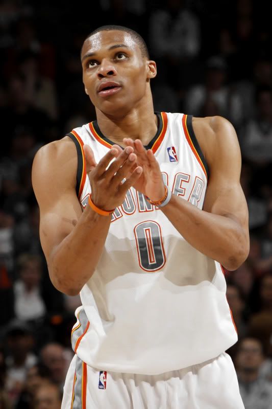
Additional shots can bee seen here and here, not to mention on this fake billboard:
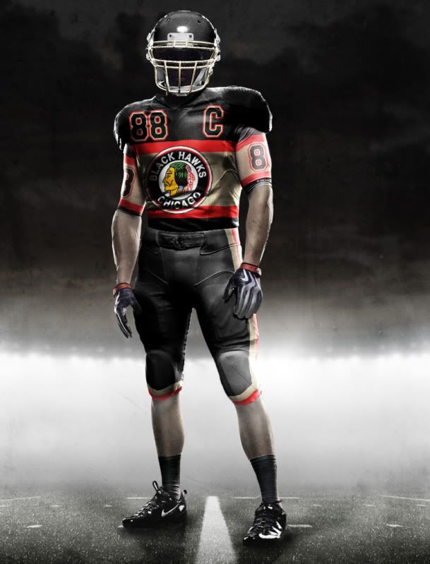
Another personal undertaking was to create a hockey uniform template for myself. Once that had been completed I tested the thing out by making uniforms in case the Blackhawks ever hosted the All-Star game:
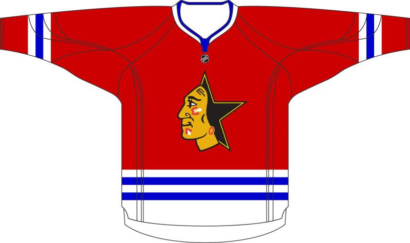
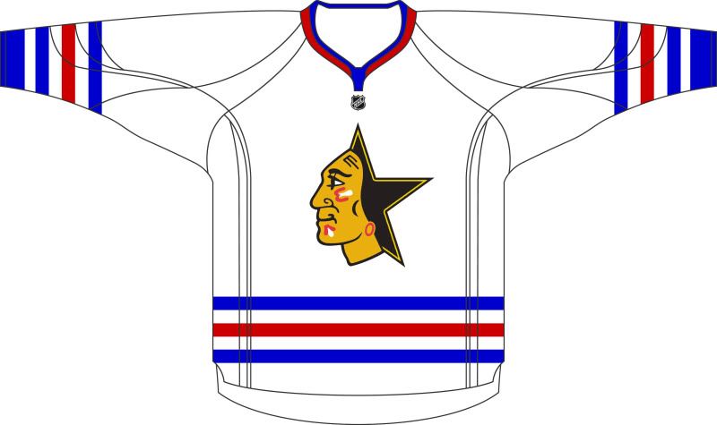
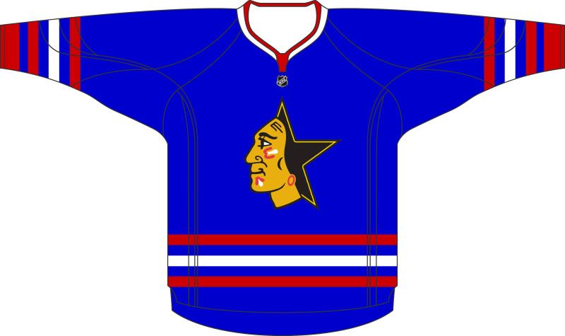
That last Hawks-Star concept is of the old Black Alternate the Hawks used to wear. The only problem is that the design is based off of the road uni, not the home. So that, obviously, inspired me to come up with new concepts for the Black Alternate:


But as always, most of the concepts I have done in recent weeks stem from requests for uniform concepts.
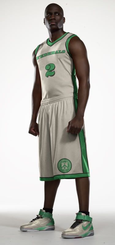
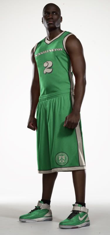
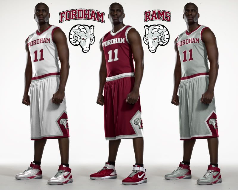
A student from my brother's Alma Mater, Fordham University, contacted me to see if I could come up with some uniforms for their basketball and football teams. Now, since my brother left the Bronx, Fordham changed their logo to this, which sucks, so I changed their logos to This, This, This and This.
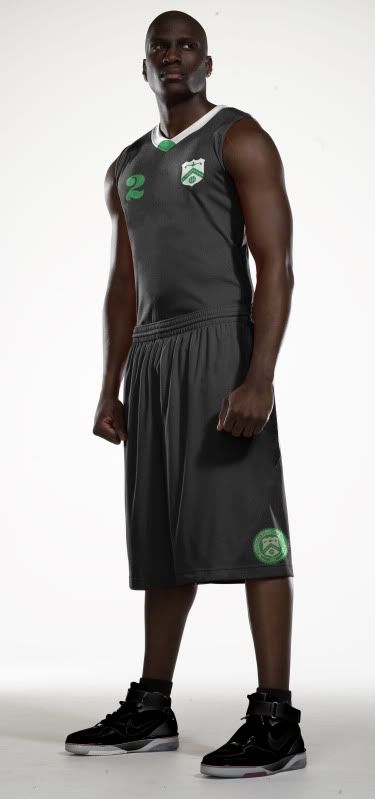
For basketball, I went simple and classic (with an all gray alternate, per his request):
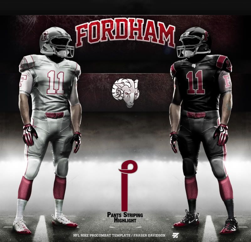
With the football program, I tried to be a bit more modern while keeping their block F maroon helmet:
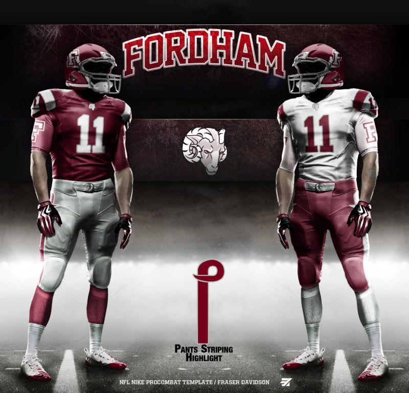
But this being a request, the Fordham student asked for some Oregon-esque alternates, spcifically an all black one. While I prefer the all gray (it helps highlight gray as a third color in my Rams concepts plus gray is the new black) the all black is pretty snazzy (if you can get past the Black for Black's sake):
And finally today, we go all the way to 'A Whale's Vagina' to update San Diego State's uniforms:
Home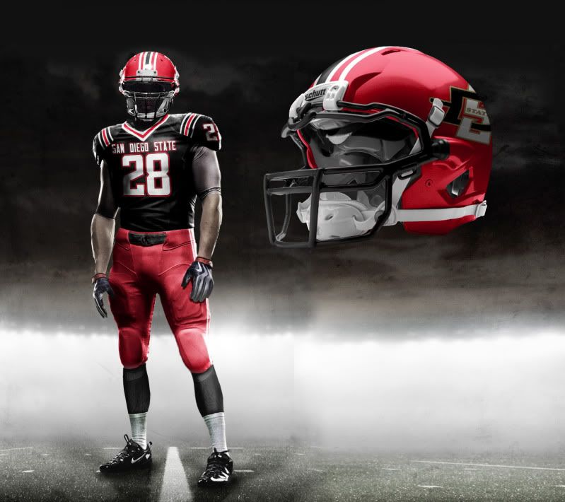 Road
Road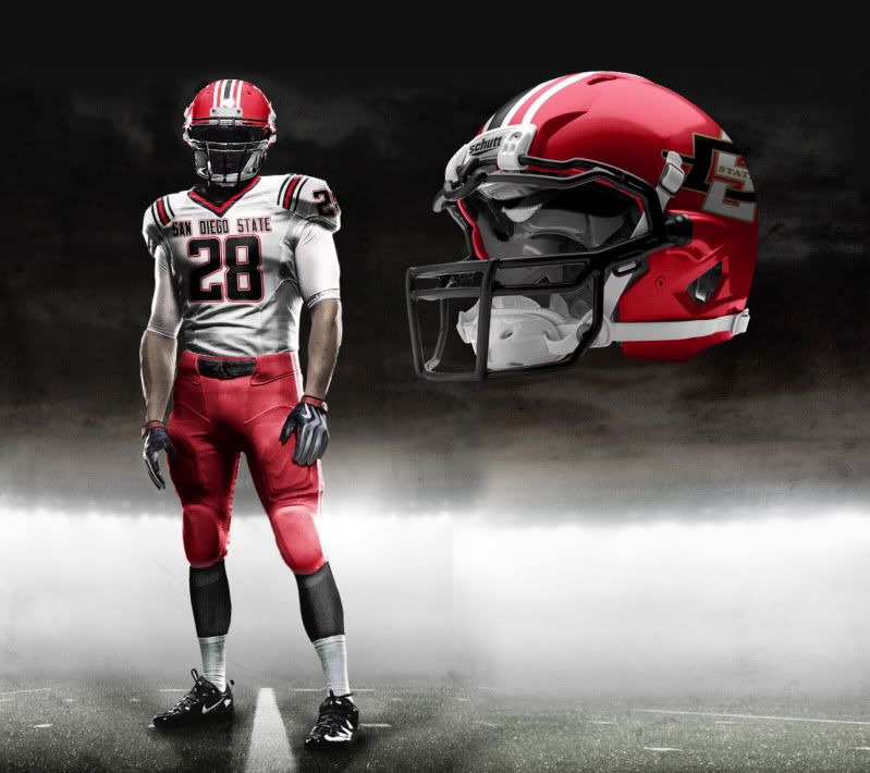
Home Alt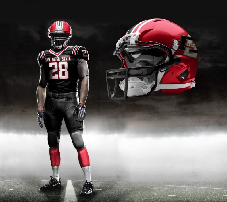 Road Alt
Throwback Helmet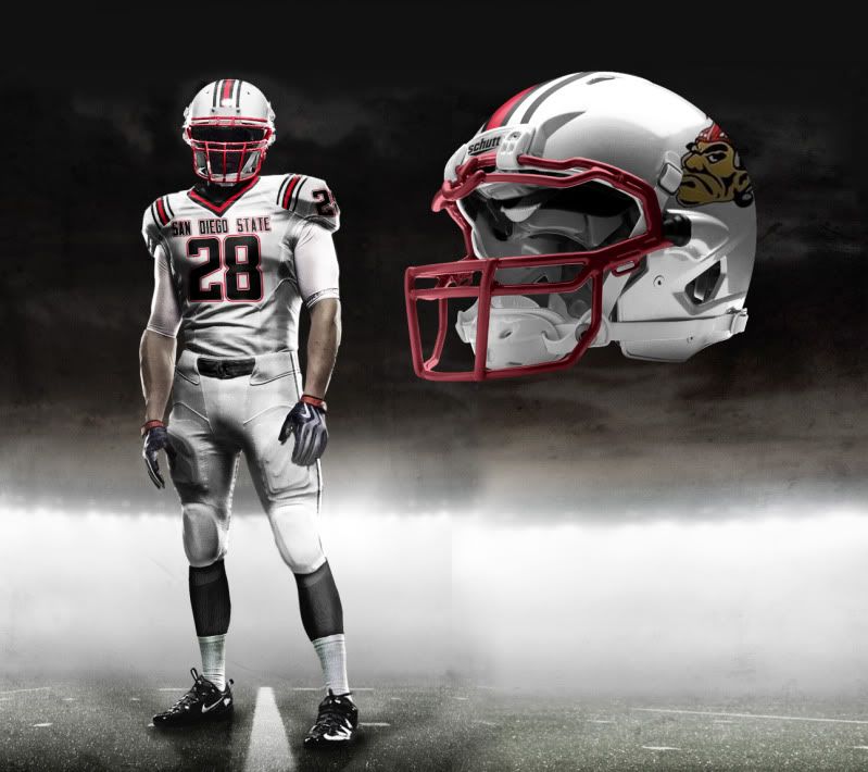
That's it for the update. I'm working on some hockey and baseball stuff right now but feel free to send me any more requests.
Until then, leave it in the comments...
 Tim E. O'Brien