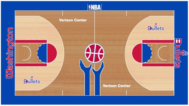
Entries in Wizards (3)

Wednesday
May112011

The WashingtonʉۢBullets

Yesterday the Washington Wizards announced a new era in their franchise's history that resembles - but does not rename them - the Washington Bullets. Here are my thoughts:

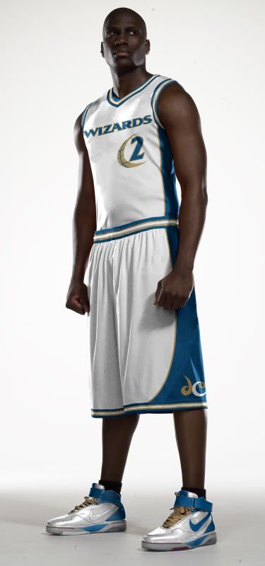
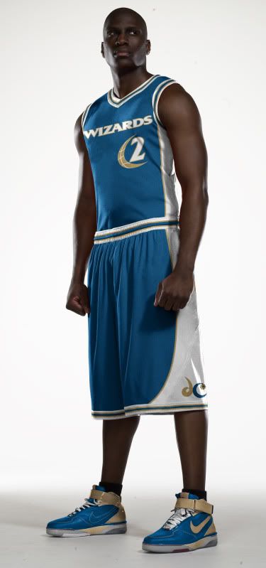
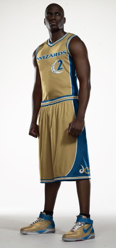
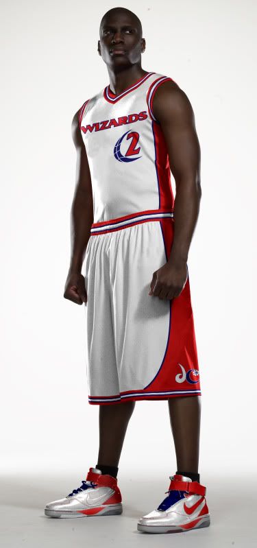
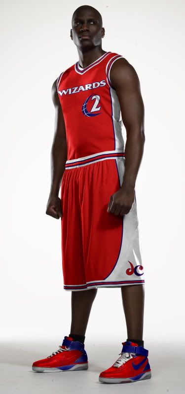
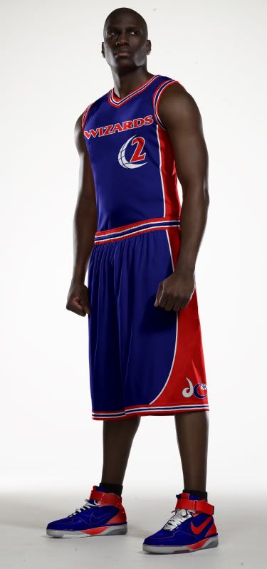
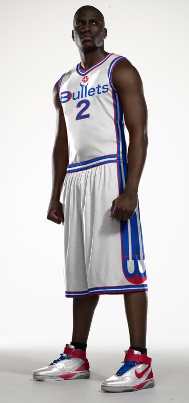
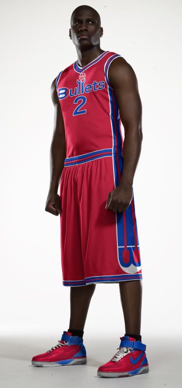
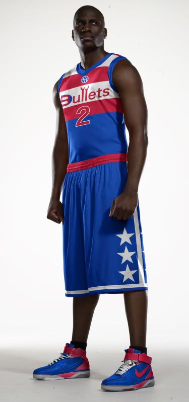
  • Let me start off by saying that I really like these uniforms. They are a huge improvement over what they have had as of recent (but still aren't as cool as this!).
  • I wish the blue was a little less navy.
  • As predicted by many (including me), the Wizard made it through the recolorization process. With the new Bullets color scheme, the Wiz looks more like Saint Nick and Less like Merlin. He needs to be dropped ASAP.
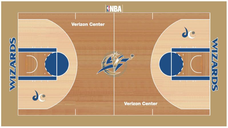
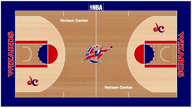
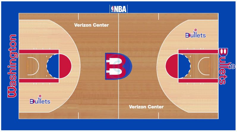
  • The new 'DC' secondary logo is amazing because of how it echos the old Bullets logo but the font on all the word-marks leaves something to be desired.
  • Speaking of the word-marks - The Washington Monument in the H in Washington and the D in Wizards is beyond class. This makes me feel like a complete amateur. Kudos to the genius who worked that into the design.
  • Whoever worked this W into the shorts should get some props too. Very subtle.
  • The Ball/Monument logo is good but I feel like it's a few steps away from greatness. Don't know what the problem is for me but something just feels wrong (maybe it's the seven sided ball).
  • The Home Uni: The number font is less that spectacular and the red tripe should end in a solid line rather than jutting down only near the center logo. Also, the blue and white on the collar and sleeves should be switched around for better contrast and to match the road uniform. Other than that, pure win.
  • The Road Uni: Same problems as the Home Uni as far as the blue stripe that goes over the shoulders and the number font, but just like the Home Uni, this uniform is a huge improvement for the Wiz.

Well, that's my take on the new Wizards jerseys. I wouldnt be surprised if the Wizard logo and name is phased out over the next few years but either way, these new unis are a vast improvement for this franchise.

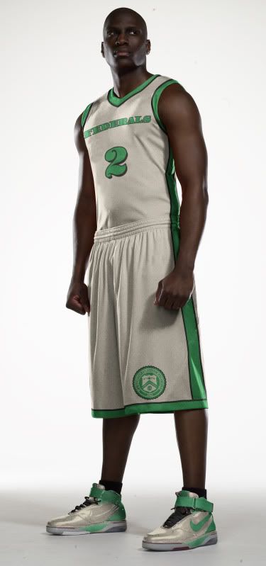
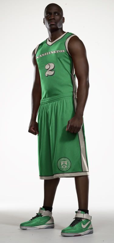
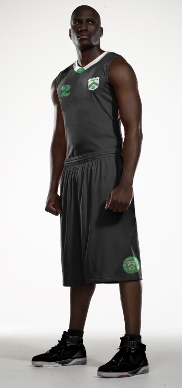
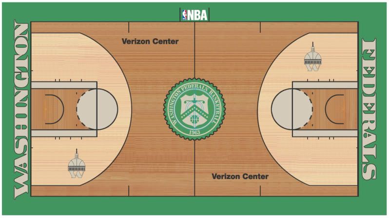
I have a BIG Uni Watch feature coming up this Sunday and while I wont say exactly what it is, you'll probably be able to make an educated guess from this picture...

Until then, you know what to do.

Friday
Apr082011

If Only They Still Had Agent 0

The Washington NBA team has bigger identity issues than people in the Witness Relocation Program.

Just like a Witness Relocation Programee (if that's a word), Washington's former life was too violent. But now, in their new life as the Wizards, they've been found... to have a crap team identity.

Since the organization hates one name and the fans hate the other, it's time for a rebrand, Cajun Style.

Logos

Given that D.C. is the capital, shouldn't the nation's capital have a governmental theme? I'll hear none of this, let's just change the colors B.S., so while brainstorming I, and I alone, came up with the name. Nevermind the rumors this team name may have already existed, The Washington Federals is too good to pass up.

The main logo is based on this treasury department logo.

The secondary logos are, obviously based on the Capitol (although I have two other W designs).

Uniforms

With the Home and Road unis, my inspiration should obvious - CASH MONEY YA'LL. I thought about throwing in those random red and blue fibers into the designs but I figured the NBA might have a problem mass producing that.

With the team nickname The Feds, you have to be taken very seriously. Now, what's more serious than a federal agent in a suit showing up and dominating you on your home court?

With that in mind I give you the MIB Alt:

(My brother noted how this Alternate looks like John Wall joined Slytherin...)

Court

This court is pretty simple and straightforward. I thought about perhaps trying to make the court look as much like a dollar bill as possible but with the flourishes in the corners and how much writing would be on the court, I decided to echo currency rather than replicate it.

Well, that's all for this rebrand. As always, I hope you enjoy it. Leave any comments or questions in the comments (dur), feel free to shoot me an email if you're so inclined and check out my shop to purchase t-shirts of my original designs.

Until next week...

Wednesday
Mar092011

Dodged a Bullet

The Wizards is messin' my shit up! (almost)

My penchant for impeccable timing combined with my severe laziness allowed me to avoid looking foolish.

this past weekend, I wrapped up a redesign of the Washington Wizards. I was set on releasing that post on Monday because of my JVBackups.com post that normally comes out on Tuesdays but I just didn't get around to doing it.

So when I awoke today to see this uni-news, I breathed a sigh of relief and got to work retooling my rebrand.

So as it turns out, I'm not the only one who thinks the Wizards need a rebrand. Since I found out the Wizards are probably changing their colors and 'considering' changing their name back to the Bullets, I have three redesign plans; Blackout, Wizards Are America And So Can You and Washington Reload.

So without further ado...

Blackout

You guessed it, we're taking the black out of the current color scheme.

Less black = better color scheme

As far as the unis go, I redesigned the entire front with their better font and I used the 'Moon-ball' to frame the numbers. I did, however keep the asymmetrical striping that only appears on the players' left side.

And we have to take the black out of the court too,

Wizards Are America And So Can You

What's more American than being from D.C.? Wearing red, white and blue.

According to the link at the top of the page, this appears to be what the Wizards main logo will be next year, so what will the D.C. secondary logo look like?

The WAAASCY uni set is the same as my previous redesign only in red, white and blue, just like the logos.

And I went America all over the Verizon Center's ass.

Washington Reload

What's more Washington D.C. than Wizards? Bullets!

OK, that may not be PC but come on, The Bullets sounds so much better than The Wizards. My logo is a bit of an update on the old Bullets logo and the secondary logo is brand new with a B that's also a W (just turn your head) and has at least three bullets built into the design.

The secondary logo led to the side striping on the Home and Road uniforms. The alternate uni is a throwback with my modern logo.

And as for the court, I couldn't decide, so I'll leave that to you...

Personally I love the hands coming onto the court...

Well, that's it for my Wizards/Bullets rebrand, more to come later in the week.