What Was Old Is New Again
A few weeks back, over at Uni-Watch.com, I ran a feature piece on my take for NHL uniforms. While I wasn't quite finished tweaking NHL teams, commenter Mike D (whom I have to assume is the Mike D from the Beastie Boys) gave me the idea to take a crack at teams of yesteryear.
With such a great idea, I immediately got to work and found four teams ripe for an update. So what follows is first, a new look for four former franchises followed by a continuation of my take on current NHL teams.
The Defunct Series
California Seals: LOGO | CREST | HOME | ROAD | THIRD
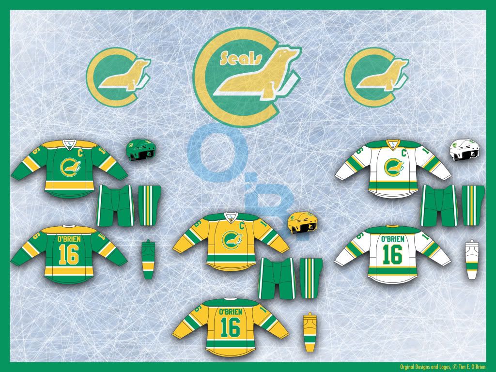 The Seals - in their California incarnation in particular - had great colors and unis, but the logo reminded me more of a bird with a fish head than a seal. So I tried to remedy that with an updated logo and script.
The unis are basically just updates of previous unis. Though I had considered making the yellow jerseys the road uni and coming up with a different third, I figured this might go against NHL uni-policy.
Hartford Whalers: CREST | LOGO | HOME | ROAD | THIRD
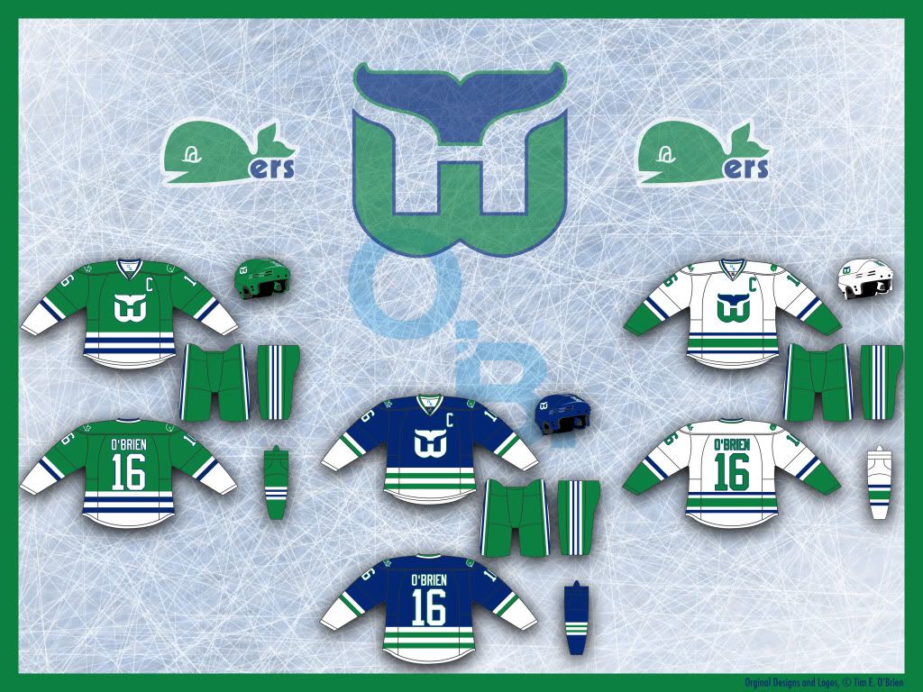 This is the first team in the Defunct Series which I didn't feel the need to edit their crest. I did edit the whale logo a bit and I considered moving the whale tail up a bit higher off of the W but decided against it.
The uniforms are fairly straightforward updates of classic Whaler unis, but it was hard to keep the bold striping patterns of the old team on the new edge cuts. I'm not thrilled with my third. I tried a gray alt but that looked forced and the blue alt - to me - starts to encroach A LOT on the Canucks' identity (though, they seem to have just stolen a lot of good design ideas from the Whalers). If you have any better ideas for a third, let me hear 'em.
Minnesota North Stars: CREST | LOGO | HOME | ROAD | THIRD
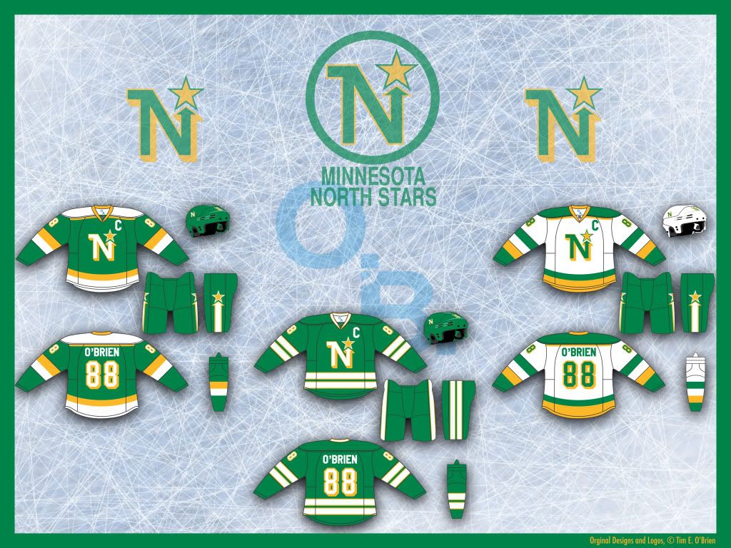 With the North Stars, the first thing I tried to do was fix their logo. To me, a team named the North Stars should have a logo that points north (up), not northeast-ish (up and to the right). After that, these home and road are actually pretty similar to my Dallas Stars set (with notable and significant differences), which makes sense since those were partially based on old North Stars unis, but I give these unis their own flare (like the arrow and star on the pants).
I love the Third jersey here, which is a fauxback, and even considered making the home and road based off of this pattern, but decided to go with the more modern feel for the regular unis.
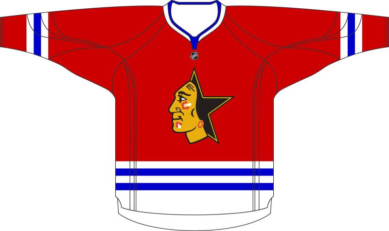
Quebec Nordiques: CREST | HOME | ROAD | THIRD
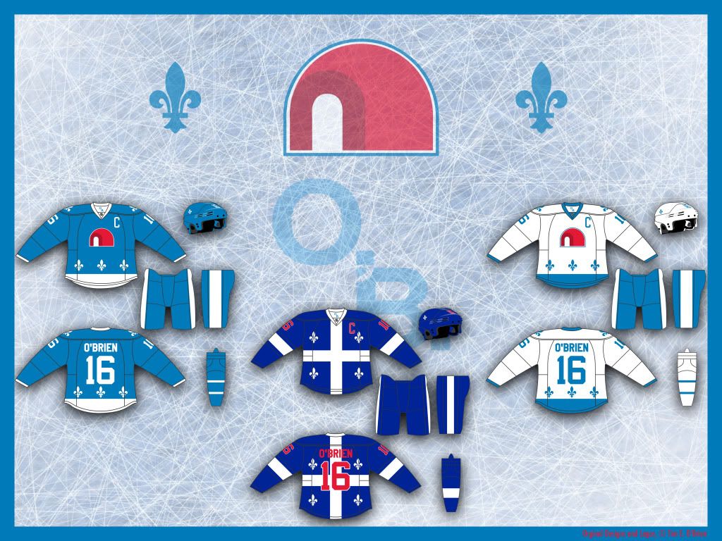 I think the old Nordiques logo is a train-wreck. Now, I understand that, design aside, people love the 'Diques logo, so - just like the Seals - I tried to update the logo while improving the design.
From what I gather, the old logo was a mashup of an N, an igloo and a hockey stick and puck. First, I rid the logo of the hockey equipment (we know you play hockey) and I give the logo a much more balanced overall shape. The door to the igloo is framed by an N for Nordiques and also appears as an entrance to a stereotypical igloo.
I even flirted with a wordmark alternate logo, but decided that might be a bit much.
The home and road unis are pretty much just updates but the third is an homage to the flag of Quebec.
 Who ever said fantasy has to be realistic? In my world, the NHL would add more outdoor "classics" and this particular one would take place in Oakland California.
Pitting the Minnesota North Stars vs the California Seals, both teams would wear throwbacks to 1975-76 with their current (Tim E.-created) logos and slightly altered pants stripes.
 The second classic I would add would be a return of the Heritage Classic - the Canadian team version of the Winter Classic.
Quebec would host this Canadian outdoor game and face an old WHA rival, the Hartford Whalers.
Once again, both teams would be wearing throwbacks to 1975-76 but this time the unis would be dead on replications of the '70s originals.
Hockey TimE
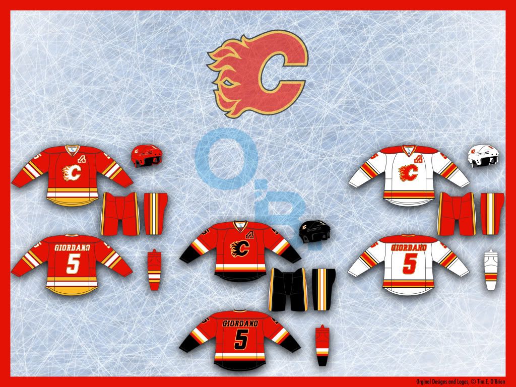 These unis are a combo of throwback and current designs. All the unis feature some black but the main striping patterns come from the era of the Flames singular Cup win.
For the captaincy patch, I use the Calgary Flaming C logo and for the alternate captains, I use the Atlanta Flames Flaming A logo.
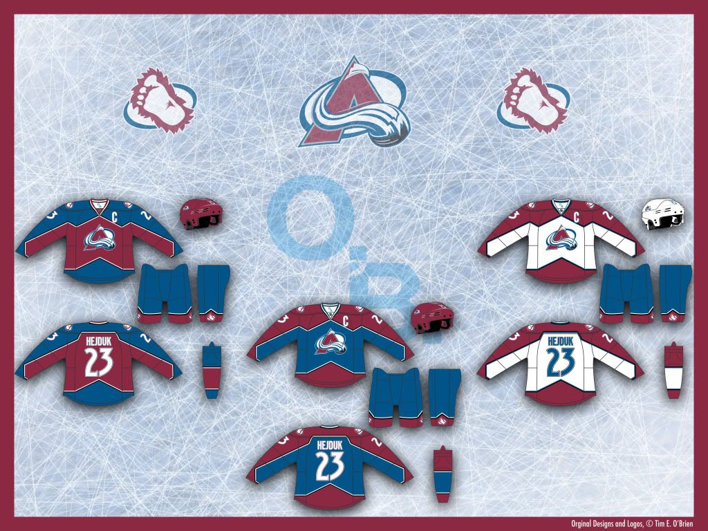 A more mountainous feel on the unis (and pants) that evokes earlier, happier times in Colorado. I also removed the black helmet and pants and eliminated gray except for on the crest.
The third is inverted Home colors, which some have said is almost indistinguishable from the Home uni, but I say, what's so wrong with that?
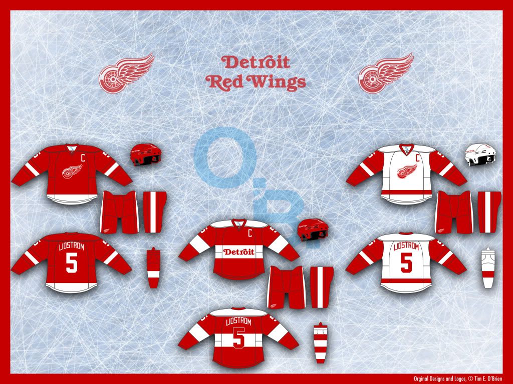 No change, home or road. The Third is a 'heritage' design that honors elements of past uniforms while incorporating some modern and all new elements.
I've always really enjoyed the Red Wing's wordmarks, so I tried to highlight them in the Third jersey.
New Jersey: HOME | ROAD | THIRD
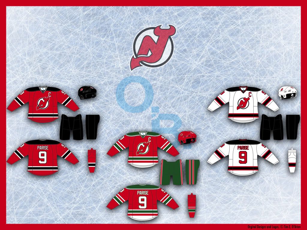 The Devils don't need too many changes. I did very minor stuff on the home and road, but I bring back the old green jersey from Jersey's first 11 seasons and bring it back as the permanent third. It's classic uni that deserves to be seen at least a few times a year.
New York Islanders: HOME | ROAD | THIRD
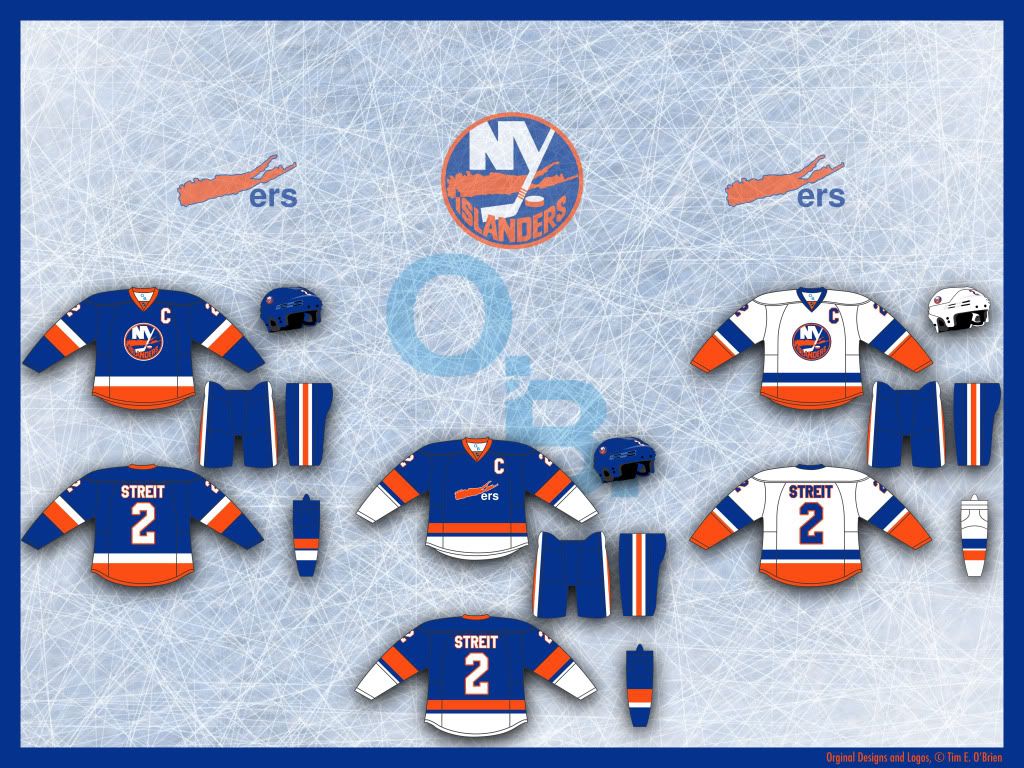 Well, the Islanders decided to shit all over good design with their third jersey so I decided it was time to work on the Isles.
With the home and road, I return the look that won four Stanley Cups, a classic and simple uni.
As for the third, I used the current home uni striping and add my new secondary logo (inspired from the Whalers' old logo) to the chest.
_____
Well, that's it for now, until next time, happy tweaking.
 Uniform Concepts