Entries by Tim E. O'Brien (54)

Wednesday
Apr062011

Blue Out the Hawks

There is an epidemic spreading throughout the sports world today known as SBD, Superfluous Blue Disease.

The symptoms include changing your color scheme to include blue, adding blue to uniforms when it isn't a team color and, of course, blue fauxbacks.

Now the Atlanta Hawks have a long tradition wearing red, but the accent color in days of old was yellow. When they changed to blue a few years back, a great color combo - red, yellow, white - was lost in the NBA.

With that in mind, I decided to ditch the blue, bring back the yellow and update their modern mess of a current uniform.

Logos

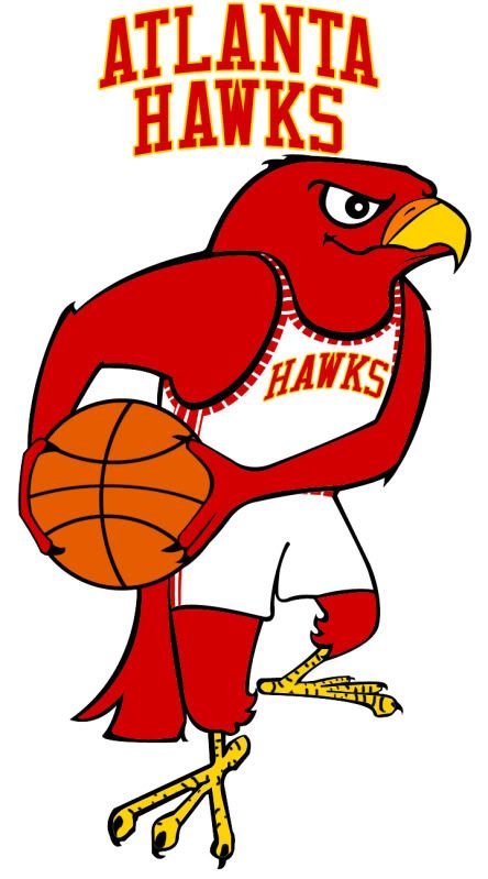
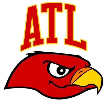
Based on the St. Louis Hawks logo from above, I gave the Hawks an update from their really ugly modern logo to a very classic cartoon logo (although including this with the right colors wouldn't be bad either).

Uniforms

Once again, we're going back in time to an era Pistol Pete knew well. Obviously not a complete throwback, these unis combine a unique, yet classic striping pattern with the new logos, font and color scheme. And while I thought about going back to 'Nique era unis, they're just too ugly, haha.

With the road alternate, I decided not to go with yellow as the main color because a yellow basketball uniform looks terrible. Instead, I witched out white for yellow and added ATL to the front.

Court

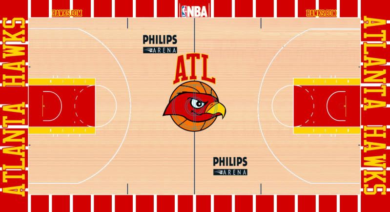
A bit ostentatious, perhaps, but fun none the less.

Well, that's it for the Hawks, I have a few more NBA designs ready and waiting to be released but many of them (including this Hawks redesign) are headed towards are larger project that will be featured on UniWatchBlog.com during an upcoming weekend.

Until next time, leave it in the comments.

Wednesday
Mar302011

Tweaking the Classics - NBA EDITION 

A while back, an emailer - Zack - sent me a request with a really interesting idea:

Just an idea since you do a lot of NBA rebrandings I would be interested to see what you would do with the Knicks, Lakers or Bulls.

To me, those three organizations are three of the top four franchises in the NBA as far as history and uniforms (the Celtics being the unnamed fourth).

Taking a crack at their uniforms - while certainly not unheard of, all three have gone through some pretty dramatic changes since the mid-80s - would be a challenge between balancing what makes their uniforms great with new ideas that can improve their image.

Also, with such perfect logos and historic courts, the only changes needed to these teams would be to their uniforms (although, as you'll see, I did alter the Knicks' logos a smidgen)

So here we go:

Bulls

Not much of a change here to the Home or Road versions. Jordan and company made these already great unis classics, so, in my humble opinion, I left them generally unchanged.

Unfortunately for these concept templates, you don't see the backs of the jerseys. If you could, you would see that the names on the backs would be sans-outline and would be white on both Road versions, because this looks way better than this.

The Bulls' black Road alternate has a long storied history. In the 1995-96 season the Bulls broke out these black alternates 10 times in route to their historic 72 win season. Good karma right? No.

The Bulls went 5-5 in their pinstripe duds (duds being the key word) and 67-5 in white and red. Ever since, the Bulls have tried to keep and update their black alternates but never quite got them right.

The biggest problem was the striping. Either the Bulls didn't have the striping (including the diamond on the shorts) or the striping was different from the Home and Road. Even today's black alternate is still wrong - the striping colors go red-black-white-black-red when they should go red-white-black-white-red (because the uniform color should be the middle stripe color).

Fixing the striping and then taking inspiration from the mid-80s Road jersey, I give you my fixed black Road alternate.

Knicks

As I said at the top of the show, I did have to make some small alterations to the Knicks' logos. All I did, as you can see, is take the black out and replace it with blue (this should give you a hint about what I did with their uniforms).


As far as the Knicks uniforms go, I basically took everything good from the modern set and combined it with the good from the Ewing Years set.

From the Ewing era, I kept the stripe pattern, collar and sleeve pattern and the fonts.

From the modern era, I kept the continuous side stripe and the logos.

Combine all that, and Voilà: I give you the New Look Knicks.

Lakers

Once again, I present to you an amalgamation of old and new.

I should be a poet.

While the Lakers look great in their current set, they used to look great in their old set too. And while I've gone back mostly to the old set, I didn't go all the way back (no one wants to see this).

I have kept the current logos, fonts (especially the lack of the drop shadow) and have made all the numbers the opposite color scheme as the 'Lakers' script this is both old and new). And finally, the striping is all from the Magic Johnson to early Kobe era.

Those are my ideas to perfect perfection. Obviously, all three teams currently look great, but who says you fix what ain't broke.

Once again, I hope you like this design. If you really like my designs, remember that I just opened up my own shop where you can purchase any of my original designs in t-shirt form. If you have any merchandize or design requests, please drop me an email.

Until then - as always - leave it in the comments.

Saturday
Mar262011

Orange You Glad I Didn't Say Royals?

It's official, Anaheim is trying to attract an NBA team.

What isn't official is what team they're trying to pursue, but it's pretty clear that it's the Sacramento Kings. However, since Anaheim is so close to Los Angeles and LA already has a team named the Kings, Anaheim wants to change the Kings' name to the Royals.

While that name has precedent in that organization, it sure doesn't make a statement about the Anaheim area. And the old color scheme of the old Royals was red and blue, which there is way too much of in the NBA these days - including nearby LA.

It's just another generic team name and color scheme.

That being said, if Anaheim wants to rebrand the Kings for their new home, I say go the full monty and change everything.

So where do you go with Anaheim? Well, someone suggested the Anaheim Lion Kings. Unfortunately, Disney might have a problem with that one. What I noticed was how Anaheim is in the O.C. (don't call it that) Orange County, and there is a color lacking a strong presence in the NBA that deserves to be recognized.

Without further adieu - and a little local inspiration - I give you The Anaheim Orange:

Logos

There aren't enough fun cartoon logos in the NBA anymore. Not everything has to be angry, it's only a game. The name Orange obviously derives from Orange County, so I decided to create the most logical logo - an orange. And with this team name, a color scheme was easy to pick.

Now, a less literal interpretation of the name orange could represent a different orange colored sphere...

With the secondary logos, I just removed all the lettering and kept the designs. Here you can clearly see that both logos have the part of the orange that used to have the stem (the nipple?) to further link the images.

Next, a tertiary logo allows all the people who love calling Orange County 'the O.C.' a chance to give the new team a similar nickname, 'the A.O."

Uniforms

With the uniforms I wanted to keep the design as simple as possible. The cartoon logo and the color scheme are loud enough, no need to go crazy.

With the road alternate, I did feel a bit of orange needed to be added to the jersey (I mean, they are the Orange) so I placed the uni number inside a faceless orange.

Not sure if I'm in love with the designs, but they're simple enough where I don't think I'll be criticized for over-designing them, haha.

Court

Finally, the Honda Center has hosted basketball games (see: 2011 NCAA Tournament) but a court for an NBA team would be brand new, so I say, "Go bold."

I hope you like this design. If you really like, remember that I just opened up my own shop where you can purchase any of my original designs in t-shirt form. If you have any merchandize or design requests, please drop me an email.

Until then, leave it in the comments.

Wednesday
Mar232011

Who Says the Unemployed Can't Make Money?

Well, based on an email a follower sent me, I decided to start a shop where I can sell my unique creations.

Now, I've already run into some copyright issues (some of which I claim are absolute BS) so my designs often lack either the team name or location so I can sell these items. If you want any specific designs on any specific item on Zazzle, please feel free to drop me an email request and I'll see what I can do.

I cannot obviously sell things that are not of my own creation (like the logos from the other day's Mavs recolorization) but I will do my best to sell any item I have created and to which I own the intellectual and property rights.

Tuesday
Mar222011

Branding a Maverick

While doing some research the other day, I came across a startling statistic. Almost 57 percent of NBA teams have blue as one of their main colors. That's 17 teams:

Hawks
Bobcats
Mavs
Nuggets
Pistons
Warriors
Pacers
Clippers
Grizzlies
T-Wolves
Hornets
Knicks
Thunder
Magic
Sixers
Jazz
Wizards

Next year, odds are that the new Anaheim Royals will go to the color scheme of red and blue and there are rumors (documented on this site) that the Washington Wizards will change their color scheme next season but will keep blue in the set.

This has to change. There's way too much blue in the league right now (I blame Eiffel 65), so today I take a look at the Dallas Mavs to see if we can get a more original color scheme.

Logos

While Dallas has a decent logo, their modern typeface and the dominant blue color need to go. Now the Mavs used to be a green and blue team, a pretty original color scheme, but we're trying to get as much blue out of the Association as possible so I've decided to leave some blue in but only as an accent color to the main color pallet of green and white.

As for the typeface, the Mavs' current alternate has this wonderful typeface on it (TF Burko) so I used that font as the only font in the redesign.

As far as the secondary logos go, once again not much of a change here but enough to highlight the new green-first color scheme.

Uniforms

The road uniforms may look familiar. The road alternate is almost exactly the same as the Mavericks' Alternate used from 2004 to 2009. However, I flipped the colors of the striping on the main road uni so that the blue remained just an accent color.

The home uni says Dallas in TF Burko but otherwise is just the logical home variation of the road jersey.

Court

Dallas has a pretty cool court so all I really did was fix the colors. I changed the font on the baselines to fit the rest of the rebrand and the stars in the corners now match the star in the main logo.

Well, that's pretty much it for this rebrand. Only Boston, Milwaukee and Utah currently have green on their uniforms (excluding St. Patrick's Day unis) and only Boston and Milwaukee have it as a main color (it's relegated to a striping color on the Jazz's unis).

Dallas needs to go back to the green.