Entries in Basketball (10)

Saturday
Jun092012

Meet My BUD

Some of you may have been wondering, "Why hasn't Tim posted anything here in a while?"

Well, this is why: The Basketball Uniform Database.

Over the past few weeks and months, I've been working on something big. I volunteered to to work with some of my fellow uni-nerds on creating a database of NBA uniforms. The goal is to go back to the '40s but as of today, our coming out party, we have 2011-2012 finished and are beginning to work our way backward in time.

In my position as the graphic designer, it has been my job to create the templates, recreate the jerseys and do anything else graphically I can for the project. I've been working with tons of images, logos and color swatches to try and come up with as accurate a depiction of NBA jerseys as I can, no matter if it's the '60s, '80s or the tweens.

Now, I'm not perfect (though I'm damn close...). That being the case, if you ever see something on there that's a glaring error, feel free to drop me an email (See: sidebar) and let me know.

And it turns out, NBA uniforms aren't perfect either.

In my personal research I've discovered two bizarre uni-quirks that I haven't seen mentioned anywhere else (though, perhaps I just haven't looked hard enough...). Let's start off with the quick one.

Philadelphia, before this season, introduced a brand new alternate uniform. It was pretty standard fair, a blue version of their current jersey template. Not bad. Not great, but not bad.

Unfortunately, Philadelphia never wore it.

You can do - as I did - and go through all of daylife's 76ers images, it doesn't appear once. Or you can go to their team website and watch game recaps. No sight of it. Or go to ESPN. I think you know what you'll find.

It's truly bizarre. The Sixers don't even sell the jersey in their online store. What makes it even more bizarre is that fans seem to love the blue jersey.

So the phantom alt of Philadelphia remains a uni-mystery. Who killed it? Why was it killed? Will it ever make it on court? We may never know.

Finally, we come to a case of, "Wait, why wouldn't they just change that?"

The New York Knickerbockers broke out new unis - their current unis - for the 2001-2002 season. Other than a collar change, the uniforms have remained unchanged for more than a decade.

Except for on thing.

Look at these pictures from the Stephon Marbury era of the nicks: Home Road and St. Paddy's Alt. See how the Knicks logo on the shorts is on the right short leg, placing the NBA logo on the left pant leg? Well, at some point during the Starbury era, the Knicks switched their logo to the left leg (where it remains today).

Except on the St. Paddy's Day alts.

For some reason, the Knicks have never switched the shorts patch on their green alternates. Never. It's very bizarre.

The Knicks changed the logo location years ago, so it's not like these are jerseys created before the change and they just never got around to it. The materials and cuts of the jerseys have changed over the years and most - if not all - of the current players on the Knicks roster have never worn the old home and road unis with the logo on the right pant leg.

It doesn't matter the occasion (Christmas, St. Patrick's Day, dunk contests, etc.), the patch is on the other pant leg. It's a very strange uni quirk that I would love to hear the rationale behind.

Though, I suspect the the explanation will be less than satisfactory.

"It's just a logo on a uniform, who cares?"

Wednesday
Apr202011

Conceptualized Basketball

Quick update today to announce that I've updated my Basketball Concepts page (skip to page 2) to include most of my recent works including my Tweaking the Classics post unis and my recent feature on UniWatchBlog.com.

Here are the updated teams:

  • Bobcats
  • Bulls
  • Clippers
  • Federals
  • Grizzlies
  • Hawks
  • Heat
  • Jazz
  • Knicks
  • Lakers
  • Mavs
  • Orange
  • Raptors
  • Timberwolves

I'd just like to thank everyone for all the feedback I've gotten, I really appreciate all the kind words and constructive criticism and I hope to keep making concepts people like.

Friday
Apr082011

If Only They Still Had Agent 0

The Washington NBA team has bigger identity issues than people in the Witness Relocation Program.

Just like a Witness Relocation Programee (if that's a word), Washington's former life was too violent. But now, in their new life as the Wizards, they've been found... to have a crap team identity.

Since the organization hates one name and the fans hate the other, it's time for a rebrand, Cajun Style.

Logos

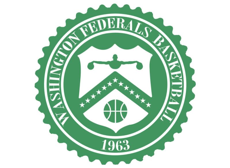
Given that D.C. is the capital, shouldn't the nation's capital have a governmental theme? I'll hear none of this, let's just change the colors B.S., so while brainstorming I, and I alone, came up with the name. Nevermind the rumors this team name may have already existed, The Washington Federals is too good to pass up.

The main logo is based on this treasury department logo.

The secondary logos are, obviously based on the Capitol (although I have two other W designs).

Uniforms

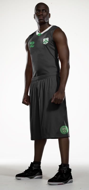
With the Home and Road unis, my inspiration should obvious - CASH MONEY YA'LL. I thought about throwing in those random red and blue fibers into the designs but I figured the NBA might have a problem mass producing that.

With the team nickname The Feds, you have to be taken very seriously. Now, what's more serious than a federal agent in a suit showing up and dominating you on your home court?

With that in mind I give you the MIB Alt:

(My brother noted how this Alternate looks like John Wall joined Slytherin...)

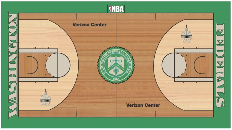
Court

This court is pretty simple and straightforward. I thought about perhaps trying to make the court look as much like a dollar bill as possible but with the flourishes in the corners and how much writing would be on the court, I decided to echo currency rather than replicate it.

Well, that's all for this rebrand. As always, I hope you enjoy it. Leave any comments or questions in the comments (dur), feel free to shoot me an email if you're so inclined and check out my shop to purchase t-shirts of my original designs.

Until next week...

Wednesday
Apr062011

Blue Out the Hawks

There is an epidemic spreading throughout the sports world today known as SBD, Superfluous Blue Disease.

The symptoms include changing your color scheme to include blue, adding blue to uniforms when it isn't a team color and, of course, blue fauxbacks.

Now the Atlanta Hawks have a long tradition wearing red, but the accent color in days of old was yellow. When they changed to blue a few years back, a great color combo - red, yellow, white - was lost in the NBA.

With that in mind, I decided to ditch the blue, bring back the yellow and update their modern mess of a current uniform.

Logos

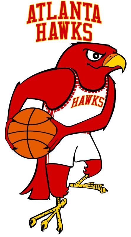
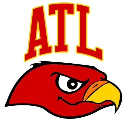
Based on the St. Louis Hawks logo from above, I gave the Hawks an update from their really ugly modern logo to a very classic cartoon logo (although including this with the right colors wouldn't be bad either).

Uniforms

Once again, we're going back in time to an era Pistol Pete knew well. Obviously not a complete throwback, these unis combine a unique, yet classic striping pattern with the new logos, font and color scheme. And while I thought about going back to 'Nique era unis, they're just too ugly, haha.

With the road alternate, I decided not to go with yellow as the main color because a yellow basketball uniform looks terrible. Instead, I witched out white for yellow and added ATL to the front.

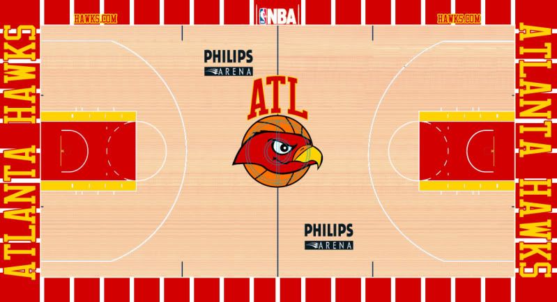
Court

A bit ostentatious, perhaps, but fun none the less.

Well, that's it for the Hawks, I have a few more NBA designs ready and waiting to be released but many of them (including this Hawks redesign) are headed towards are larger project that will be featured on UniWatchBlog.com during an upcoming weekend.

Until next time, leave it in the comments.

Saturday
Mar262011

Orange You Glad I Didn't Say Royals?

It's official, Anaheim is trying to attract an NBA team.

What isn't official is what team they're trying to pursue, but it's pretty clear that it's the Sacramento Kings. However, since Anaheim is so close to Los Angeles and LA already has a team named the Kings, Anaheim wants to change the Kings' name to the Royals.

While that name has precedent in that organization, it sure doesn't make a statement about the Anaheim area. And the old color scheme of the old Royals was red and blue, which there is way too much of in the NBA these days - including nearby LA.

It's just another generic team name and color scheme.

That being said, if Anaheim wants to rebrand the Kings for their new home, I say go the full monty and change everything.

So where do you go with Anaheim? Well, someone suggested the Anaheim Lion Kings. Unfortunately, Disney might have a problem with that one. What I noticed was how Anaheim is in the O.C. (don't call it that) Orange County, and there is a color lacking a strong presence in the NBA that deserves to be recognized.

Without further adieu - and a little local inspiration - I give you The Anaheim Orange:

Logos

There aren't enough fun cartoon logos in the NBA anymore. Not everything has to be angry, it's only a game. The name Orange obviously derives from Orange County, so I decided to create the most logical logo - an orange. And with this team name, a color scheme was easy to pick.

Now, a less literal interpretation of the name orange could represent a different orange colored sphere...

With the secondary logos, I just removed all the lettering and kept the designs. Here you can clearly see that both logos have the part of the orange that used to have the stem (the nipple?) to further link the images.

Next, a tertiary logo allows all the people who love calling Orange County 'the O.C.' a chance to give the new team a similar nickname, 'the A.O."

Uniforms

With the uniforms I wanted to keep the design as simple as possible. The cartoon logo and the color scheme are loud enough, no need to go crazy.

With the road alternate, I did feel a bit of orange needed to be added to the jersey (I mean, they are the Orange) so I placed the uni number inside a faceless orange.

Not sure if I'm in love with the designs, but they're simple enough where I don't think I'll be criticized for over-designing them, haha.

Court

Finally, the Honda Center has hosted basketball games (see: 2011 NCAA Tournament) but a court for an NBA team would be brand new, so I say, "Go bold."

I hope you like this design. If you really like, remember that I just opened up my own shop where you can purchase any of my original designs in t-shirt form. If you have any merchandize or design requests, please drop me an email.

Until then, leave it in the comments.