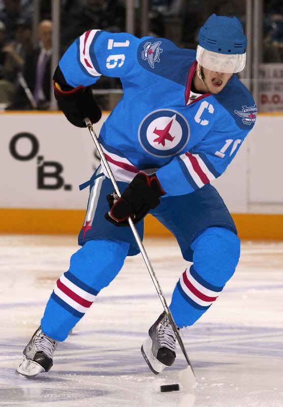
Entries by Tim E. O'Brien (54)

Saturday
Jul232011

Tim E. And the Jets

On Friday, the Winnipeg Jets unveiled their new logos and - fitting the theme of other recent logo/uni announcements - I was underwhelmed.

While I don't hate anything specifically in the new iconography (maybe except for the new wordmark), I was once again surprised by True North's lack of originality.

One of the most surprising features of the designs is the prominence of the maple leaf. Uh, you're not the only Canadian team and there's already this one team who uses that same leaf.

So lets get into my critiques:

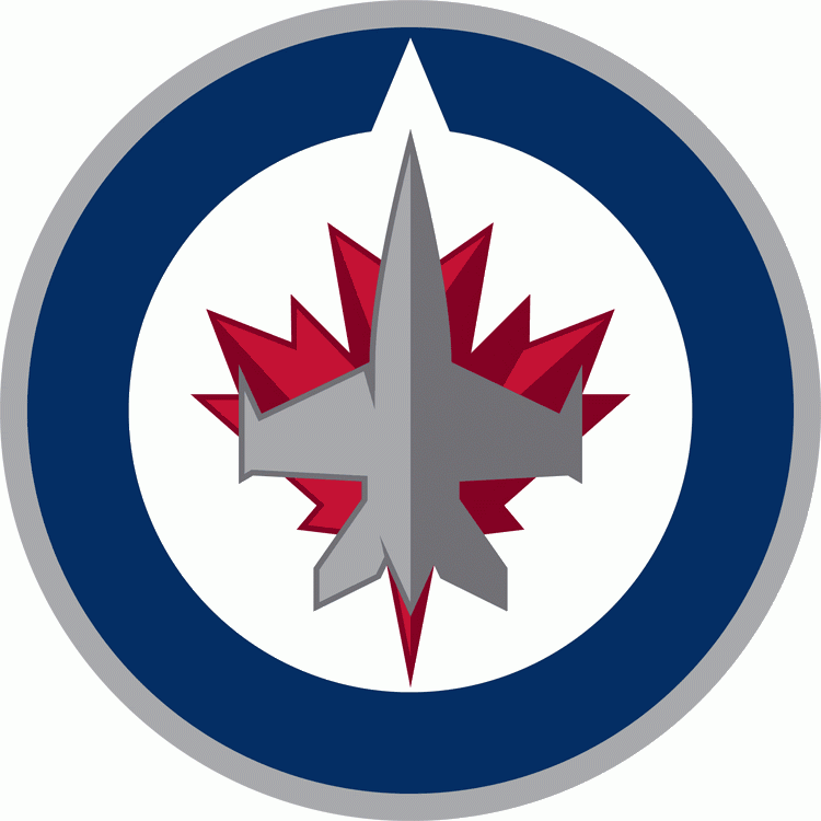
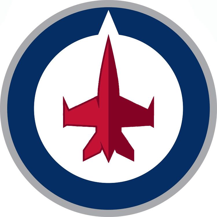
The Primary Logo: I love the roundel that is clearly based off of the Royal Canadian Air Force's roundel but I could easily live without the maple leaf. Also, the compass point representing True North is a bit intrusive and egotistical but I can live with it because it reminds me of the J/hockey stick in this.

Grade: B+ | Uni-Watch.com Scale: Good, close to Great

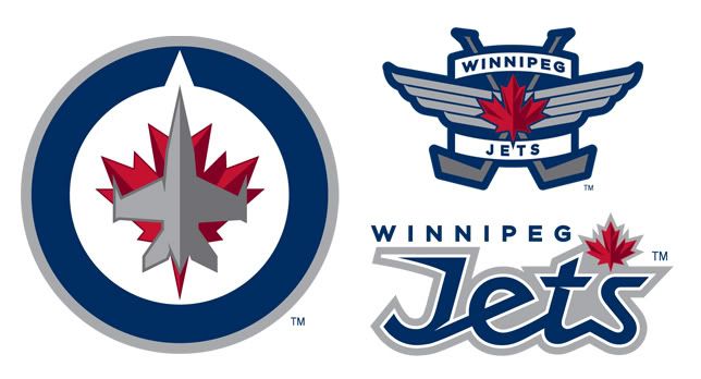
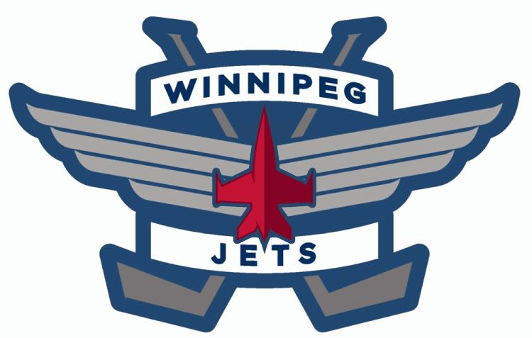
The Secondary Logo: Once again, the maple leaf is way too prominent. It's a good looking logo, but in a league with a team already known as the leaves and a team already known as the wings, do you really feel the need to combine those images when talking about the Jets?

Grade: B | Uni-Watch.com Scale: Good

The Wordmark: In one word? Hideous. In two words? Train wreck.

Other than being ugly and having terrible fonts, the leaf - yet again - dominates the design and actually looks like an apostrophe, making them the Jet's.

On their website, the Jets show a few different designs featuring a stencil font. That font fits in with the fighter jet motif, in that it looks like something that could be sprayed in the side of a fighter. But yet they didn't use that as a wordmark, go figure.

Grade: F | Uni-Watch.com Scale: Stupid

OVERALL: Grade: C+ but should've been better and more original.

So, while still a passing grade, I figured I could make some improvements - and maybe create some unis while I'm at it.

Logos:

I take my idea of removing the maple leaf but trade in the gray jet for a red one.

Next up, the secondary gets the jet trade in, too.

Uniforms:

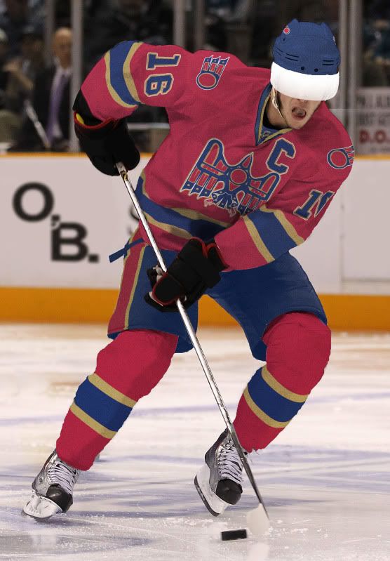
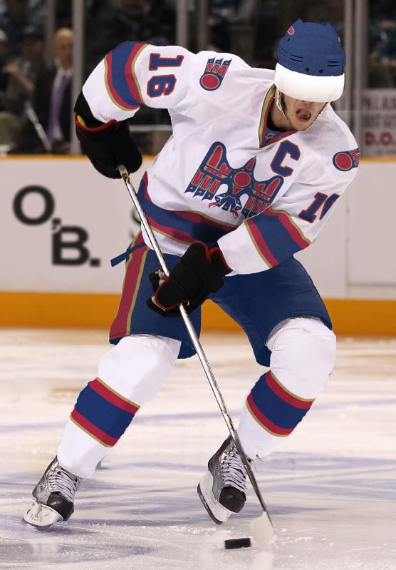
For the home and road unis, I took inspiration from the roundel and went for a classic look mixed in with some modern/jet themed flare (hence the stencil uni numbers and captain's C). I also included the jet on the pants with the stripes looking like a planes' contrail.

For the Third Jersey, I made the helmet, jersey and socks gray to mimic a fighter jet (and so it can easily be worn at home or on the road). The numbers and captain's C are now in a darker gray to, once again, imitate the stencils used on planes.

Well, those are my ideas and hopefully you like them. As usual, until next time, happy tweaking.

Wednesday
Jul202011

Indiana Déjà Vu

Yesterday, Indiana announced a new uniform set for 2011. While anything is an improvement over this, I'm not sure just going back to this was the best idea ever.

A few weeks back, I had hopes that this would be IU's uniform next year. Aside from that silly collar, that's almost exactly what I wanted out of the Hoosiers' unis.

But, alas, the Hoosiers disappointed me yet again. The uniform - seen here and to the right - along with the helmet (at the bottom) are basically throwbacks to the Terry Hoeppner era.

And actually the new IU unis look a lot like my over-the-top IU concept, down to the overly fat uni numbers - except for the numbers on the compression sleeves, and the candy-stripped pants.

Compare: 2011 uni  vs. O’B. Candy-stripe.

Let's start with the helmet. I like the white facemask but that's where my love affair quickly ends. The only redeeming feature of the 2010 uniforms was the double stripe helmet.

Originally a one game throwback with a block I, the double stripe helmet from recent Hoosier past was so popular it was the new standard uniform helmet THE NEXT GAME and then continued to be for the next three seasons.

While the Hoosiers aren't the only red cap in the BigTen (Minnesota flirts with a red helmet), IU could at least continue having a unique red lid while they’re at it.

As for the jerseys, they're way too boring. Maybe add some stripes to the bottom of the sleeves, or maybe go with sleeve numbers rather than pad numbers, or go for what IU fans really want, the double stripe theme all over.

The Hoosiers were just shoulder stripes away from that design two years ago and they were a pair of pants (and that stoopid side blotch on the jersey) from having it last season. Keep it simple but don't make us an Oklahoma knockoff again (I mean, Riddell already thinks we're interchangable).

And please, for Christ's sake, remove the "For the Glory Of Old IU" from the inside of the collar.

Final Grades:

The Helmet - Love the facemask, hate (like, loath) the lack of stripes. Grade: D | Uni-Watch.com Scale: Seriously Stupid

The Jersey - No side blotches, but no stripes whatsoever. Grade: B- | Uni-Watch.com Scale: Good but could be Great

The Pants - Back to the ol' double stripe. Grade: A+ (so long as they wear red pants on the road) | Uni-Watch.com Scale: Great

Overall, two steps forward, one step back: B- (which is a vast improvement from the D- that was last year.)

Wednesday
Jun152011

Soaring High

Recently, the people over at Uni-Watch.com and ESPN.com announced a contest to rebrand the Atlanta Thrashers for their move to Winnipeg. While I came up with a pair of concepts, my design of the "Manitoba Falcons" made it to the reader voting level.

What follows is an in-depth look at my design of the Manitoba Falcons:

I based my primary logo design on art styles from the indigenous Haida people of Canada and specifically on their depictions of raptors (eagles, hawks, Falcons, etc.).

With my falcon logo, I tried to convey an image that is uniquely Canadian. This falcon is meant to appear in flight - which is why we do not see its face - to represent both the freedom of the Great White North and the fluidity and constant movement in hockey.

Its wings and body vaguely form the shape of an M - for Manitoba - and also have smaller, traditional designs that resemble Ms. In the center of the falcon is a red puck. The symbolism here is clear: Hockey is the lifeblood of Canada and at the heart of Canadian culture. On either side of the puck is a hockey stick.

As for the Secondary logo, the red puck makes a return with addition of feathers from the primary design. Not too much symbolism behind the flying puck...

Before I get to the uniforms, I'd first like to explain that the design (bird motif) and color scheme (blue and red) are an homage to both Atlanta and Winnipeg. The gold should remind Winnipeggers of their once beloved Moose without hitting them over their head.

The Home Uniform: A classic red - almost burgundy - jersey is contrasted with blue pants and helmet. The socks are also burgundy and feature the same classic striping that graces the jersey.

The Road Uniform: The road white jersey is paired up with matching socks but the blue helmet and pants are here to stay. I added a thin gold stripe to the outside of the jersey and socks striping to incorporate the gold onto the road uni. Other than that, the roadies look good.

...And MTS Centre is gunna look good, too.

If you like my design, go here and vote for my submission to win the Uni Watch contest.

Saturday
Jun042011

Cross-Dressing Revisited

It's been a while, but I assure you, I have been very busy.

Over the next few weeks, I'll have more concepts and work to post but much of it is either tied up in Uni-Watch.com projects or isn't quite ready to be unfurled.

But today I bring you a quick-hitter revisiting the idea of taking a team from one professional league and dressing them up in another.

All of today's teams are going to MLB (coming from the NFL and NHL) and - I think - they all turned out pretty well.

Let's get to it:

Bears - Home, Home Alt, Road - So these aren't how they wear the whites in the NFL, but this is a MLB project. Not a huge fan of the dark pants but Bears tradition says you can get rid of them.

Blackhawks - Home, Road, Road Alt - So these aren't how they wear the whites in the NHL either, but like I said above, this is a MLB project. Unfortunately the dark pants are the only option in the NHL but i think the crest as a heart patch works nicely.

Chiefs - Home, Home Alt, Road - I think this Chiefs design may have turned out the best out of all of them. It's clean, simple and very translatable to baseball.

Patriots - Home, Road - And this is where the idea doesn't go so well. Too much white, cheesy wordmark and a guy holding a football. I guess I could've gone with Flying Elvis but I just don't like that uniform/design.

Finally, the requester asked me to explain how I create these 2D MLB concepts. Well, without knowing what program people use, it basically goes like this:

  • First, I download the template I need from places like SportsLogos.net.
  • Next, I download the logos I need from SportsLogos.
  • I open up the template in my image editing program (personally I use PhotoShop) and I draw on the colors and stripes.
  • Penultimately, I place and resize the logos where I want them and then,
  • Finally, I save the whole thing a a JPEG file and upload it to the internets.

Pretty simple stuff.

Happy tweaking, and until next time...

Wednesday
May112011

The Washington •Bullets

Yesterday the Washington Wizards announced a new era in their franchise's history that resembles - but does not rename them - the Washington Bullets. Here are my thoughts:

  • Let me start off by saying that I really like these uniforms. They are a huge improvement over what they have had as of recent (but still aren't as cool as this!).
  • I wish the blue was a little less navy.
  • As predicted by many (including me), the Wizard made it through the recolorization process. With the new Bullets color scheme, the Wiz looks more like Saint Nick and Less like Merlin. He needs to be dropped ASAP.
  • The new 'DC' secondary logo is amazing because of how it echos the old Bullets logo but the font on all the word-marks leaves something to be desired.
  • Speaking of the word-marks - The Washington Monument in the H in Washington and the D in Wizards is beyond class. This makes me feel like a complete amateur. Kudos to the genius who worked that into the design.
  • Whoever worked this W into the shorts should get some props too. Very subtle.
  • The Ball/Monument logo is good but I feel like it's a few steps away from greatness. Don't know what the problem is for me but something just feels wrong (maybe it's the seven sided ball).
  • The Home Uni: The number font is less that spectacular and the red tripe should end in a solid line rather than jutting down only near the center logo. Also, the blue and white on the collar and sleeves should be switched around for better contrast and to match the road uniform. Other than that, pure win.
  • The Road Uni: Same problems as the Home Uni as far as the blue stripe that goes over the shoulders and the number font, but just like the Home Uni, this uniform is a huge improvement for the Wiz.

Well, that's my take on the new Wizards jerseys. I wouldnt be surprised if the Wizard logo and name is phased out over the next few years but either way, these new unis are a vast improvement for this franchise.

I have a BIG Uni Watch feature coming up this Sunday and while I wont say exactly what it is, you'll probably be able to make an educated guess from this picture...

Until then, you know what to do.

Page 1 ... 2 3 4 5 6 ... 11 Next 5 Entries »