
Tweaking the Classics - NBA EDITION
A while back, an emailer - Zack - sent me a request with a really interesting idea:
Just an idea since you do a lot of NBA rebrandings I would be interested to see what you would do with the Knicks, Lakers or Bulls.
To me, those three organizations are three of the top four franchises in the NBA as far as history and uniforms (the Celtics being the unnamed fourth).
Taking a crack at their uniforms - while certainly not unheard of, all three have gone through some pretty dramatic changes since the mid-80s - would be a challenge between balancing what makes their uniforms great with new ideas that can improve their image.
Also, with such perfect logos and historic courts, the only changes needed to these teams would be to their uniforms (although, as you'll see, I did alter the Knicks' logos a smidgen)
So here we go:
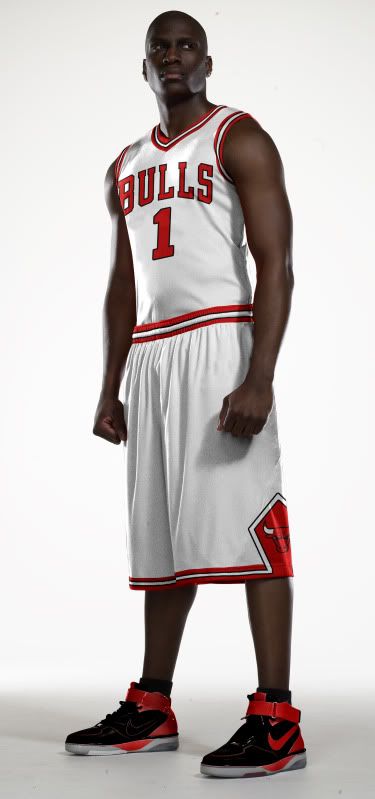
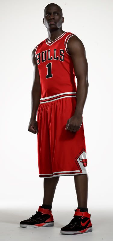
Bulls
Not much of a change here to the Home or Road versions. Jordan and company made these already great unis classics, so, in my humble opinion, I left them generally unchanged.
Unfortunately for these concept templates, you don't see the backs of the jerseys. If you could, you would see that the names on the backs would be sans-outline and would be white on both Road versions, because this looks way better than this.
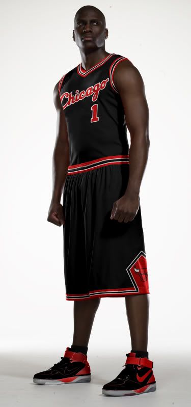
The Bulls' black Road alternate has a long storied history. In the 1995-96 season the Bulls broke out these black alternates 10 times in route to their historic 72 win season. Good karma right? No.
The Bulls went 5-5 in their pinstripe duds (duds being the key word) and 67-5 in white and red. Ever since, the Bulls have tried to keep and update their black alternates but never quite got them right.
The biggest problem was the striping. Either the Bulls didn't have the striping (including the diamond on the shorts) or the striping was different from the Home and Road. Even today's black alternate is still wrong - the striping colors go red-black-white-black-red when they should go red-white-black-white-red (because the uniform color should be the middle stripe color).
Fixing the striping and then taking inspiration from the mid-80s Road jersey, I give you my fixed black Road alternate.
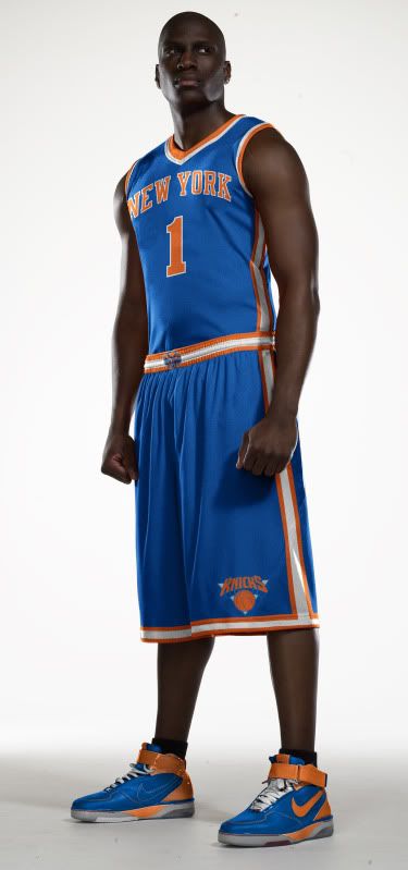
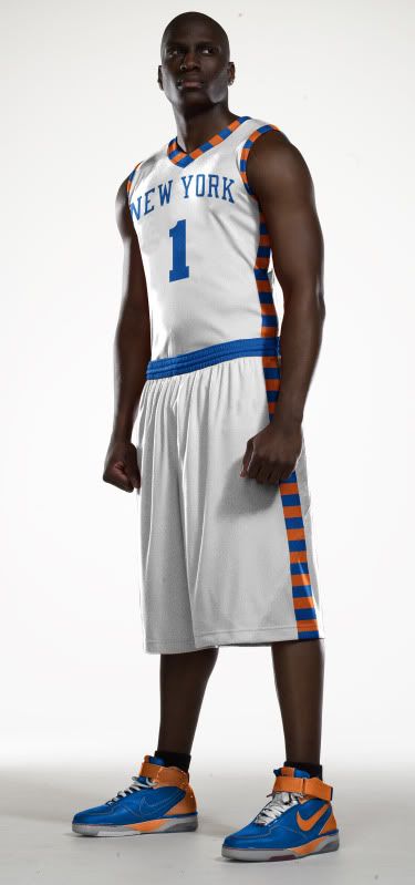
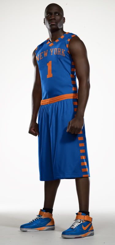
Knicks
As I said at the top of the show, I did have to make some small alterations to the Knicks' logos. All I did, as you can see, is take the black out and replace it with blue (this should give you a hint about what I did with their uniforms).
![]()
![]()
As far as the Knicks uniforms go, I basically took everything good from the modern set and combined it with the good from the Ewing Years set.
From the Ewing era, I kept the stripe pattern, collar and sleeve pattern and the fonts.
From the modern era, I kept the continuous side stripe and the logos.
Combine all that, and Voilà: I give you the New Look Knicks.
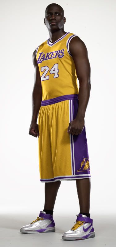
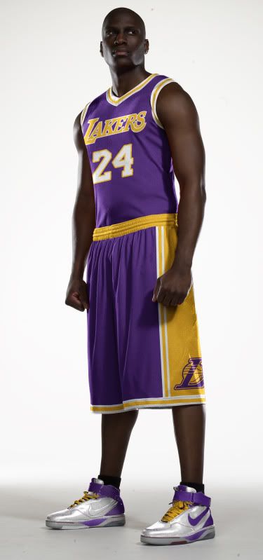
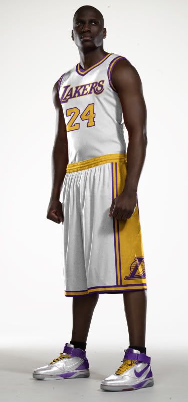
Lakers
Once again, I present to you an amalgamation of old and new.
I should be a poet.
While the Lakers look great in their current set, they used to look great in their old set too. And while I've gone back mostly to the old set, I didn't go all the way back (no one wants to see this).
I have kept the current logos, fonts (especially the lack of the drop shadow) and have made all the numbers the opposite color scheme as the 'Lakers' script this is both old and new). And finally, the striping is all from the Magic Johnson to early Kobe era.
Those are my ideas to perfect perfection. Obviously, all three teams currently look great, but who says you fix what ain't broke.
Once again, I hope you like this design. If you really like my designs, remember that I just opened up my own shop where you can purchase any of my original designs in t-shirt form. If you have any merchandize or design requests, please drop me an email.
Until then - as always - leave it in the comments.
 Tim E. O'Brien
 Tim E. O'Brien
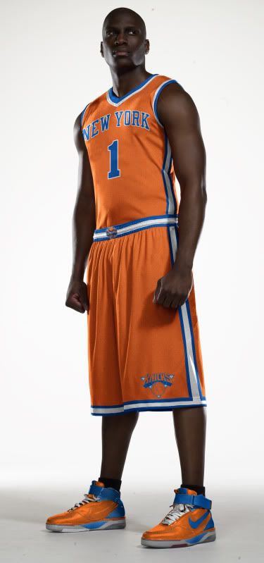
Update #2:
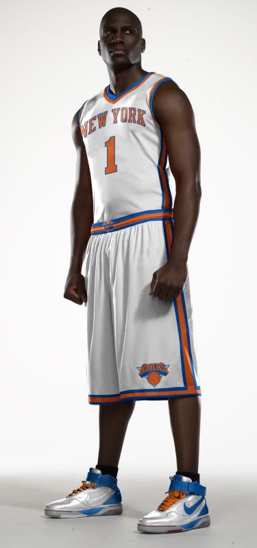
Dan, based on your request in the comments, here is an Orange alt:
Uniform Concepts
Reader Comments (10)
What I'd like to see is your take on what could be done to fix the Charlotte Bobcats abysmal uniforms.
By their nature, tweaks are not official and thus subjective to one's taste and often reflect nostalgia. While I love most of your interpretations, I certainly am allowed to have my own judgment and constructive criticisms, which I will offer below, which hopefully won't be taken the wrong way.
Your Bulls tweaks:
I can't tell if all three jerseys (white, red, black) now have V-necks but they look great.
Before the team came up with the official black alternates, I've always imagined the black jersey to be exactly the same as the red jersey, only with the colors red and black reversed. The Bulls' current jersey takes a different approach and made the black jersey into “the opposite” of the home white jersey, only it's not really the opposite, but rather the home white with only the white portions changed to black.
Your approach is literally the opposite of the home white jersey, down to the stripes on the neck and armholes, the waistband and the bottom of the shorts. It looks sweet.
As far as the NOBs (Name On Back) goes, since the Bulls have gone with and without outlines on the names, I can't really make up my mind as to which one looks better. I think that your take on the NOBs is without the outlines, and if the right font is used then I'm totally in agreement. The only catch is that it might conflict with your “opposite” take on the black jersey. Let me explain.
I'm guessing you would have RED NOBs on the home white jersey, and WHITE NOBs on the red and black road jerseys. It's the latter that would be in conflict with your pattern. Since the black jersey is the opposite of the white jersey (i.e., white became black, black became white, while red and the Bulls and NBA logos remain unchanged), shouldn't the NOB on the black jersey be in red letters, as well? I know that they look great in white letters (as seen during the 2006/07 season), but the tweak would then be inconsistent, which isn't illegal but a bit, well, inconsistent.
There are three options I can think of:
1) Leave the the same (red/white/white letters on home/away/alternate jerseys).
2) Change it to match patter (red/white/red letters on home/away/alternate jerseys).
3) Change the color on the home jersey (black/white/white letters on home/away/alternate jerseys.)
Option 3 is my least favorite, and option 2 makes it hard to see on the alternate jersey, but without outlines around the names, it is the most consistent alternative.
Your Knicks tweaks:
The look great, and I agree: the black color doesn't belong in the logo. At least the Knicks didn't go BFBS (black for black's sake) and came up with an all-black alternate road jersey, but when I think of “Knicks,” I only think of orange and blue. Since I live on the West Coast, I don't really have a strong opinion of East Coast teams and their jerseys, with the exception of Boston, Chicago and Miami, and to a lesser degree, Detroit and Philadelphia.
Your Lakers tweaks:
Well, this is where I have the most opinions since they're my local team. I love that you brought back the waistbands. Brilliant! The Lakers should've never gotten rid of them, though I can see why the did it since there is now (since 1999) a stripe down the side of the jersey. (Same reason why the Spurs' waistbands are now gone.) Your Lakers tweak look like they have V-necks, as well, like your Bulls tweaks did, which is better looking than the current wishbone neckhole and single piping armholes.
Your past-meets-present combo works great and look awesome, but I still miss the purple letters on the home jersey. I love the gold numbers on the “Sunday white” alternate jersey, and if the colors on the numbers of the gold jersey were purple, then the color of the “Lakers” name on the white jersey would be gold, as well. But as it stands it's perfect. The only suggestion I have (I'm nitpicking now), is the same as the Bulls jersey issue. Just as with your Bulls tweak, your color preference on the “third” jersey seems to be the “opposite” of the home jersey, while mine are the “opposite” of the away jersey, but to each their own. (I guess the only “solution” would be to have a fourth jersey, as well. I'm perfectly happy with two jerseys, but four jerseys is just fine by me.) Since your white tweak reflects the opposite of the home gold tweak (i.e., white became gold, gold became white, purple remained purple and all NBA and Lakers logos remain intact), then shouldn't the waistband on the white jersey be purple? And for the neck and armholes on the white jersey: instead of purple-gold-purple, shouldn't they be gold-purple-gold? Other than those observations, I think that if the L-Ball alternate logo on the shorts were changed to the full Lakers logo (with or sans the “Los Angeles” wording) or just eliminated altogether, it'll look much better. This is not a dig at you, but the design of the “L” logo itself.
Anyway, look forward to more of your tweaks! I really enjoyed seeing (and dissecting) them here and on Uni Watch!
Sincerely,
Paul Lee
Fellow uni tweaker
LOL After a second look at the shorts, your "Sunday white" Laker jersey appears to be the "opposite" (purple-white swap) of the purple road jersey, after all. NOW the inconsistency (which looks fine but just not correspondent) lies with the color of the word "Lakers" and number on the front. I still dig the gold numbers, but the number "should" be (if "direct swap" was indeed your intention) in purple outlined in gold (as they are on the official jersey), but the format of the "Lakers" should gold outlined with purple.
Again, that's just my take on the jersey. It looks fine as it stands, and if your intention was the amalgamation of the home/road jerseys color swaps, then that's cool, too :)
Sincerely,
Paul Lee
http://21nfl.biz/image/NBA%20Jerseys/Chicago%20Bulls/NBA%20Jersey%20Chicago%20Bulls%2023%20%20Jordan%20black.jpg
I do not believe that this was an authentic jersey. It might either be a knockoff or a "fashion" jersey. Whichever the case may be, I do not believe that it's been ever worn on-court. I do not think that I am mistaken, but then again I do not know everything.