Meet My BUD

Some of you may have been wondering, "Why hasn't Tim posted anything here in a while?"
Well, this is why: The Basketball Uniform Database.
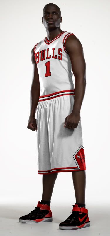
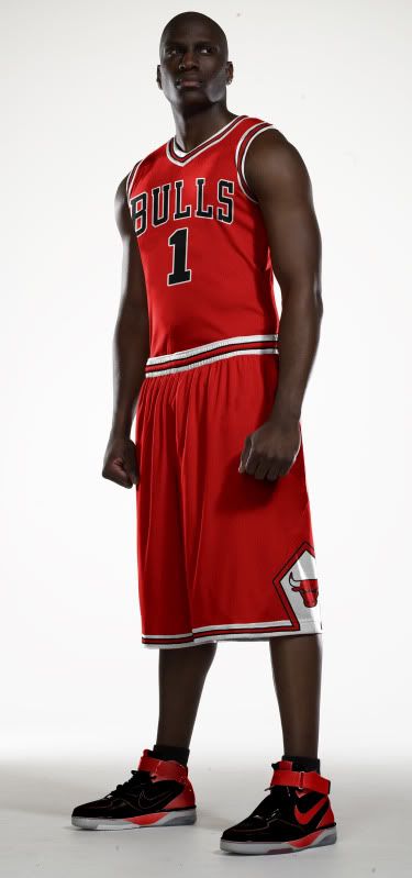
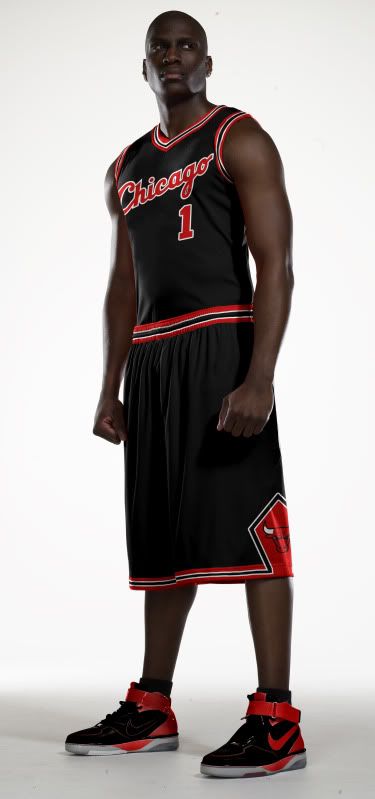
Over the past few weeks and months, I've been working on something big. I volunteered to to work with some of my fellow uni-nerds on creating a database of NBA uniforms. The goal is to go back to the '40s but as of today, our coming out party, we have 2011-2012 finished and are beginning to work our way backward in time.
In my position as the graphic designer, it has been my job to create the templates, recreate the jerseys and do anything else graphically I can for the project. I've been working with tons of images, logos and color swatches to try and come up with as accurate a depiction of NBA jerseys as I can, no matter if it's the '60s, '80s or the tweens.
Now, I'm not perfect (though I'm damn close...). That being the case, if you ever see something on there that's a glaring error, feel free to drop me an email (See: sidebar) and let me know.
And it turns out, NBA uniforms aren't perfect either.
In my personal research I've discovered two bizarre uni-quirks that I haven't seen mentioned anywhere else (though, perhaps I just haven't looked hard enough...). Let's start off with the quick one.
Philadelphia, before this season, introduced a brand new alternate uniform. It was pretty standard fair, a blue version of their current jersey template. Not bad. Not great, but not bad.
Unfortunately, Philadelphia never wore it.
You can do - as I did - and go through all of daylife's 76ers images, it doesn't appear once. Or you can go to their team website and watch game recaps. No sight of it. Or go to ESPN. I think you know what you'll find.
It's truly bizarre. The Sixers don't even sell the jersey in their online store. What makes it even more bizarre is that fans seem to love the blue jersey.
 So the phantom alt of Philadelphia remains a uni-mystery. Who killed it? Why was it killed? Will it ever make it on court? We may never know.
Finally, we come to a case of, "Wait, why wouldn't they just change that?"
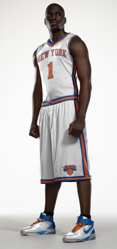
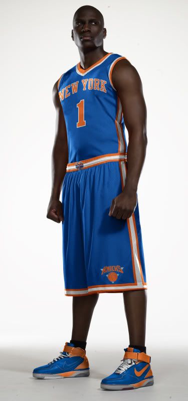
The New York Knickerbockers broke out new unis - their current unis - for the 2001-2002 season. Other than a collar change, the uniforms have remained unchanged for more than a decade.
Except for on thing.
Look at these pictures from the Stephon Marbury era of the nicks: Home Road and St. Paddy's Alt. See how the Knicks logo on the shorts is on the right short leg, placing the NBA logo on the left pant leg? Well, at some point during the Starbury era, the Knicks switched their logo to the left leg (where it remains today).
Except on the St. Paddy's Day alts.
For some reason, the Knicks have never switched the shorts patch on their green alternates. Never. It's very bizarre.
The Knicks changed the logo location years ago, so it's not like these are jerseys created before the change and they just never got around to it. The materials and cuts of the jerseys have changed over the years and most - if not all - of the current players on the Knicks roster have never worn the old home and road unis with the logo on the right pant leg.
It doesn't matter the occasion (Christmas, St. Patrick's Day, dunk contests, etc.), the patch is on the other pant leg. It's a very strange uni quirk that I would love to hear the rationale behind.
Though, I suspect the the explanation will be less than satisfactory.
"It's just a logo on a uniform, who cares?"
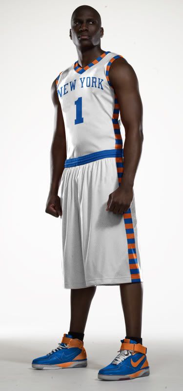
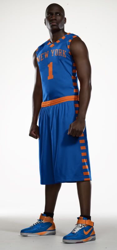
 Uniform Concepts
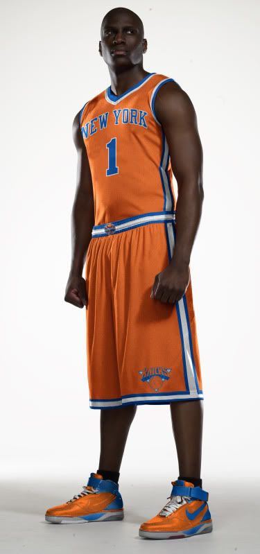
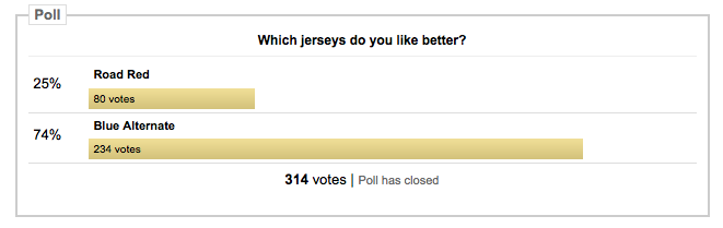