Entries in MLB (4)

Tuesday
Dec132011

Plight of the ApOstracized 

Most people don't even notice my struggle. Most people probably wouldn't even consider it a problem. Most people probably think this much ado about nothing, but I consider it a slight on my humanity.

I am an ApOstracized American.

Being ApOstracized is not a choice, I was born this way, but the government doesn't see it that way. Hell, pop culture doesn't even see it that way.

Born an "O'Brien", I have long suffered the indignity of people getting my name wrong. On government forms I'm either "OBrien", "O Brien" or the infuriating "Obrien" - assuming they didn't spell my name with an "a".

I was introduced to these injustices at an early age, where they first tried to disenfranchise my people of our proper name.

Standardized tests are a cause of anxiety for many young children, but for me - and people of my ilk - they were also a cause of oppression. The oft misused apostrophe, a dominant and important feature of my surname, was often cast aside by anti-apostrophe bigots.

I remember taking my first standardized test and while given instructions to fill in the circles in the name box, "Last name, then first leaving a space between them. Then fill in the corresponding bubbles." I immediately noticed that I did not fit into this perfect little circle. I was the proverbial pencil mark outside the line.

Patiently, I raised my hand and waited for Mrs. Carrol to call on me. Obviously there was some mistake - I didn't see an apostrophe bubble anywhere. I mean, I had an older brother and sister and I knew other apostrophe families, surely someone had to have a protocol for me and my people. Maybe they just forgot to give me the right form.

"Mrs. Carrol, what do I do since I have an apostrophe?"

The question hushed the otherwise precocious class.

Quietly, my teacher - my authority figure - looked around, perplexed. Finally, after meeting eyes with her teacher's assistant and shrugging, she told me to just separate the "O" and the "B" with a space.

A thousand questions raced through my head. Would the machine think I was named Brien O? Could I live as a boy named Brien O? Could we bring this error to the attention of someone with greater knowledge of this situation?

I learned early in life, separate is not equal.

No one validated my apostrophe, and by third grade I was done asking what to do. I had become docile, acquiescent.

But as I grew older, I grew bolder. Proud of my name, I would fill in the "space" bubble but defiantly write the apostrophe in the box above it. Take that society.

As my passion for sports evolved as I grew, I decided to partake in sports, sports video games and bought much sports paraphernalia.

Fortunately, I only played sports for teams that went NNOB. However, sports games like Madden or NBA2K refused to allow the apostrophe in my name in their game. No league, even those like the NBA, NHL or FIFA that have players with apostrophes already in the game, would allow me to Create-A-Player with my distinguishing feature.

The bigotry stung like salt in a wound; I couldn't be Tim O'Brien but I could be Tîm ÒBríèñ.

Why wouldn't EA or SEGA allow me to be who I am? I wanted to write them letters, but Microsoft Word told me my name was spelled wrong.

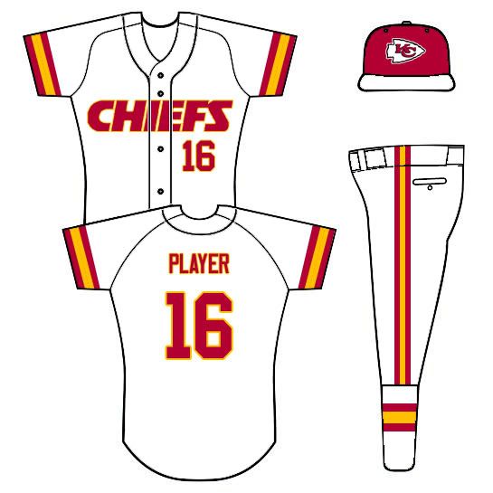
Even my fandom was called into question. For my 16th birthday, my golden birthday, I wanted a White Sox alternate jersey with my name and my favorite number, 16. I had tried this once before. The NFL would not tolerate my people.

A miracle happened that summer, my family found a sports paraphernalia store owner who would - without consulting MLB - place my apostrophe onto an authentic White Sox jersey. And thus my wish was granted.

I have since become more accepting of my lot in life and tolerate the bigotry I deal with on a near daily basis (mail doesn't get delivered on Sundays). But to this day, four out of the five major US sports leagues do not recognize the rights of ApOstracized Americans.

Major League Baseball's response to an apostrophe: "Not allowed."

National Football League's response to an apostrophe: "Not allowed."

The National Basketball Association's response to an apostrophe is also, "Not allowed," but their stance softens for player specific jerseys or if you select a current apostrophe-having player.

The National Hockey League - even on teams with three completely different ApOstracized players - refuses to grant our right to exist. In fact, their box wont even let you type in the apostrophe while are charging you $80 for the right to not do so.

Only lowly Major League Soccer will allow everyone their right to an apostrophe, though I'll believe it when I see it.

But I dream of a day, when I will not be judged by the punctuation in my name, but content of my of my character.

We're here, we're clear, we want to see our apostrophe.

Wednesday
Nov302011

The Maple Leaf: It's Stupid

Oh, Canada...

As an American, I look down on you with the loving contempt of an older brother. No matter what you do, no matter how well you do it, I'll always consider myself far superior. And the worst part is, it's kinda your fault.

Canada tries so hard to make a name for itself and establish an identity independent from the US, but it does so in a way that always screams, "See? We're not America!" And that's never the right way to go about creating an identity.

One of the most ubiquitous and obnoxious ways Canadians try to establish this self-image in sports is to wantonly slap a red maple leaf onto any identity they can, regardless of color scheme, team name or club history.

And whether it's because Americans are too stupid to know what cities are in Canada or whether Canadians are too stupid to realize no one cares, the maple leaf logo trend is supremely stupid.

________________________________________________________________

The maple leaf permeates every major sports league in the US and Canada.  Hell, even the NFL - a league without a Canadian team - is not immune to this trend. Thanks Bills, how could we tell you were at Rogers Centre (It's Center Canada, but don't get me started...) without that helpful little leaf?

The NBA has been mostly leaf-free except for the Raptors in the mid-2000s. Apparently NBA teams are too busy working a basketball into every logo to hop onto the maple leaf trend...

The NHL, a league which shouldn't feel the need to do this since Canada has seven teams (Oh, and they created the sport), is one of the worst offenders.

Note to Canadian NHL teams: Only one team should have a Maple Leaf in its logo.

Yet again, reason is ignored and the leaf is everywhere. At one point, this little gem was an alternate logo for the Ottawa Senators.

The newest NHL team, the Winnipeg Jets (a team that already had a leaf-free identity) went the full-leaf and slapped it on every... single... logo they could find. Sure, there identity is based on this, but doesn't this or this accomplish the same feat while evoking the leaf rather than haphazardly placing it in the logo?

And did I mention that there's no other red anywhere in Jet's color scheme or on their uniforms?

Even the Calgary Flames caved to the trend. After 27 years in Canada, not only did the Flames slap on an Alberta Flag on one shoulder, they threw the Canadian flag on the other - just in case you hadn't realized Calgary was in Alberta, Canada.

Even the measly MLS manages to throw in a maple leaf onto one of their two Canadian teams. That one may be the least egregious since the design is so poor, you can barely tell it's a maple leaf, but it is.

But the real offender, and probably the originator of the maple leaf trend, is the Toronto Blue Jays organization. Repeatedly and habitually, the Blue Jays (whom you would think would eschew any red for shades of... oh, I don't know... blue?) have forced this stupid symbol of, "WE'RE IN CANADA," into every iteration of their team identity since their founding in 1977.

Even during the brief period where this was their primary logo and when a variation of that was their cap logo, guess what graced the sleeve of every uniform they wore? That's right. The leaf.

So desperate, consistent and ubiquitous has the use of the leaf been in their identity that - I argue - they have corrupted the team identities of almost every sports team in Toronto.

Raptors? TR + Leaf alt logo. Toronto FC? Main Crest + Leaf. Even minor league teams have leaf logos.

The Maple Leafs get a pass as they existed decades before the Blue Jays, their identity contains no red and their leaf has maintained some design independence from the flag version of the leaf since their inception.

But still, Toronto has a leaf problem.

...Canada has a leaf problem, and it's a stupid problem to have.

Saturday
Jun042011

Cross-Dressing Revisited

It's been a while, but I assure you, I have been very busy.

Over the next few weeks, I'll have more concepts and work to post but much of it is either tied up in Uni-Watch.com projects or isn't quite ready to be unfurled.

But today I bring you a quick-hitter revisiting the idea of taking a team from one professional league and dressing them up in another.

All of today's teams are going to MLB (coming from the NFL and NHL) and - I think - they all turned out pretty well.

Let's get to it:

Bears - Home, Home Alt, Road - So these aren't how they wear the whites in the NFL, but this is a MLB project. Not a huge fan of the dark pants but Bears tradition says you can get rid of them.

Blackhawks - Home, Road, Road Alt - So these aren't how they wear the whites in the NHL either, but like I said above, this is a MLB project. Unfortunately the dark pants are the only option in the NHL but i think the crest as a heart patch works nicely.

Chiefs - Home, Home Alt, Road - I think this Chiefs design may have turned out the best out of all of them. It's clean, simple and very translatable to baseball.

Patriots - Home, Road - And this is where the idea doesn't go so well. Too much white, cheesy wordmark and a guy holding a football. I guess I could've gone with Flying Elvis but I just don't like that uniform/design.

Finally, the requester asked me to explain how I create these 2D MLB concepts. Well, without knowing what program people use, it basically goes like this:

  • First, I download the template I need from places like SportsLogos.net.
  • Next, I download the logos I need from SportsLogos.
  • I open up the template in my image editing program (personally I use PhotoShop) and I draw on the colors and stripes.
  • Penultimately, I place and resize the logos where I want them and then,
  • Finally, I save the whole thing a a JPEG file and upload it to the internets.

Pretty simple stuff.

Happy tweaking, and until next time...

Tuesday
Apr262011

Cross-Dressing 

I've been gone for a week, miss me?

The other day, I was inventorying some of my graphic design and sports concept works when I stumbled upon this.

That Chicago Blackhawks football uni predates all my IU concepts, my NFL concepts and  my NBA Concepts. That was one of the first designs I ever did using the Nike Pro Combat template (Though I'm not quite sure why I gave Pat Kane the Captain's C, why not just put #19?).

When I was reminiscing about my early uni-tweak days, I came across the page of Majestic NHL baseball jerseys. Well, and idea immediately came to mind: What If I redesigned teams' uniforms to fit other sports' jerseys?

I decided to switch around all of Chicago's major sports teams (sorry Fire). My Rules were basic, first, I arbitrarily started but whatever uniform template I dealt with (i.e. basketball), that Chicago team (i.e. the Bulls) would be the next design I would do. This will become clearer soon.

Next, if only because cuts of jerseys are so different, some changes to every uniform had to be made. Most changes fall into one of two categories:

  1. The design doesn't fit on the template. Or,
  2. The design change fits the template's sport better than a copy/paste version of the uniform.

Some look better than others - much better - but I think this is a fun idea to play around with uniform design.

On to the Cross-Dressing.

Bears in the NHL - Home and Road - This quickly turned into my favorite design. Old football uniforms and modern NHL uniforms actually have similar cuts. Hell, they look closer than old NFL unis and current NFL unis do. I decided to put the Bear's head logo on the front of the uni to go with the hockey theme but also because it's a great but underutilized logo. The Bears' 'C' makes a perfect captaincy patch.

Blackhawks in the NBA - Home and Road - I decided to put the Hawks in the NBA this time since I had already created NFL unis a while back. In contrast to the Bears in the NFL, I think these concepts are probably the worst in the bunch.

Different colored shorts don't really work in the NBA and the jersey striping is just upsetting but, hey, they can't all be winners. (also, I didn't include their third jerseys since they are featured in the NFL design above)

Bulls in the MLB - Home, Road and Alternate - These I think you'll either love or loath. Now the only real change to the Bulls uniform design is the that front number is moved off-center to fit better with the MLB template. The Bulls' unis actually used to feature off-center front numbers, so it's not even unheard of.

No road grays for obvious reasons and solid color road and alternates may make some baseball purists ill but you could always mix and match pants and jerseys. And with the Bulls playing in the MLB, maybe they bring back the pinstripes.

Cubs in the NFL - Home and Road and Alternates. With both Chicago baseball teams, they really only have three jerseys (home and road pants under the same colored top do not make two alternates) so with the Cubs a brought back the old Blue on Blue pinstripes as a road alternate option.

I also brought back an old 'CHICAGO' font and the old Cub's head logo is on all the left sleeves.

White Sox in the NFL - Home and Road and Alternates. Now I cannot claim this idea as my own, but having two black alternates, one base on the home jersey and the other on the road jersey, is a great way for the Sox to diversify their uniforms (they wear their current black alt for most home and road games - it's getting a bit old).

The thing I liked most about doing these baseball uniforms for a football template was how it shows that a football uniform doesn't just need to be a uni number and that's it. I don't think I'd recomend pinstripes anytime soon but this shows that there's room for design change in football.

Well, that's all for today. As always, I hope you enjoy something and feel free to leave comments or questions.