Entries in College (4)

Monday
Aug132012

I Am Uni Tracker (And So Can You!)

I've been uni tracking for a while now. Last year, in the wake of the release of Indiana's white helmets, I began the Hoosier Tracker. Soon thereafter, I began my collaboration over at the Basketball Uniform Database.

This year I have decided to track Northwestern's new duds and have been given the honor and task of being the third iteration of the Duck Tracker.

The Duck Tracker brings new challenges with the position.

Obviously Oregon's many uniform combinations and frequent one-off uniforms present challenges in getting the most up to date documentation up as quickly as possible. With the Hoosier Tracker, once I had set it up, it basically took me five minutes to make the changes and upload the new picture. On many weeks, I had the Hoosier Tracker updated by the opening kickoff (just in time for the irish coffee...).

This is my goal for the Ducks this year, but my muti-tracking means this might not be the case every week. But the previous three season of Duck Tracking have been excellent and popular - very popular - and the need to keep up with the precedents they set is a challenge I hope to live up to.

And this is the challenge of breaking into uni tracking: The seemingly daunting task of tracking. This is why, today, I call on anyone with some free time and the will and the tenacity to pick a college football team and track them.

It's for the greater uni-nerd good.

The task will not be as hard as it may seem, as almost anyone can do it. All you need is a .blogspot.com address and a way of tracking your team.

The great thing about tracking is that the way in which you can track a team can vary from person to person, team to team and it can also reflect something about the tracker. For my Hoosiers, last season I used a 3D template that I had created with a background that changed based on the location of every game. This personified what I've been known for over at Uni Watch (the 3D templates) while actually putting them to good use.

But I wouldn't expect Rick Pearson to track like that. Knowing how Ricko used to track, I wouldn't want him to track like me.

And that's the point. Some people will hand draw, some might just use game photos and some might use templates like I plan on using this year - in some fashion - for the three schools I'll be tracking (If you are a person who may want to use a 2D or 3D template of mine, you can find and download them here).

For anyone willing to take up my challenge, I will add a link to your website to all of my tracker sites and together we can start a revolution. Hell, if you are really going to join me, I am even willing to make you a header logo that fits the theme of the three headers I will be using this year.

Rather than taking on a whole league or a whole history, let's start small, together, and we might be able to accomplish something collectively great.

Friday
Sep302011

B1G Rivalries

This weekend, BigTen conference football returns and so do BigTen rivalry games.

Earlier this month, I posted my concepts and tweaks for all 12 BigTen teams here and on the wonderful SportsLogos.net, showing what I thought the schools should wear every game. Some people over at SportsLogos noticed that many of my designs a fairly traditional and/or pretty close to what most BigTen teams currently wear.

Heeding this criticism, I decided to create what I referred to as a 'Rivalry Series' (although inspiration credit goes to this guy here). What follows are six rivalry games, their special uniforms and descriptions. Enjoy:

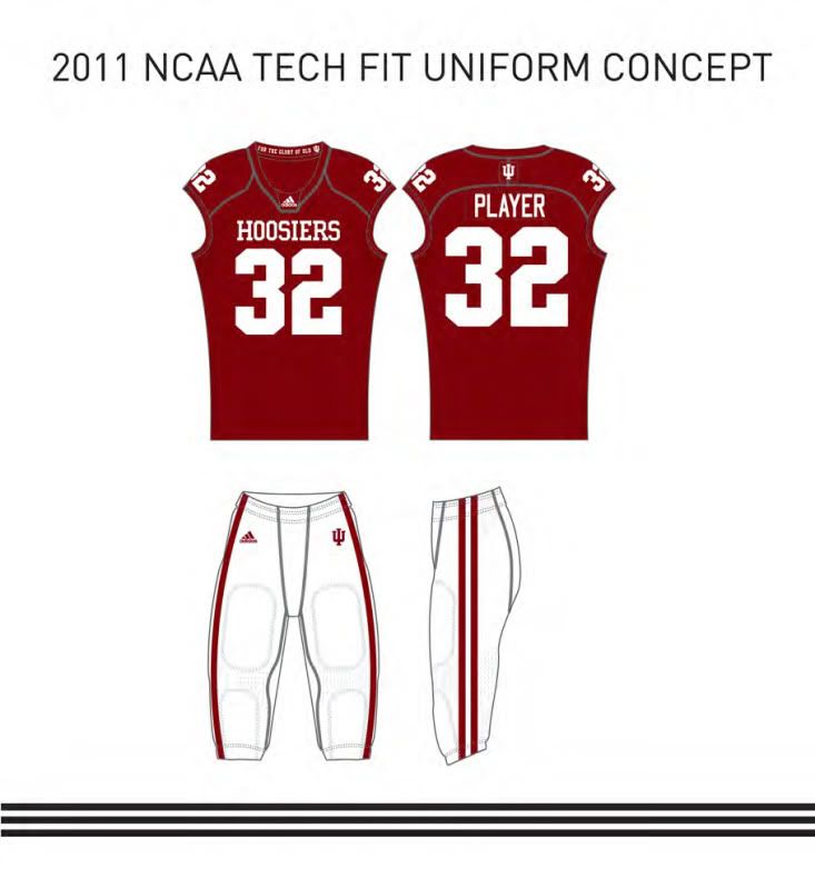
The Bucket Game - IU vs PU

Indiana: I bring back my much beloved candy-striped pants but pair them with (a variation of) their actual 2011 jersey. The helmet matches their current lid and features the iconic interlocking 'IU'.

Now, originally, my design showed a candy striped helmet and that the compression shirt sleeves and the socks not matching, but that was because each individual player could either wear vertical or horizontal stripes - so long as they wear all matching - allowing for fun customization while still being 'uniform'.

However, I scrapped both those ideas and returned the standard helmet and unified all the stripes.

Purdue: As this years visitors, Purdue comes to The Rock wearing all old gold. The 'P' logos; helmet, shoulder and pants stripes; and numbers all sink up to match: Black trimming White. The numbers are a modern variation of classic varsity block. Finally, the compression shirt and socks are Boiler black.

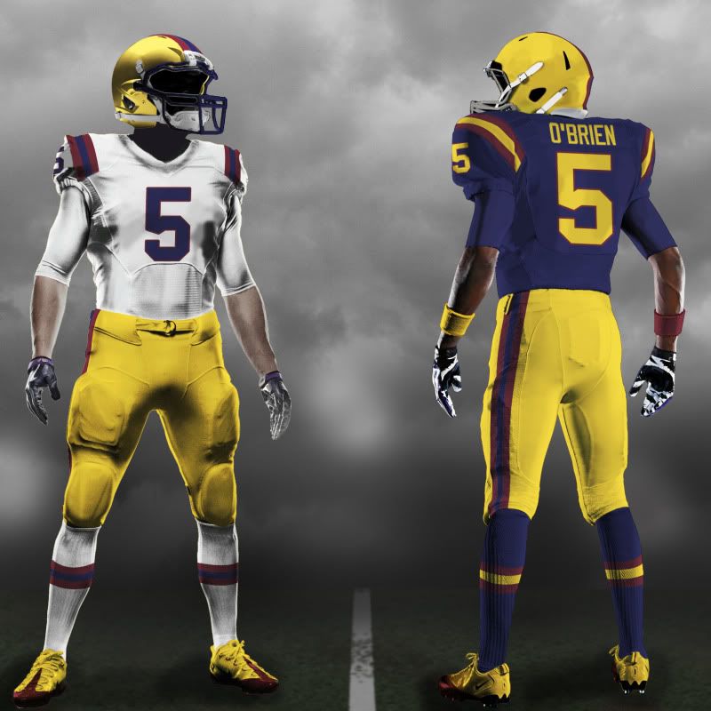
The Land of Lincoln Game - U of I vs NU

Illinois: The Illini host this year's Sweet Sioux Tomahawk game Land of Lincoln game, and they come onto (a) Memorial Stadium* wearing fauxbacks to a simpler time. Three simple stripes grace the shoulders and pants. A rounded version of the state name appears on the helmet (as opposed to "Illini" which has appeared on the lid in the past). Only blue and orange grace the uni (except the shoes), just like it was back in the day.

Northwestern: The Wildcats are also donning a fauxback of sorts. The white helmet is inspired by this helmet from NU history. The jersey is basically their current road uni with the addition of the 'N-Cat' logo while the pants have a purple double stripe that give the 'Cats a sleek, clean look.

The Heroes Game - NU vs UI - There isn't much history in this 'rivalry' game so I manufacture some from the uniforms:

Nebraska: As the home team, Nebraska comes out in a uniform that honors many of their best teams from their long, storied history. While the helmet design is the same as the one's they've worn since 1970, the red facemask harkens back to 1982. The jersey focuses on both those eras as well. The shoulder numbers are from the 1970 unis while the sleeve 'N's are from the 1983 team.

The pants are from both eras but the red belt screams 1983. The black shoes and white socks go through many generations of Huskers.

Iowa: The Hawkeyes come into (a) Memorial Stadium wearing fauxbacks to their 1958 National Championship team. While Iowa has worn fauxbacks to this era before, they've never worn the road version of these before. That's a shame, because those were some beautious unis. The moving of the stripes from the sleeves to the shoulders is just for player continuity (no lost stripes due to lack of undershirt).

Also, the facemask is unapologetically black.

Paul Bunyan's Ax Game - UW vs Minn - One of the Best rivalry trophies in all of sports deserves some great unis:

Wisconsin: The home team in 2011 comes out wearing something like nothing you've ever seen take the field at Camp Randall. The helmet is a variation of the current helmet that rids the flying W of it's unnecessary drop shaddow. This harkens back to most of Wisconsin's history, when the helmets were only white and red.

The Jersey is simple yet completely original. The shoulders are adorned with stripes that will quickly remind any UW fan of Bucky Badger. While the pants are almost identical to their current set, the socks pick up on the Bucky Badger theme and run with it all the way to victory.

Minnesota: The Golden Gophers have a tough task winning in Camp Randall. This Fauxback set calls upon the predecessors of this Minnesota football squad to lead them back to the path of victory and BigTen supremacy. The undershirt features Goldy Gopher's double stripe (just like my other concepts) and gold become predominant to remind the team of their victorious and glorious past.

The Land Grant Game - PSU vs MSU

Penn State: The home team for this game will march into Happy Valley with a uniform that will be very recognizable to it's fans and opponents. While there are some design changes (many of them have a fauxback feel) the biggest difference may be the color on the uniform.

The Blue on these unis are more royal blue than the current navy blue unis the Nittany Lions currently wear. This is a throwback to an earlier era. Combine that with helmet numbers, the return of white jersey accents and a singular, thin blue stripe on the pants and Penn State has a modern update of a classic uniform.

Michigan State: The Spartans recently unveiled a new Nike Pro Combat uniform for 2011. However, I disagree with Nike's use of Bronze and Black on MSU's uniforms, particularly since MSU is named after a group of people who are famous for wearing red. But Michigan State's colors are green and white and as such, those are the only colors I use on this uni.

The shoulders of jersey pop thanks to a green field that adorns them which flows nicely into the optional green compression with an updated version of MSU's 'S' logo. While the jersey numbers revert to a more traditional font, the university mark is updated to match the 'S' logo font. Thick white stripes grace both the helmet, pants and socks and help unify this uniform.

The Big Game - UM vs OSU

Michigan: As a BigTen alumnus, it's very hard for me to conceive Michigan wearing anything but their normal helmets, blue jerseys and maze pants at The Big House. I actually liked the fauxback they wore against Notre Dame, but I didn't want to re-tread the ground Adidas already walked. Instead, I made minor changes to the current home uni and left one of the best lids in all of sports untouched.

The jersey gets an 'M' logo sewn onto the shoulder as sort of a 'pride-patch'. While a player's name and number are usually the only thing to grace a Wolverine uni, I wanted the 'M' to be on there to remind the players that the glory of the game should go to Michigan.

While I added a blue belt to the pants, I removed the 'M' logo from them just to simplify the uni even more. The shoes and compression shirt are team colors but I'm not sure how much even I am digging the maze sleeves.

Ohio State: The Buckeyes are Nike Pro Combat veterans at this point. With the theme of most of their NPC unis being 'fauxback' I continue this trend with a look back to the late '60s (just on the cusp of one of their greatest eras like hopefully this will be).

While I could not find the exact specifics of the road uniform that matches this helmet, these jerseys, pants and socks probably approximate the jersey pretty well. The differing color TV numbers are a signature part of OSU's look from this era and the Northwestern stripes that adorn the helmet, jersey, pants and socks unify this set as a world class Ohio State uniform.

Well, that about wraps that up. You may have noticed the two new templates I was using. I'm proud to say that I created both of them and the one that features both the front and back of the uni has been improved even since I created these B1G concepts.

I'm currently working on doing some ACC and SEC stuff in this new template which I'll bring to you as soon as I can.

Happy tweakin'...

*With Nebraska now in the B1G, there are three Memorial Stadiums in the conference (U of I, IU and OU).

Sunday
Aug212011

Pac-ing It In

Football season is tantalizingly close. With high hopes for the new season come all new looks for your favorite teams - players, coaches and (of course) uniforms.

In this spirit, I've decided to get back to my roots and start coming up with some new football uni concepts. Now, since I've started doing concepts, I've gotten many requests from people out West asking me to take a crack at the Pac-12 the same way I did the BigTen a few months back.

Well, I couldn't think of a better way to get back into the swing of all things football than to tweak on of the nations' finest conferences. So, without further adieu, I give you my take on the the Pac-12:

Arizona - Home, Road, Red Alt, Blue Alt:

While I'm sorta known as a stripe-classicist, I love the fading stripe of Zona's. Granted, I wouldn't want it on every team (or even many) but it reminds me of a mirage in a desert and I think it works very nicely for the Wildcats. I kept the fading stripes on the pants and helmet and added them to the compression sleeves. I also reduced the role of the red jersey because I think ASU should be the red Arizona state school (that's also why there's no red pants). Oh, and no blue helmet, one UA helmet is enough.

Arizona State - Home, Road, Home Alt:

I created a few ASU unis a while back but looking back on them, I don't actually like my own designs too much. While my new designs draw from the new Sun Devils uniforms Nike came up with, I still like the classic look of the old Sparty-helmeted unis. I do like the gradient number font a lot, so much so I added it to the Alternate's pants. To me, that just screams 'heat'.

California - Home, Road, Yellow Alt, All Blue Alt, Yellow Alt Two:

Here is my first real departure from the norm. With two-tone numbers, a modern font and a variation of Georgia's shoulder stripes, these new Cal uniforms are anything but your daddy's Cal uniforms. I kept the classic lid and colors but that's about all that didn't change.

Colorado - Home, Road:

Back to a more classical look (but only briefly, look who's up next...). No stripes. Just numbers and the word 'Colorado' in bold italics font. No black pants. No gold alternate. Just how it should be.

Oregon - Regular Home, Road; White Pants Home, Road; White and Green Home, Road; Green Helmet Alt; Yellow Alt:

Listen, everyone needs an Oregon. For every Alabama, there has to be an Oregon. I did limit the Ducks, however. My rule: You can only wear green, white or yellow. Even with those restrictions, I gave them three helmets, five jerseys and three pairs of pants. That's 45 possible combinations. I narrowed that down to the combos I think look best. I actually like the Oregon Wings and the design of the current jerseys and helmets don't bother me, what does bother me is all the out of scheme colors. I faux-back to the days of yellow helmets and pants and Kelly green jerseys with the modern accoutrements.

As for the all yellow uni? Ducks are yellow.

Oregon State - Home, Road, Home Alt, All Black Alt:

The Beavers may have started the whole, "stripes on the compression shirt," fad, but they looked so good, I decided to bring that look along with modern numbers and logos. To differentiate OSU even more, I made orange the Home uni and left the black jersey as the alternate. I downplay the cartoon beaver logo and this is the only Pac-12 design in which I use full length socks. This could become an iconic look for the Beavers.

Stanford - Home, Road:

The Cardinal (sic) have flirted with black recently. I stop that shit.

Washington - Home, Road, Road Alt:

With the Huskies, I removed any black or modern stripes. Instead, I put the Huskies' alternate logo on the shoulders and their TV numbers on the compression sleeves. I also gave them a unique and thin number font and gold pants as the go-to road pants.

Washington State - Home, Road:

The Cougars recently announced new unis and I was rather unimpressed. Instead I take some elements from those unis and add them to WSU's tradition of alternating Home and Road helmets.

UCLA - Home, Road:

There shouldn't be much to change to UCLA but adidas has made this untrue. Instead I return the UCLA stripes to a reasonable length (though they still could be longer) and remove all dark blue from the stripes (though I keep it around the numbers).

USC - Home, Road:

No Change. Perfection.

Utah - Home, Road:

To be honest, I kinda phoned this one in. It's basically what they wear these days (though slightly different) but it was the last set I was doing and I have no idea about Utah's history, what a 'Ute' is or where to go with their unis. So I made them the only solid red team in the Pac-12.

Well, that's my take, feel free to leave yours in the comments. Until next time...

Wednesday
Jul202011

Indiana Déjà Vu

Yesterday, Indiana announced a new uniform set for 2011. While anything is an improvement over this, I'm not sure just going back to this was the best idea ever.

A few weeks back, I had hopes that this would be IU's uniform next year. Aside from that silly collar, that's almost exactly what I wanted out of the Hoosiers' unis.

But, alas, the Hoosiers disappointed me yet again. The uniform - seen here and to the right - along with the helmet (at the bottom) are basically throwbacks to the Terry Hoeppner era.

And actually the new IU unis look a lot like my over-the-top IU concept, down to the overly fat uni numbers - except for the numbers on the compression sleeves, and the candy-stripped pants.

Compare: 2011 uni  vs. O’B. Candy-stripe.

Let's start with the helmet. I like the white facemask but that's where my love affair quickly ends. The only redeeming feature of the 2010 uniforms was the double stripe helmet.

Originally a one game throwback with a block I, the double stripe helmet from recent Hoosier past was so popular it was the new standard uniform helmet THE NEXT GAME and then continued to be for the next three seasons.

While the Hoosiers aren't the only red cap in the BigTen (Minnesota flirts with a red helmet), IU could at least continue having a unique red lid while they’re at it.

As for the jerseys, they're way too boring. Maybe add some stripes to the bottom of the sleeves, or maybe go with sleeve numbers rather than pad numbers, or go for what IU fans really want, the double stripe theme all over.

The Hoosiers were just shoulder stripes away from that design two years ago and they were a pair of pants (and that stoopid side blotch on the jersey) from having it last season. Keep it simple but don't make us an Oklahoma knockoff again (I mean, Riddell already thinks we're interchangable).

And please, for Christ's sake, remove the "For the Glory Of Old IU" from the inside of the collar.

Final Grades:

The Helmet - Love the facemask, hate (like, loath) the lack of stripes. Grade: D | Uni-Watch.com Scale: Seriously Stupid

The Jersey - No side blotches, but no stripes whatsoever. Grade: B- | Uni-Watch.com Scale: Good but could be Great

The Pants - Back to the ol' double stripe. Grade: A+ (so long as they wear red pants on the road) | Uni-Watch.com Scale: Great

Overall, two steps forward, one step back: B- (which is a vast improvement from the D- that was last year.)