
Indiana Déjà Vu
 Yesterday, Indiana announced a new uniform set for 2011. While anything is an improvement over this, I'm not sure just going back to this was the best idea ever.
A few weeks back, I had hopes that this would be IU's uniform next year. Aside from that silly collar, that's almost exactly what I wanted out of the Hoosiers' unis.
But, alas, the Hoosiers disappointed me yet again. The uniform - seen here and to the right - along with the helmet (at the bottom) are basically throwbacks to the Terry Hoeppner era.
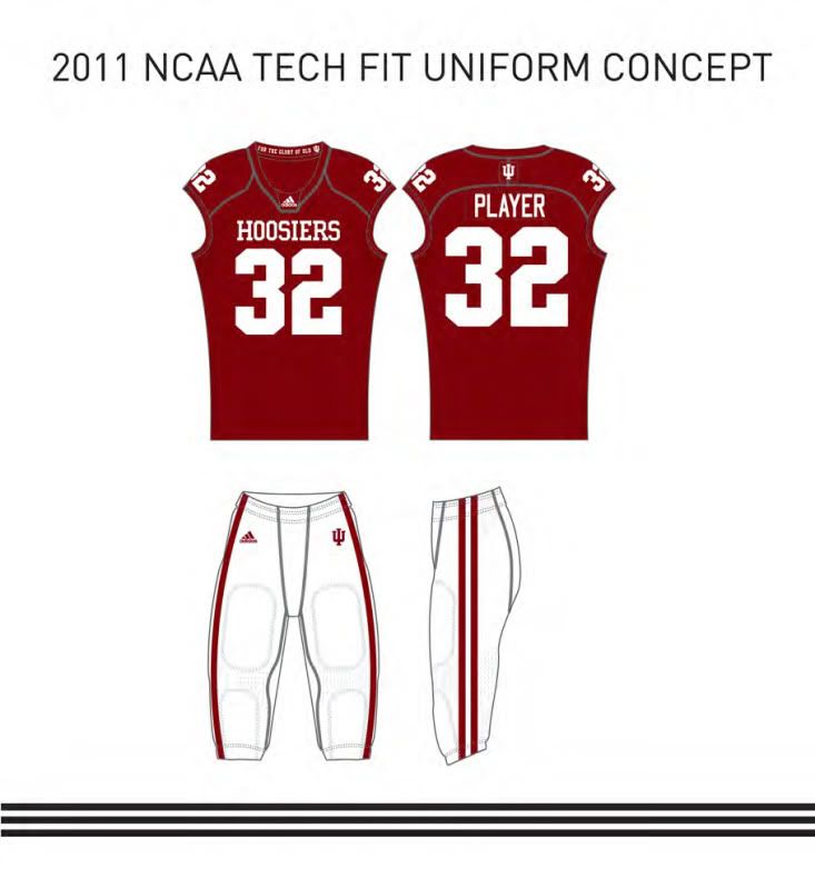
And actually the new IU unis look a lot like my over-the-top IU concept, down to the overly fat uni numbers - except for the numbers on the compression sleeves, and the candy-stripped pants.
Compare: 2011 uni vs. O’B. Candy-stripe.
Let's start with the helmet. I like the white facemask but that's where my love affair quickly ends. The only redeeming feature of the 2010 uniforms was the double stripe helmet.
Originally a one game throwback with a block I, the double stripe helmet from recent Hoosier past was so popular it was the new standard uniform helmet THE NEXT GAME and then continued to be for the next three seasons.
While the Hoosiers aren't the only red cap in the BigTen (Minnesota flirts with a red helmet), IU could at least continue having a unique red lid while they’re at it.
As for the jerseys, they're way too boring. Maybe add some stripes to the bottom of the sleeves, or maybe go with sleeve numbers rather than pad numbers, or go for what IU fans really want, the double stripe theme all over.
The Hoosiers were just shoulder stripes away from that design two years ago and they were a pair of pants (and that stoopid side blotch on the jersey) from having it last season. Keep it simple but don't make us an Oklahoma knockoff again (I mean, Riddell already thinks we're interchangable).
And please, for Christ's sake, remove the "For the Glory Of Old IU" from the inside of the collar.
Final Grades:
The Helmet - Love the facemask, hate (like, loath) the lack of stripes. Grade: D | Uni-Watch.com Scale: Seriously Stupid
The Jersey - No side blotches, but no stripes whatsoever. Grade: B- | Uni-Watch.com Scale: Good but could be Great
The Pants - Back to the ol' double stripe. Grade: A+ (so long as they wear red pants on the road) | Uni-Watch.com Scale: Great
Overall, two steps forward, one step back: B- (which is a vast improvement from the D- that was last year.)
 Tim E. O'Brien