Entries in Uniform Cencepts (34)

Wednesday
Mar302011

Tweaking the Classics - NBA EDITION 

A while back, an emailer - Zack - sent me a request with a really interesting idea:

Just an idea since you do a lot of NBA rebrandings I would be interested to see what you would do with the Knicks, Lakers or Bulls.

To me, those three organizations are three of the top four franchises in the NBA as far as history and uniforms (the Celtics being the unnamed fourth).

Taking a crack at their uniforms - while certainly not unheard of, all three have gone through some pretty dramatic changes since the mid-80s - would be a challenge between balancing what makes their uniforms great with new ideas that can improve their image.

Also, with such perfect logos and historic courts, the only changes needed to these teams would be to their uniforms (although, as you'll see, I did alter the Knicks' logos a smidgen)

So here we go:

Bulls

Not much of a change here to the Home or Road versions. Jordan and company made these already great unis classics, so, in my humble opinion, I left them generally unchanged.

Unfortunately for these concept templates, you don't see the backs of the jerseys. If you could, you would see that the names on the backs would be sans-outline and would be white on both Road versions, because this looks way better than this.

The Bulls' black Road alternate has a long storied history. In the 1995-96 season the Bulls broke out these black alternates 10 times in route to their historic 72 win season. Good karma right? No.

The Bulls went 5-5 in their pinstripe duds (duds being the key word) and 67-5 in white and red. Ever since, the Bulls have tried to keep and update their black alternates but never quite got them right.

The biggest problem was the striping. Either the Bulls didn't have the striping (including the diamond on the shorts) or the striping was different from the Home and Road. Even today's black alternate is still wrong - the striping colors go red-black-white-black-red when they should go red-white-black-white-red (because the uniform color should be the middle stripe color).

Fixing the striping and then taking inspiration from the mid-80s Road jersey, I give you my fixed black Road alternate.

Knicks

As I said at the top of the show, I did have to make some small alterations to the Knicks' logos. All I did, as you can see, is take the black out and replace it with blue (this should give you a hint about what I did with their uniforms).


As far as the Knicks uniforms go, I basically took everything good from the modern set and combined it with the good from the Ewing Years set.

From the Ewing era, I kept the stripe pattern, collar and sleeve pattern and the fonts.

From the modern era, I kept the continuous side stripe and the logos.

Combine all that, and Voilà: I give you the New Look Knicks.

Lakers

Once again, I present to you an amalgamation of old and new.

I should be a poet.

While the Lakers look great in their current set, they used to look great in their old set too. And while I've gone back mostly to the old set, I didn't go all the way back (no one wants to see this).

I have kept the current logos, fonts (especially the lack of the drop shadow) and have made all the numbers the opposite color scheme as the 'Lakers' script this is both old and new). And finally, the striping is all from the Magic Johnson to early Kobe era.

Those are my ideas to perfect perfection. Obviously, all three teams currently look great, but who says you fix what ain't broke.

Once again, I hope you like this design. If you really like my designs, remember that I just opened up my own shop where you can purchase any of my original designs in t-shirt form. If you have any merchandize or design requests, please drop me an email.

Until then - as always - leave it in the comments.

Saturday
Mar262011

Orange You Glad I Didn't Say Royals?

It's official, Anaheim is trying to attract an NBA team.

What isn't official is what team they're trying to pursue, but it's pretty clear that it's the Sacramento Kings. However, since Anaheim is so close to Los Angeles and LA already has a team named the Kings, Anaheim wants to change the Kings' name to the Royals.

While that name has precedent in that organization, it sure doesn't make a statement about the Anaheim area. And the old color scheme of the old Royals was red and blue, which there is way too much of in the NBA these days - including nearby LA.

It's just another generic team name and color scheme.

That being said, if Anaheim wants to rebrand the Kings for their new home, I say go the full monty and change everything.

So where do you go with Anaheim? Well, someone suggested the Anaheim Lion Kings. Unfortunately, Disney might have a problem with that one. What I noticed was how Anaheim is in the O.C. (don't call it that) Orange County, and there is a color lacking a strong presence in the NBA that deserves to be recognized.

Without further adieu - and a little local inspiration - I give you The Anaheim Orange:

Logos

There aren't enough fun cartoon logos in the NBA anymore. Not everything has to be angry, it's only a game. The name Orange obviously derives from Orange County, so I decided to create the most logical logo - an orange. And with this team name, a color scheme was easy to pick.

Now, a less literal interpretation of the name orange could represent a different orange colored sphere...

With the secondary logos, I just removed all the lettering and kept the designs. Here you can clearly see that both logos have the part of the orange that used to have the stem (the nipple?) to further link the images.

Next, a tertiary logo allows all the people who love calling Orange County 'the O.C.' a chance to give the new team a similar nickname, 'the A.O."

Uniforms

With the uniforms I wanted to keep the design as simple as possible. The cartoon logo and the color scheme are loud enough, no need to go crazy.

With the road alternate, I did feel a bit of orange needed to be added to the jersey (I mean, they are the Orange) so I placed the uni number inside a faceless orange.

Not sure if I'm in love with the designs, but they're simple enough where I don't think I'll be criticized for over-designing them, haha.

Court

Finally, the Honda Center has hosted basketball games (see: 2011 NCAA Tournament) but a court for an NBA team would be brand new, so I say, "Go bold."

I hope you like this design. If you really like, remember that I just opened up my own shop where you can purchase any of my original designs in t-shirt form. If you have any merchandize or design requests, please drop me an email.

Until then, leave it in the comments.

Wednesday
Mar232011

Who Says the Unemployed Can't Make Money?

Well, based on an email a follower sent me, I decided to start a shop where I can sell my unique creations.

Now, I've already run into some copyright issues (some of which I claim are absolute BS) so my designs often lack either the team name or location so I can sell these items. If you want any specific designs on any specific item on Zazzle, please feel free to drop me an email request and I'll see what I can do.

I cannot obviously sell things that are not of my own creation (like the logos from the other day's Mavs recolorization) but I will do my best to sell any item I have created and to which I own the intellectual and property rights.

Sunday
Mar202011

The Last Crack of(at) Thunder

After a few weeks of feedback from the interwebs, I have taken the most popular of my ideas and the best suggestions and combined them into my final* version of my Thunder rebrand.

Logos

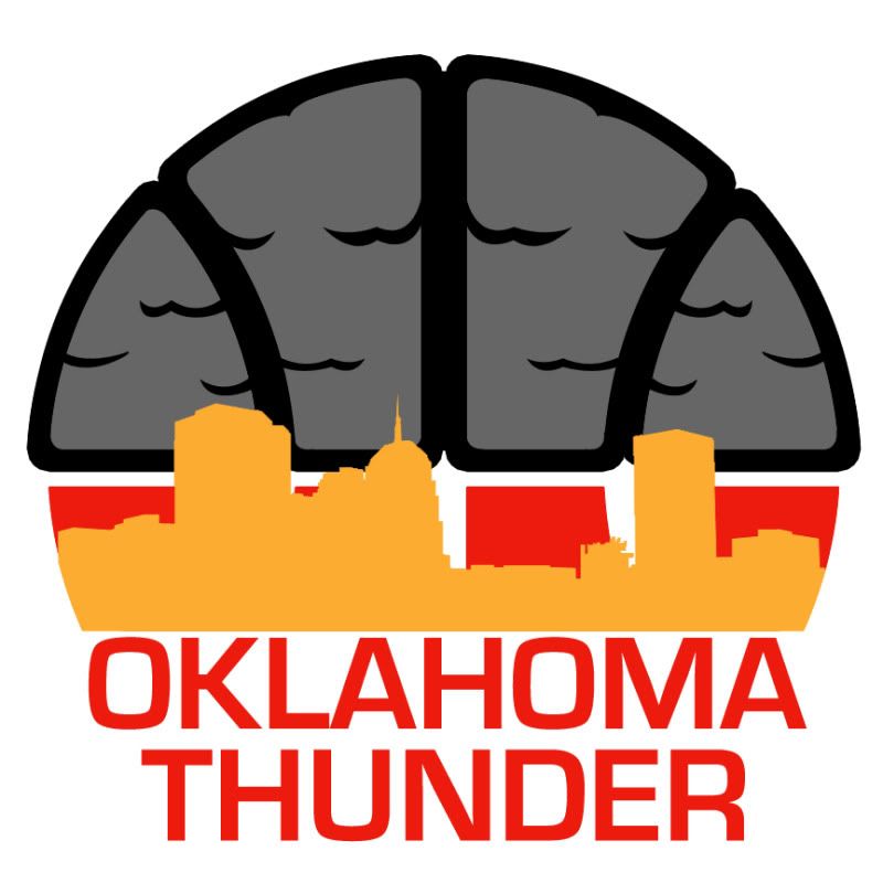
Let's start with a new main logo, the Thunder Ball.

As an homage to the city they used to be from and the team they used to be, the new main Thunder logo incorporates the old SuperSonics logo as well as the new preferred color scheme (gray and black with yellow and red/orange highlights) and the new thundercloud theme. And of course, it's a basketball because apparently all NBA teams have to have a basketball somewhere in one of their logos...

The red/orange behind the cityscape symbolizes an Oklahoma sunset in the distance as the clouds roll in over head.

The new typeface is derived from the Oklahoma state flag, which tries to make up for the loss of the state flag's blue in the color scheme. Many people hated the old Thunder typeface (I didn't but that's just me) but this new type helps to further the correlation between the team and Oklahoma.

The team has also been renamed the Oklahoma Thunder (this was a popular request). However, the cityscape is still of OKC, the town the 'Thunder Dome' still calls home, so there is a bit of compromise.

The secondary logo is the Bison Cloud logo I originally came up with but in the monotone gray/black color scheme and accent colors. I decided not to keep the bison brown so that it would not confuse the color scheme and so it would appear like an image in the clouds.

So maybe Rumble the Bison should change his coat.

Uniforms

'Fixing' the typeface and removing the word 'CITY' from the road uniform was pretty much the only change to these uniforms. the logo on the shorts remains the Bison Cloud logo because the Thunder Ball logo doesn't really work as anything other than a main chest logo (think current Golden State unis).

Court

The court hasn't changed much since my last incarnation. The logos have all been updated to their current appearance and the baseline wordmarks has changed to fit the new font and team name.

 And with all that, you have yourself a rebrand. Feel free to tell me what you think in the comments.

*for now. Let's be honest, I'll probably mess around with this again.

Thursday
Mar172011

Royal Pain In My Ass

Last month, as you may recall, I did a rebrand for the Sacramento Kings.

My design was broken down into three different ideas all based off of this logo. The reason I needed three main ideas was because - at the time - no one knew where the Kings would end up, Sacramento, Anaheim or other.

No matter where they were located, though, I kept the name 'Kings'. Why wouldn't I? It's a good team name and they have been some incarnation of the Kings since 1972.

Well, according to this article, not only are the Kings closer to moving to Anaheim (probably) but the current Kings' habit of wearing 'Royals' throwbacks (pictured above) seem to be a foreshadowing of a name change.

So taking into account the new location (Anaheim), the new name (Royals) and the uniform set I already created and received a lot of positive feedback from, I decided to update my Kings rebrand for the Anaheim Royals.

Logos

While this was based off of this, the new logo set throws back to this Cincinnati Royals logo, so not much of a change.

Uniforms

Like I said, I got a lot of positive feedback about these unis so there's no point in changing anything that isn't necessary.

Court

Well, the Honda Center in Anaheim already has the nickname 'The Pond' for the Ducks, but I'm not quite sure how that'll jibe with the Royals ('the team across The Pond'?).

However the name works, I think the court looks great. Until my next rebrand, drop me an email if you have any questions or requests.

Page 1 ... 2 3 4 5 6 ... 7 Next 5 Entries ยป