 Click to see all my uniform concepts as a slideshow
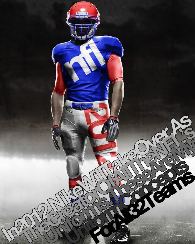
In 2012, Nike will take over as the official licensee of all NFL apparel - including the team uniforms.
With this change comes the reputation Nike has earned in the collegiate game over the past few years, of creative and unusual design.
Much of this 'creativity' comes from Nike's new Pro Combat Uniform style. This new style incorporates an undershirt that can allow uniform designers to bring back arm stripes that have disappeared in recent years.
With this in mind, I recently decided to embark on a project to design new uniforms - using the Nike Pro Combat template - for all 32 NFL teams. Some team's uniforms change drastically, some almost don't change at all but what follows are the 120 uniform combinations I would like to see in the NFL.
Teams are in alphabetical order and include a brief description of what I did. Also, if I altered a team's logo, it will appear in the linked uniform designs (Some old logos are included as well for no particular reason).
49ers: Home, Road - Not too much changed here but this is the perfect example of what the compression undershirt can do for sleeve stripes. Ever since the 9ers moved from back to this Montana-era look, the only thing wrong has been the lack of proper stripes. So voila...
Bears: Home, Road, Road Alt, Throwback - My Bears. These are one of the best uniforms in the league and a pure classic. I threw in the white pants with the white jersey cause they pop up every few seasons and they used to be the norm in the 70s and 80s and I also brought back the gray facemask 'cause it just looks good. I also kept this year's throwback because that shit is baller. Add the retro brown pants and the white 'C' on the helmet and, baby, you've got yourself a stew goin'...
Bengals: Home, Road, Road Alt, Orange Alt - This was my first real test. In order to make the uniform design feel viable, I tried to make sure the stripped area of the jersey was contained withing the shoulder segments of the uniform. The Bengals' lid is classic and Ochocinco made the uni number font iconic so those stayed. The pants stripping is similar to the current pants only it isn't truncated and is only orange and black.
Bills: Home, Road, Road Alt, Red Alt, Patriotic Alt - This one is kind of retro. While I took the modern logo and flipped the colors to echo the old logo, the uniform comes almost directly from the past. I threw in a red alternate for good measure though.
Broncos: Home, Road, Road Alt - The Broncos are supposed to wear orange. And check out those stripes...
Browns: Home, Road, Home Alt, Road Alt - These are almost unchanged, just more room for the stripes. I brought back orange pants but I can't remember how they turned out in real life but I thought I'd give 'em a shot as the alternate.
Buccaneers: Home, Road, Alternate - Everyone seems to love the 'Creamsicles' but I think they were uglier than some choose to remember. I did add the creamy orange to the great modern logo (check out the football in the logo) and added it as a secondary color. I kept the modern helmet and pants (although now they're sans-stripe) because they remind me more of a swashbuckler's pantaloons than a freeze pop, and I think that's a good thing.
Cardinals: Home, Road - This one is old school. The pants stripping is super old. The helmet is really old. The Arizona flag is kinda old. Combine all the elements with super thin stripes and you have a really modern yet classic uniform.
Chargers: Home, Road, Road Alt, Dark Alt - San Diego, which is German for 'a whale's vagina', got it right with when they went back to the white helmets and the powder blues. Unfortunately, those are the Chargers current alternates. I switch them to the main uniforms and leave them pretty much unchanged.
Chiefs: Home, Road, Road Alt - Just wider stripes on the sleeves and socks as well as incorporating yellow into the logo.
Colts: Home, Road - Classic uniform. All I added were some sock stripes.
Cowboys: Home, Road, Alternate - I went a bit retro here. The Boys wear white at home and blue when forced to on the road so I went back to a 60s look for a more classic appeal. However, Dallas has this weird idiosyncratic uniform quirk where their pants paired with their white jersey have a teal tint to them and don't match their helmet. I like that quirk, so I kept it. But then I got rid of it in the alternate...
Dolphins: Home, Road, Home Alt, Road Alt, Orange Alt 1, Orange Alt 2 - This is an instance where I dropped the drop shadow. Miami has classic Floridian uniforms, so I brought them back to their peak of greatness when Marino was just beginning to do his thang. I also tweaked the logo so there was no more dark blue in it (which was also taken out of the uni striping).
Eagles: Home, Road, Home Alt, Road Alt 1, Road Alt 2, Road Alt 3 - Everyone loved the Iggles throwbacks this year, so I say drop the drop shadow, keep the number font, logo and new age helmet wings and add the Kelly green. Then I found these sleeves from the Ron Jaworski era - how can you not love 'em?
Falcons: Home, Road, Road Alt, Red Alt - Simple. Go back to the throwback. Keep the modern logo, just add a gold beak to match the retro helmet (Georgia's colors are red, white and black and the Falcons didn't want to disrespect Georgia Tech, so they added gold piping to their helmet stripe) and you have a perfect logo for a great uniform.
Giants: Home, Road, Alternate - Same as they wear today. No stripes on either color jersey and big red Northwestern stripe on the white one.
Jaguars: Home, Road, Home Alt, Road Alt, Black Alt 1, Black Alt 2 - This one was one of the last I did. I knew I wanted to do something interesting with them but I just wasn't sure what. The shoulder stripes arise from the whiskers on the logo jaguar's face and the spots - well, those are self explanatory. I'm not sure even I like the spots all that much, but its an interesting idea for a compression shirt.
Jets: Home, Road, Home Alt, Road Alt - The Jets, in recent years, have made their green darker. My concept reverses that trend. And since we're going back to old school colors, why don't we go back to the old school stripes - they're so damn funky.
Lions: Home, Road - Barry Sanders colors (No Black.) with Ndamukong Suh rounded numbers (well, without the weird cutaways in the number like at the top of the inside of the 0 and 9). Same goes for the logo's colors.
Packers: Home, Road - With the full compression sleeves, the Pack can go back to their classic sleeve stripes and sock stripes. Here's my inspiration: Home, Road.
Panthers: Home, Road, Home Alt, Road Alt, Blue Alt 1, Blue Alt 2 - I love that the Panthers' logo is an all black panther outlined in that blue. In that vein, I made the Panthers all black outlined in blue at home. I also kept the Panthers' semi-iconic shoulder stripes.
Patriots: Home, Road, Alternate - Everyone love Patriot Pat and his old school uniforms. Stop fighting it New England, go back to them. I even gave you a blue alternate.
Raiders: Home, Road, Road Alt - Classic. Can't improve on perfection.
Rams: Home, Road, Road Alt - The old school Rams uniforms were so great and with the maze and blue, they remind you of Michigan. It just doesn't get more 'classic football' than that.
Ravens: Home, Road, Home Alt, Road Alt, Black Alt 1, Black Alt 2 - I did not drop the drop shadow. There's just something about Poe and Ravens - the shadow fits. I made the helmet stripe solid and purple and added a solid purple stripe to the black pants.
Redskins: Home, Road, Home Throwback, Road Throwback - The Skins got it right with the yellow pants this year, now they just need put the asymmetrical stripe on their helmet and back to wearing those killer throwbacks.
Saints: Home, Road, Home Alt, Road Alt - Pretty much unchanged except that the black pants manage to maintain the helmet and gold pants striping by adding a gold piping around it.
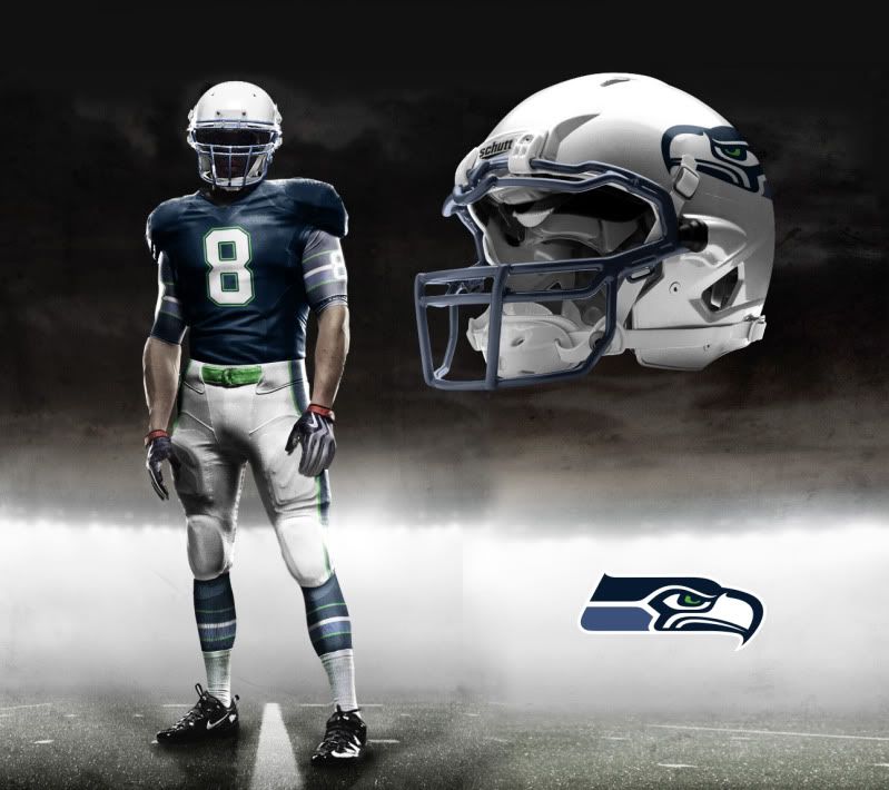
Seahawks: Home, Road, Dark Alt - A major overhaul while keeping the modern logo. The home jersey color comes from the lighter color on the logo and the sleeve, pants and sock stripping comes from the neck of the seahawk but is outlined in the emerald from his eye (I mean it is the Emerald City).
Steelers: Home, Road, Throwback - Perfect unis. Even their throwbacks are great.
Texans: Home, Road, Road Alt, Red Alt - I don't think I'm the first to say the Texans should have a white helmet (that logo was built for a white helmet) and I don't think I'll be the last. Hopefully they'll take the hint. As for the jerseys, I got rid of the stupid modern stripe and - since it is the Lone Star State - I added a lone star to each sleeve.
Titans: Home, Road, Home Alt, Road Alt, Sky Blue Alt 1, Sky Blue Alt 2 - A lot of people would say, go back to the Houston Oilers jerseys. I say, the Houston Oilers sucked and the Tennessee Titans have had much more success in their short history in these modern classics. Just go back to the dark blue with light blue highlights as the home jersey and maybe throw in some modern socks and we has a great set of unis.
Vikings: Home, Road, Road Alt - A throwback to a classic is never a bad idea, home or away.


 Tim E. O'Brien


