Entries in Basketball (10)

Tuesday
Mar222011

Branding a Maverick

While doing some research the other day, I came across a startling statistic. Almost 57 percent of NBA teams have blue as one of their main colors. That's 17 teams:

Hawks
Bobcats
Mavs
Nuggets
Pistons
Warriors
Pacers
Clippers
Grizzlies
T-Wolves
Hornets
Knicks
Thunder
Magic
Sixers
Jazz
Wizards

Next year, odds are that the new Anaheim Royals will go to the color scheme of red and blue and there are rumors (documented on this site) that the Washington Wizards will change their color scheme next season but will keep blue in the set.

This has to change. There's way too much blue in the league right now (I blame Eiffel 65), so today I take a look at the Dallas Mavs to see if we can get a more original color scheme.

Logos

While Dallas has a decent logo, their modern typeface and the dominant blue color need to go. Now the Mavs used to be a green and blue team, a pretty original color scheme, but we're trying to get as much blue out of the Association as possible so I've decided to leave some blue in but only as an accent color to the main color pallet of green and white.

As for the typeface, the Mavs' current alternate has this wonderful typeface on it (TF Burko) so I used that font as the only font in the redesign.

As far as the secondary logos go, once again not much of a change here but enough to highlight the new green-first color scheme.

Uniforms

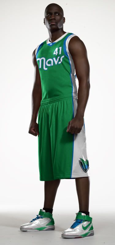
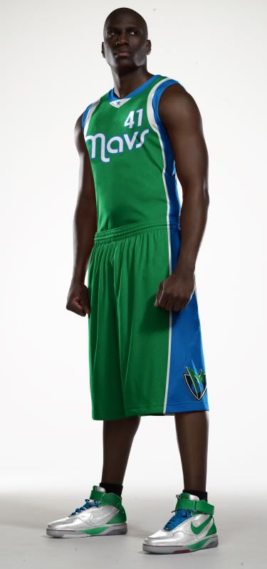
The road uniforms may look familiar. The road alternate is almost exactly the same as the Mavericks' Alternate used from 2004 to 2009. However, I flipped the colors of the striping on the main road uni so that the blue remained just an accent color.

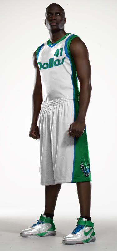
The home uni says Dallas in TF Burko but otherwise is just the logical home variation of the road jersey.
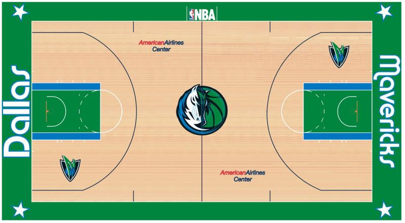
Court

Dallas has a pretty cool court so all I really did was fix the colors. I changed the font on the baselines to fit the rest of the rebrand and the stars in the corners now match the star in the main logo.

Well, that's pretty much it for this rebrand. Only Boston, Milwaukee and Utah currently have green on their uniforms (excluding St. Patrick's Day unis) and only Boston and Milwaukee have it as a main color (it's relegated to a striping color on the Jazz's unis).

Dallas needs to go back to the green.

Monday
Mar142011

Pacing Myself

One of the funny things about living in Indiana for four years is that I've been to more Pacers games than Bulls games in the past half decade (and that's with one of the games Pacers vs. Bulls).

Now, not that there's anything wrong with the Pacers or Conseco Fieldhouse, but I barely care about the NBA and my built in favorite/hometown team, the Bulls, are way better than this incarnation of the Pacers.

There are a few things I have come to realize, though.

  1. Always accept free skybox tickets. The beer is free.
  2. The Pacers aren't as white as I thought they were (although they're pretty damn white).
  3. The Pacers logo is great.

While I'm one to come in, shake up a team identity and look for improvements from the past, the Pacers have the perfect logo for their team sitting at mid court.

Now, since this isn't exactly a rebrand I guess this would be considered an update.

Uniforms

The Pacers should be commended, in an era when teams get rid of yellow for gold and turn blue into midnight navy, the Pacers have kept their colors reasonable. While I may have made the blue on the uniforms a little bit more blue than their current set, the current Pacer blue is still solid (but it has been getting a little too dark).

As for the design, like I said, I like to look into the past and the Pacers have a great uniform tradition. That being the case, my designs for the home and road are almost complete throwbacks and the alternate is a fauxback that can be worn at Conseco or at the majority of other NBA arenas.

Court

And while Conseco Fieldhouse is a beautiful facility and has a fine court, I thought I woud update the court to make it a bit more unique, like say adding the alternate's striping (which unfortunately goes down the players right side).

Well, that's it for my Pacer Update, I would like to thank the great people over at UniWatchBlog.com for once again highlighting my work (here is the link to my Q&A and Nets Rebrand). Please feel free to peruse my site and if you have any uniform or logo requests, feel free to email me here.

Friday
Mar112011

Next Year Will Be Better

I mean, it can't get worse.

Thursday
Feb242011

Tidbits and Nuggets

Melo's gone. It's time to reload in Denver.

And how do you reload best? That's right, by letting me redo your logos. unis and court.

Yay.

Once again, I find history calling to me. The logo to the right is from 70s and 80s and went along with this uniform. I decided to bring both back but update them a bit.

Unfortunately those colors, purple and yellow and red and blue, completely clash, so I decided to make both the logo and uniforms match.

The colors I chose? Midnight blue and an orange-y old gold

I just love that miner but this font is where it's at.

As for the unis, like I said, I'm just updating that classic look linked above.

But there were also some fun alternate ideas with this color scheme. In fact, I think I like this blue uni better than the one above.

As for the Pepsi Center, I think the color scheme looks fine and dandy in this mock-up.

But just updating a classic uni is so boring, especially when you're dealing with an organization that wore this for years. With that in mind i looked up Denver's city flag...

Wow. How could you not get inspired?

Well, those are my Nuggets conepts, tell me what your ideas in the comments.

† If you enjoy this rebrand, please check out my other uniform ideas in my Uniform Concept page. I'm always willing to take critiques, praise or requests (which this was).

Tuesday
Feb082011

Basketball Jones

Check out the new uniform concept page for basketball jerseys.

If you have any uniform concept requests, feel free to contact me.

Page 1 2