Saturday
Jun092012

Meet My BUD

Some of you may have been wondering, "Why hasn't Tim posted anything here in a while?"

Well, this is why: The Basketball Uniform Database.

Over the past few weeks and months, I've been working on something big. I volunteered to to work with some of my fellow uni-nerds on creating a database of NBA uniforms. The goal is to go back to the '40s but as of today, our coming out party, we have 2011-2012 finished and are beginning to work our way backward in time.

In my position as the graphic designer, it has been my job to create the templates, recreate the jerseys and do anything else graphically I can for the project. I've been working with tons of images, logos and color swatches to try and come up with as accurate a depiction of NBA jerseys as I can, no matter if it's the '60s, '80s or the tweens.

Now, I'm not perfect (though I'm damn close...). That being the case, if you ever see something on there that's a glaring error, feel free to drop me an email (See: sidebar) and let me know.

And it turns out, NBA uniforms aren't perfect either.

In my personal research I've discovered two bizarre uni-quirks that I haven't seen mentioned anywhere else (though, perhaps I just haven't looked hard enough...). Let's start off with the quick one.

Philadelphia, before this season, introduced a brand new alternate uniform. It was pretty standard fair, a blue version of their current jersey template. Not bad. Not great, but not bad.

Unfortunately, Philadelphia never wore it.

You can do - as I did - and go through all of daylife's 76ers images, it doesn't appear once. Or you can go to their team website and watch game recaps. No sight of it. Or go to ESPN. I think you know what you'll find.

It's truly bizarre. The Sixers don't even sell the jersey in their online store. What makes it even more bizarre is that fans seem to love the blue jersey.

So the phantom alt of Philadelphia remains a uni-mystery. Who killed it? Why was it killed? Will it ever make it on court? We may never know.

Finally, we come to a case of, "Wait, why wouldn't they just change that?"

The New York Knickerbockers broke out new unis - their current unis - for the 2001-2002 season. Other than a collar change, the uniforms have remained unchanged for more than a decade.

Except for on thing.

Look at these pictures from the Stephon Marbury era of the nicks: Home Road and St. Paddy's Alt. See how the Knicks logo on the shorts is on the right short leg, placing the NBA logo on the left pant leg? Well, at some point during the Starbury era, the Knicks switched their logo to the left leg (where it remains today).

Except on the St. Paddy's Day alts.

For some reason, the Knicks have never switched the shorts patch on their green alternates. Never. It's very bizarre.

The Knicks changed the logo location years ago, so it's not like these are jerseys created before the change and they just never got around to it. The materials and cuts of the jerseys have changed over the years and most - if not all - of the current players on the Knicks roster have never worn the old home and road unis with the logo on the right pant leg.

It doesn't matter the occasion (Christmas, St. Patrick's Day, dunk contests, etc.), the patch is on the other pant leg. It's a very strange uni quirk that I would love to hear the rationale behind.

Though, I suspect the the explanation will be less than satisfactory.

"It's just a logo on a uniform, who cares?"

Wednesday
Apr112012

Logo Cup Playoffs

With the Stanley Cup Playoffs kicking off today I thought I might try and pick the Stanley Cup Playoff series.

But being that I'm all about logos and uniforms, I thought I'd make my picks in a bit of a unique way: The team with the best logo moves on.

Without further adieu, here are my picks in the 2012 Logo Cup Playoffs:

The West

1 Vancouver Canucks vs 8 Los Angeles Kings

This series isn't really close. The Canucks have a great logo and the Kings have a below average logo. While the Kings' logo isn't awful on it's own, compared to a great logo, it just doesn't have enough to overcome its flaws.

Vancouver in 5


4 Nashville Predators vs 5 Detroit Redwings

This is a case of another giant taking on a mere mortal.

The Redwings' logo is one of the best in all of sports, and while Nashville's logo isn't bad, Detroit's is far superior.

Redwings in 5


3 Phoenix Coyotes vs 6 Chicago Blackhawks

So far all of the West's series have been one sided.

This series continues the trend.

Blackhawks in 5


2 St. Louis Blues vs 7 San Jose Sharks

Finally a match up worth watching. Both are average logos, but the Sharks' logo is just a little bit better.

This series is closer than the first few, but still a pretty decisive victory.

Sharks in 6


1 Vancouver Canucks vs 7 San Jose Sharks

This is the first real battle and boy is it a good one.

The Sharks have great colors and an awesome logo fit for a hockey jersey, but the Canucks have a Haida art-inspired orca that doubles as a 'C'.

Canucks in 7


5 Detroit Redwings vs 6 Chicago Blackhawks

If they were in different conferences, this could easily be the Stanley Cup Finals match up.

But fortunately, they aren't (and we get to watch these two great logos play at least 6 times a season).

This is so close it's ridiculous.

Blackhawks in 7 and like six overtime periods


1 Vancouver Canucks vs 6 Chicago Blackhawks

The Canucks' logo is good. The Indiana Head is legendary.

Sorry LeBrongo. Be careful leaving the stadium.

Blackhawks win the West in 5


The East 

1 New York Rangers vs 8 Ottawa Senators

The Rangers have tradition, the Senators have... high fastening pants.

Rangers in 5


4 Pittsburgh Penguins vs 5 Philadelphia Flyers

If the Penguins still used yellow instead of gold, this would be over in about five or six.

As is, the logos are both pretty great and pretty close.

Pittsburgh in 7


3 Florida Panthers vs 6 New Jersey Devils

I like both of these logos.

The Panthers' is so complex, it really can only work as a hockey crest. The Devils' is so simple, it's elegant.

It's close but an easy choice.

Devils in 6


2 Boston Bruins vs 7 Washington Capitals

Against a quality opponent like the Bruins' logo, the Caps' just doesn't stand a chance.

Bruins in 5


1 New York Rangers vs 6 New Jersey Devils

The battle of the Hudson.

Again, both teams have quality logos, but one is just better.

Devs in 6


2 Boston Bruins vs 4 Pittsburgh Penguins

Again, this would be a different story if the Pens had yellow and not gold.

Since they don't, my decision is harder, and not in Pittsburgh's favor.

Bruins in 7


2 Boston Bruins vs 6 New Jersey Devils

Both logos have great history but the Bruins has the type of history and pedigree that breeds championships.

Bruins win the West in 5


The Finals 

Boston Bruins vs Chicago Blackhawks

Home ice advantage won't be enough to overcome the Indian Head.

Blackhawks in 6


Friday
Mar302012

The Swootchover

The Nike Football League is official and I feel the need to make a few comments.

In general, I don't care about what happened in Brooklyn yesterday but I do care greatly about football, my Bears and uniform design. Since the only real redesign to speak of from yesterday was the Seahawks, that's what I'll be covering.

First, let's talk about the Nike aspects that affect football:

Flywire Collar: Call it whatever you want - Flywire, Nikelace, Colombian Necktie, etc. - but I'm torn on this uni element. I feel like collars creeping up on people is an issue that bugs football players, it bugged me as a kid and I see a lot of players holding the collar back. Hell, Jay Cutler violently pulls on his collar, but perhaps that's to adjust his pads.

Listen, if it makes jerseys more comfortable, I think it might be worth it. But on some of the jerseys, it ruins the flow of the collar design. If you can't make the collar uniform all the way around, don't bother with this 'technology'.

New Jerseys: The main issue here is that the jerseys have different materials and when players begin to sweat, these different materials react differently and begin to appear as though they're two different colors, AKA the Sweatbox.

Basically, I don't really care. Listen, it's hard playing at your maximum output when you're starting to overheat. If this helps, I'm okay with it. What's the difference between this and pit stains on Gayle Sayers back in the '60s?

New Pants: This is a bit of a twofer.

First, the new pants feature a belt loop that includes padding at the hip that players might otherwise not wear. Now, this design infringes a bit on the pants stripes on many teams but if this prevents one player from missing one half of football on your team, the pads are well worth the small infringement on the pants' design.

There’s a lot of reasons to hate Nike, but I don't think this is one of those reasons. This sort-of mandatory hip padding could be a great thing since most players would rather go without any hip padding due to a comfort issue.

Next is the same issue with the Jerseys: Different materials in different places. Pretty much the same as above, the issues seem negligible and the benefits are noticeable.

Now lets get to The Bears:

When I first saw the new Bears unis, I was mad. I was mad because the numbers on the new Nike jerseys are now on the shoulders rather than the sleeves. But now that I've had some time to mull it over I now think that it was a bit of an inevitability. Otherwise the sleeve stripes would've really suffered. It's not perfect, but it's understandable.

But I have a dream that one day sons of stripes and sons of TV numbers will be able to fit together at the table of uni-hood (specifically on the sleeve). All sleeve elements are created equal. I have a dream.

Other than that, the uniforms are pretty innocuous. They'll look primarily the same from a distance and that makes me happy. The 'GSH' is slightly bigger, but as long as it's there but not overwhelming, I could care less.

Finally, let's get to the Seahawks new designs:

I'm more surprised than any of you might be when I say this: I kinda like them.

Now, there's a bit too much going on on the jerseys (I don't need the triangle surrounding the swoosh, the asymmetrical 'Seahawks' and these green things around the collar need to go away) but there's some good stuff to work with.

And while I think the number font is stupid, that pants design is brilliant. I mean genius. It's a classic stripe with a unique take and local flavor (Haida art inspiration).

I think my biggest qualm with the helmet is that the helmet isn't gray. And if the helmet is gray I think they should only use the gray pants.

With some minor modifications, these uniforms might be some of my favorite modern uniforms in any sport.

A lot of the reaction is quite negative but I think these unis have potential. They're not great as of yet, but perhaps they will be, just like the great Titans' unis.

Well, those are my thoughts and I'm glad the NFL still looks like the NFL and I'm glad there's still room for me and my concepts to improve the NFL's image.

Friday
Jan272012

An Open Letter To Indiana Football:

Dear Mr. Glass and Coach Wilson,

Let me introduce myself. My name is Tim O'Brien and I am graduate of Indiana, class of 2010. I have long been a Big Ten football fan and a diehard Hoosier fan since first stepping foot on campus. In my relatively short time supporting IU football, I have been witness to the hope that Terry Hoeppner brought, the moving 2007 season, the struggles under Bill Lynch and the disappointing 2011 campaign.

While there may be a lot of bad history over the past few years and - well - decades, hope springs eternal. I believe in IU football and I trust we have the program headed in the right direction on the field.

However, I do believe that Hoosier football is headed backwards in one sense: Aesthetically.

When Coach Wilson came to IU, the Hoosiers came off one of their visually ugliest seasons. By allowing Adidas, and not tradition and a demand for excellence, to dictate our football uniforms, we ended up wearing these hideous, ink-blotted uniforms. Now, they may not have been as bad as when black was a part of the uniform when Randle El was in Bloomington (black is for boiler makers) but the lack of attention to details that plagued IU football on and off the field was visually symbolized by these bad uniforms.

Last season, Coach Wilson - and the football staff - came in, cleaned house and cleaned up the Hoosiers' uniforms. And while they were not bad in any specific sense, these uniforms lacked individuality: Coach Wilson brought not only a wealth of football knowledge from Oklahoma, but their uniforms too.

Let's take a closer look at the two uniforms. Both have red helmets with white facemasks and interlocking '_U' logos. Both have solid red or solid white jerseys that have team nicknames (that confuse people not from that state...) written in block lettering and both wear white pants with red double stripes for every game.

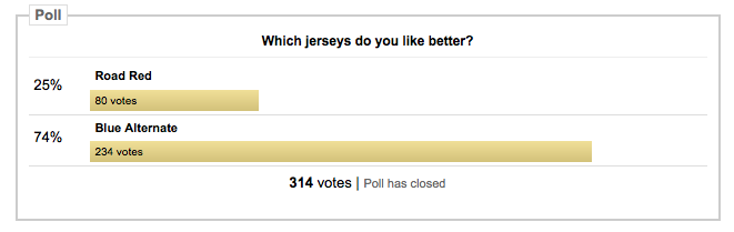
The only defining IU characteristic was a white helmet that, as you can see from this uniform analysis I did, brought us nothing but five losses and an average of 43.4 points against per game. Not good (plus, IU has no recent history in white helmets, just do away with them).

Now, while I understand why this new uniform set was created (1. To visually define a new era. 2. To get rid of those hideous previous uniforms. 3. To remind people of Oklahoma visually, and therefore co-opt their success and tradition. 4. The white helmet let the players have fun mixing and matching.), you were not the first person to do that with Indiana, Terry Hoeppner did it, too.

But not being original shouldn't be the only deterrence. Dressing up like another winning football program to inspire greatness and pride in one's own team is an old - and I would argue, incorrect - way of thinking. Just because you have the winged helmet design doesn't make you Michigan and just because you have a white helmet, you wont all of the sudden play like The U in the '80s.

When thinking about a visual identity, you should always think of Cool Runnings (yeah, I said it). When confronted with an identity crisis, Derice tries to find an identity by co-opting the Swiss team's. Sick of imitating the Swiss, Sanka finally stands up to Derice and explains to him that they cannot win by pretending to be something they're not:

"All I'm saying, mon, is if we walk Jamaican, talk Jamaican and is Jamaican, then we sure as hell better bobsled Jamaican."

What I propose to you is that last year's Oklahoma copycat uniforms were our Swiss team and the double stripe is IU's Jamaica.

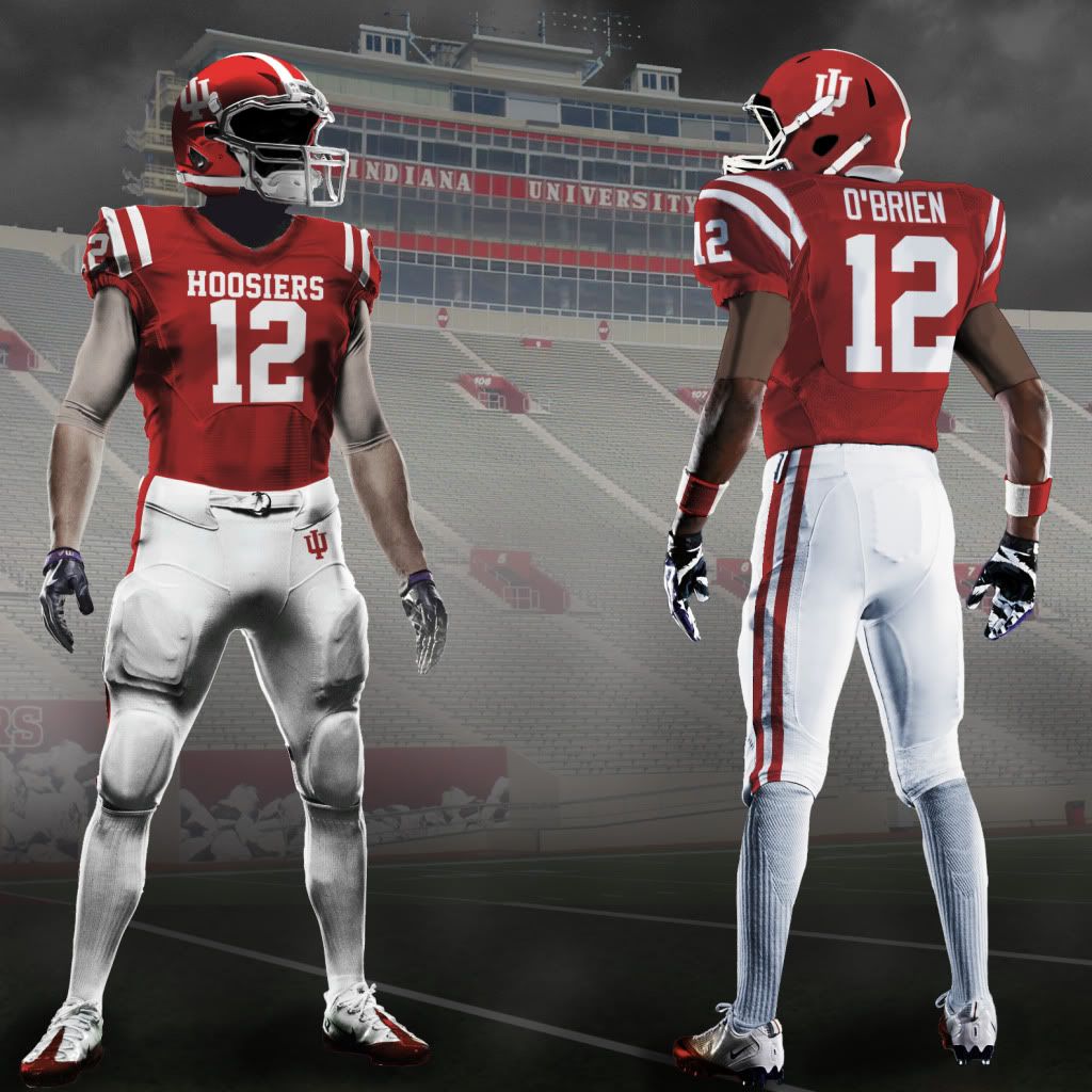
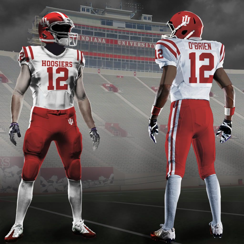
What do I mean by, "the double stripe?" Simple. I believe it is uniquely Indiana when the helmet, jersey and pants all feature double stripes (white then a space and then white on red elements, the reverse on white elements).

See for yourself (click on an image to enlarge it):

It is a simple, elegant uniform that is both modern and classic, just like the interlocking IU. The double stripe echoes the proud traditions of the basketball program but still states a unique take on the classic identity. No other team in major college football has a white double stripe on a colored helmet, and yet Indiana has it in its history and tradition.

With this red helmet, you can the extrapolate the uniform from there: White double stripes on the red jersey's shoulders, red double stripes on the white's shoulders; the iconic block 'Hoosiers' remains; a red double stripe on the home white pants; and white stripes on the road red pants. The red road pants are a key that will help define IU's unique image.

I know you might be thinking that all of this is much ado about nothing, or that it's just outright nonsense, but people at the University of Oregon would beg to differ.

Whether or not you think what Oregon (read: Nike) is doing visually with their football uniforms is irrelevant. What is clear is that both proponents and opponents of their aesthetic philosophy agree is that their unique branding and their attention to aesthetic details has brought them from obscurity to national prominence.

The fact that they wear 12 different uniform combinations a season does not make them good at football, but by flashing these shiny objects in front of the eyes of 17 year olds while recruiting and then allowing them to wear these duds as student athletes has gotten them recruits that otherwise would've gone elsewhere. Some of their recruits have even acknowledged this.

Still not convinced that uniforms are a powerful tool in recruiting? Here's a short list of teams who do:

  • Oregon
  • Notre Dame
  • Ohio State
  • Michigan
  • Stanford
  • Northwestern
  • Michigan State
  • Oklahoma State
  • Boise State
  • TCU

I could go on, but those teams (all of which played in bowl games this past season) all have played in unique uniforms and/or have played in 'one off' unis, like the Maryland flag uniforms - which were hideous but brought national attention to a program that is otherwise unimpressive.

But unlike Maryland (Under Armour) and Oregon (Nike), IU doesn't have to go the rout of just giving their uniform supplier (in our case, Adidas) free reign, we can go a more classical route, like the one Michigan took this year or what Ohio State has been doing for the past few seasons: Keep a traditional, beautiful uniform as the normal set and sprinkle in some throwbacks, fauxbacks and punchy new designs.

And one doesn't even have to go far from Memorial Stadium to find ideas, you can just look across the parking lot to Assembly Hall.

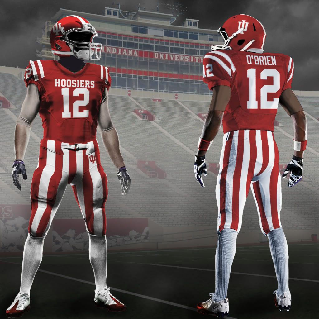
By taking some of the iconic Hoosier imagery and tradition imbedded in IU basketball, Indiana can adapt and add it to football. Namely, the candy striped pants.

How iconic are the pants? Google "Candy Stripe" and the first result is to Wikipedia which has a definition for it as, " Candy stripe, the warm-up style for the Indiana Hoosiers mens basketball team."

That's iconography you can believe in.

Now you may think those are a bit ostentatious, but Memorial Stadium already features the candy stripes, fans already wear the pants to games and, frankly, people seem to like my concepts with the candy stripes even if they admit that they're not all that practical.

What they are is 'fun', something IU football is rarely described as. And while even I, the guy who came up with this idea, think that these shouldn't be worn every game, it'd be fun to see them once and a while (maybe even around the time of Hoosier Hysteria...?).

Even if this idea is a real nonstarter, throwbacks are always fan favorites. Michigan rolled out a few throwbacks and fauxbacks this past season to much acclaim. Student athletes got cool new uniforms to wear, merchandise stores got new jerseys to sell and alumni got to wistfully remember their days on campus.

The Hoosiers could go back to an Anthony Thompson "Block I" throwback or go even further back to a design from the 1933 season, home or road or anything in between (heck, the Hoosiers wore powder blue in the early '50s). Anything is possible and most anything would be better than what we have now.

What I want most out of my Hoosiers is winning and respectability. I don't need national dominance, I don't need crazy uniform combinations every week and I definitely don't need to watch what feels like the Oklahoma freshman squad. I just want to be proud of how my team - my University - looks when they take the field, both in play and in dress. When I turn on the Hoosiers, just like in basketball, I want to see a team I can recognize as truly 'Hoosiers'.

Because if we walk like Hoosiers, talk like Hoosiers and be Hoosiers, then we sure as hell better play football like Hoosiers.

Sincerely,

Tim E. O'Brien

IU Class of 2010

Wednesday
Jan042012

What Was Old Is New Again

A few weeks back, over at Uni-Watch.com, I ran a feature piece on my take for NHL uniforms. While I wasn't quite finished tweaking NHL teams, commenter Mike D (whom I have to assume is the Mike D from the Beastie Boys) gave me the idea to take a crack at teams of yesteryear.

With such a great idea, I immediately got to work and found four teams ripe for an update. So what follows is first, a new look for four former franchises followed by a continuation of my take on current NHL teams.

The Defunct Series

California Seals: LOGO | CREST | HOME | ROAD | THIRD

The Seals - in their California incarnation in particular - had great colors and unis, but the logo reminded me more of a bird with a fish head than a seal. So I tried to remedy that with an updated logo and script.

The unis are basically just updates of previous unis. Though I had considered making the yellow jerseys the road uni and coming up with a different third, I figured this might go against NHL uni-policy.

Hartford Whalers: CREST | LOGO | HOME | ROAD | THIRD

This is the first team in the Defunct Series which I didn't feel the need to edit their crest. I did edit the whale logo a bit and I considered moving the whale tail up a bit higher off of the W but decided against it.

The uniforms are fairly straightforward updates of classic Whaler unis, but it was hard to keep the bold striping patterns of the old team on the new edge cuts. I'm not thrilled with my third. I tried a gray alt but that looked forced and the blue alt - to me - starts to encroach A LOT on the Canucks' identity (though, they seem to have just stolen a lot of good design ideas from the Whalers). If you have any better ideas for a third, let me hear 'em.

Minnesota North Stars: CREST | LOGO | HOME | ROAD | THIRD

With the North Stars, the first thing I tried to do was fix their logo. To me, a team named the North Stars should have a logo that points north (up), not northeast-ish (up and to the right). After that, these home and road are actually pretty similar to my Dallas Stars set (with notable and significant differences), which makes sense since those were partially based on old North Stars unis, but I give these unis their own flare (like the arrow and star on the pants).

I love the Third jersey here, which is a fauxback, and even considered making the home and road based off of this pattern, but decided to go with the more modern feel for the regular unis.

Quebec Nordiques: CREST | HOME | ROAD | THIRD

I think the old Nordiques logo is a train-wreck. Now, I understand that, design aside, people love the 'Diques logo, so - just like the Seals - I tried to update the logo while improving the design.

From what I gather, the old logo was a mashup of an N, an igloo and a hockey stick and puck. First, I rid the logo of the hockey equipment (we know you play hockey) and I give the logo a much more balanced overall shape. The door to the igloo is framed by an N for Nordiques and also appears as an entrance to a stereotypical igloo.

I even flirted with a wordmark alternate logo, but decided that might be a bit much.

The home and road unis are pretty much just updates but the third is an homage to the flag of Quebec.

The American Classic:

Who ever said fantasy has to be realistic? In my world, the NHL would add more outdoor "classics" and this particular one would take place in Oakland California.

Pitting the Minnesota North Stars vs the California Seals, both teams would wear throwbacks to 1975-76 with their current (Tim E.-created) logos and slightly altered pants stripes.

The Heritage Classic:

The second classic I would add would be a return of the Heritage Classic - the Canadian team version of the Winter Classic.

Quebec would host this Canadian outdoor game and face an old WHA rival, the Hartford Whalers.

Once again, both teams would be wearing throwbacks to 1975-76 but this time the unis would be dead on replications of the '70s originals.

Hockey TimE

Calgary: HOME | ROAD | THIRD

These unis are a combo of throwback and current designs. All the unis feature some black but the main striping patterns come from the era of the Flames singular Cup win.

For the captaincy patch, I use the Calgary Flaming C logo and for the alternate captains, I use the Atlanta Flames Flaming A logo.

Colorado: HOME | ROAD | THIRD

A more mountainous feel on the unis (and pants) that evokes earlier, happier times in Colorado. I also removed the black helmet and pants and eliminated gray except for on the crest.

The third is inverted Home colors, which some have said is almost indistinguishable from the Home uni, but I say, what's so wrong with that?

Detroit: HOME | ROAD | THIRD

No change, home or road. The Third is a 'heritage' design that honors elements of past uniforms while incorporating some modern and all new elements.

I've always really enjoyed the Red Wing's wordmarks, so I tried to highlight them in the Third jersey.

New Jersey: HOME | ROAD | THIRD

The Devils don't need too many changes. I did very minor stuff on the home and road, but I bring back the old green jersey from Jersey's first 11 seasons and bring it back as the permanent third. It's classic uni that deserves to be seen at least a few times a year.

New York Islanders: HOME | ROAD | THIRD

Well, the Islanders decided to shit all over good design with their third jersey so I decided it was time to work on the Isles.

With the home and road, I return the look that won four Stanley Cups, a classic and simple uni.

As for the third, I used the current home uni striping and add my new secondary logo (inspired from the Whalers' old logo) to the chest.

 _____

Well, that's it for now, until next time, happy tweaking.