
Logo Cup Playoffs
![]() With the Stanley Cup Playoffs kicking off today I thought I might try and pick the Stanley Cup Playoff series.
With the Stanley Cup Playoffs kicking off today I thought I might try and pick the Stanley Cup Playoff series.
But being that I'm all about logos and uniforms, I thought I'd make my picks in a bit of a unique way: The team with the best logo moves on.
Without further adieu, here are my picks in the 2012 Logo Cup Playoffs:
The West
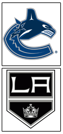
1 Vancouver Canucks vs 8 Los Angeles Kings
This series isn't really close. The Canucks have a great logo and the Kings have a below average logo. While the Kings' logo isn't awful on it's own, compared to a great logo, it just doesn't have enough to overcome its flaws.
Vancouver in 5
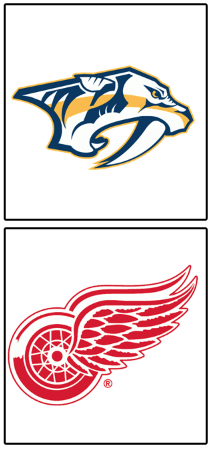
4 Nashville Predators vs 5 Detroit Redwings
This is a case of another giant taking on a mere mortal.
The Redwings' logo is one of the best in all of sports, and while Nashville's logo isn't bad, Detroit's is far superior.
Redwings in 5
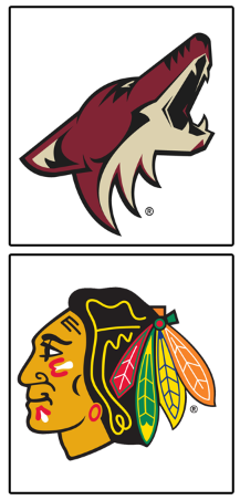 3 Phoenix Coyotes vs 6 Chicago Blackhawks
So far all of the West's series have been one sided.
This series continues the trend.
Blackhawks in 5
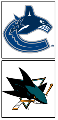
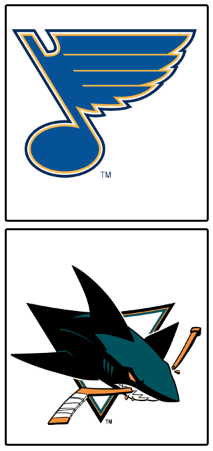 2 St. Louis Blues vs 7 San Jose Sharks
Finally a match up worth watching. Both are average logos, but the Sharks' logo is just a little bit better.
This series is closer than the first few, but still a pretty decisive victory.
Sharks in 6
 1 Vancouver Canucks vs 7 San Jose Sharks
This is the first real battle and boy is it a good one.
The Sharks have great colors and an awesome logo fit for a hockey jersey, but the Canucks have a Haida art-inspired orca that doubles as a 'C'.
Canucks in 7
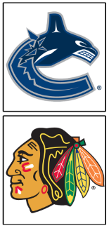
 5 Detroit Redwings vs 6 Chicago Blackhawks
If they were in different conferences, this could easily be the Stanley Cup Finals match up.
But fortunately, they aren't (and we get to watch these two great logos play at least 6 times a season).
This is so close it's ridiculous.
Blackhawks in 7 and like six overtime periods
1 Vancouver Canucks vs 6 Chicago Blackhawks
The Canucks' logo is good. The Indiana Head is legendary.
Sorry LeBrongo. Be careful leaving the stadium.
Blackhawks win the West in 5
The East
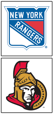
1 New York Rangers vs 8 Ottawa Senators
The Rangers have tradition, the Senators have... high fastening pants.
Rangers in 5

4 Pittsburgh Penguins vs 5 Philadelphia Flyers
If the Penguins still used yellow instead of gold, this would be over in about five or six.
As is, the logos are both pretty great and pretty close.
Pittsburgh in 7
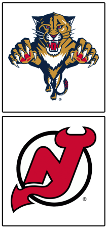 3 Florida Panthers vs 6 New Jersey Devils
I like both of these logos.
The Panthers' is so complex, it really can only work as a hockey crest. The Devils' is so simple, it's elegant.
It's close but an easy choice.
Devils in 6
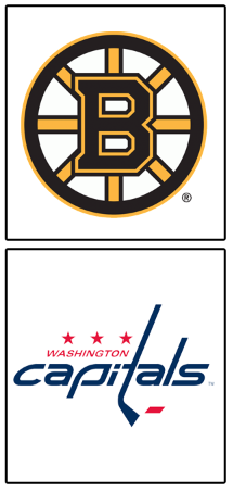
2 Boston Bruins vs 7 Washington Capitals
Against a quality opponent like the Bruins' logo, the Caps' just doesn't stand a chance.
Bruins in 5
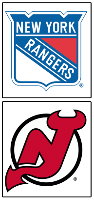
1 New York Rangers vs 6 New Jersey Devils
The battle of the Hudson.
Again, both teams have quality logos, but one is just better.
Devs in 6
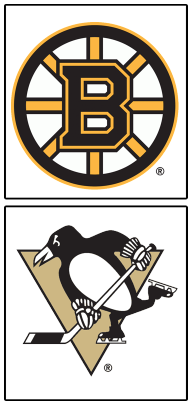
2 Boston Bruins vs 4 Pittsburgh Penguins
Again, this would be a different story if the Pens had yellow and not gold.
Since they don't, my decision is harder, and not in Pittsburgh's favor.
Bruins in 7
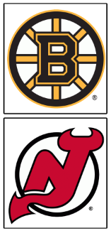
2 Boston Bruins vs 6 New Jersey Devils
Both logos have great history but the Bruins has the type of history and pedigree that breeds championships.
Bruins win the West in 5
The Finals
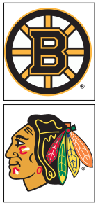
Boston Bruins vs Chicago Blackhawks
Home ice advantage won't be enough to overcome the Indian Head.
Blackhawks in 6
 Tim E. O'Brien
UPDATE:
I also have a uniform based bracket. Teams with home ice advantage get to wear (IMO) the best uni they currently wear. Road teams wear the worst (IMO) they currently wear:
Click to Enlarge
![]()
Reader Comments