
Uni Analysis: The 2012-13 Wildcats (From The NUni Tracker)
An historic season is in the books for the Northwestern Wildcats. The third 10 win season in school history, the first bowl win since 1949 and Coach Fitz moved into sole ownership of the title of winningest head coach in Northwestern history.
As I have done over at the Hoosier Tracker the last two years, I have decided to go element by element and analyze which uniform elements and combinations were the most successful for the 'Cats this past season. So let's get to it and start with the uni combinations:
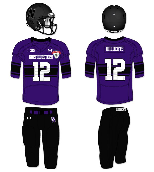
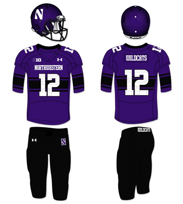 Purple/Purple/Black: 4-0 33 PFPG 16.5 PAPG
This combo was the most worn combination all season. Of the combinations worn more than once, this one had the most stout defense and was second in points for per game. What is truly amazing, though, is the disparity in points for and against, especially considering that the Vanderbilt and Illinois wins were not in this combination. While it is a solid, winning look, I would still like to see some Purple/Purple/White next season.
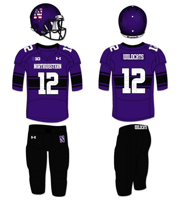
America/Purple/Black: 1-0 23 PFPG 13 PAPG
Behold the Vanderbilt game. The first home game in the uniforms and Coach Fitz has to go and slap a flag themed logo on the helmets because it's early-middle September. Listen, I get that you have a relationship with some military members and you go do that training session in Wisconsin every year, but September 11th was not a military attack and probably barely directly affected anyone on this particular football team. What you do to honor servicemen and women at halftime and during games is commendable, this silly decal? It feels like a gimmick - something well beneath what people who serve deserve.
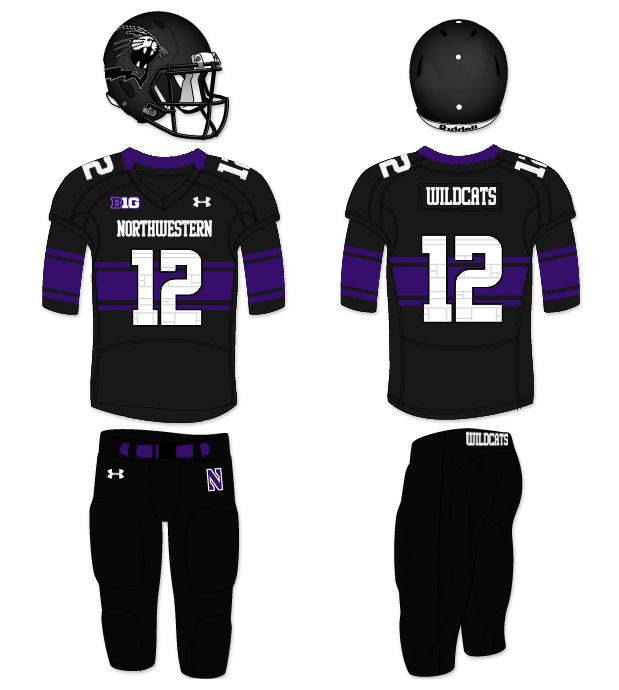
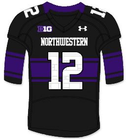
Black/Black/Black: 0-1 28 PFPG 29 PAPG
1. The first all black uniform in school history.
2. The first black helmet in school history.
3. The first helmet to feature a logo different from the 'N' since 1980(The Adidas one-off helmet had no logo, only numbers).
This set will be known as a history making set for many reasons. Unfortunately, it'll be best known for being worn when Northwestern blew a two score lead in the fourth quarter against Nebraska. All black? Not a good look for the 'Cats...
Black/Black/Purple: 1-0 50 PFPG 14 PAPG
I believe Northwestern played a high school this game. What's that? Illinois? Sheesh, I hope they fired that guy who got two sideline interference penalties. NO‽ See you in Champaign, Illini!
But in all seriousness, this look would be GREAT, with the normal helmet. It would be a nod to the success of the mid '90s and early aughts and would still be part of this great modern Under Armour set. Also, please don't ever wear that helmet again, the logo just doesn't work like that and the silver and black makes it nearly invisible.
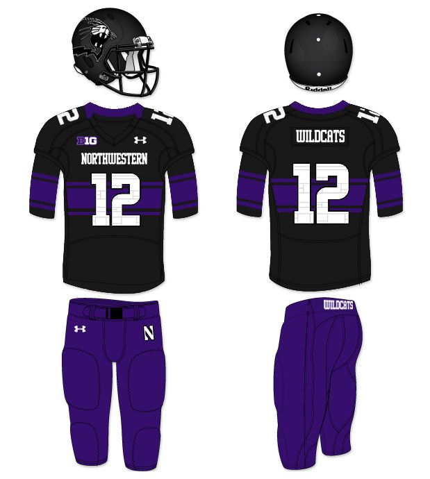
Black/Purple/Black: 1-0 34 PFPG 20 PAPG
The first bowl win since 1949 and the Wildcats wore a purple jersey with a strongly featured Northwestern Stripe, what could be wrong?
A: The helmet. Now, let's be clear, I don't even mind that they wore the matte black helmet again - Black/Purple/Black, in and of itself, is not a bad look - but the logo was damn near invisible again and while I'm glad it was the iconic 'N', Had it been purple or white, I would've been in love. This uniform is a nice change from the norm, but I like the idea of Purple/Black/Purple even more.
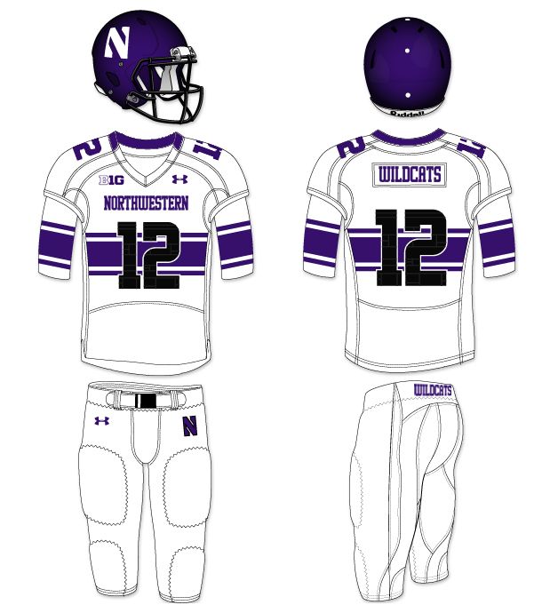
Purple/White/White: 1-2 33.7 PFPG 39.3 PAPG
The only uniform set with a worse points against average than points for, there is just one, simple, undeniable take away: Don't wear the white pants with the white jersey anymore. That should be an easy concept, as Northwestern has - in the past - rocked both purple (think Darnell Autry) and black (think Zak Kustok) pants on the road to great success.
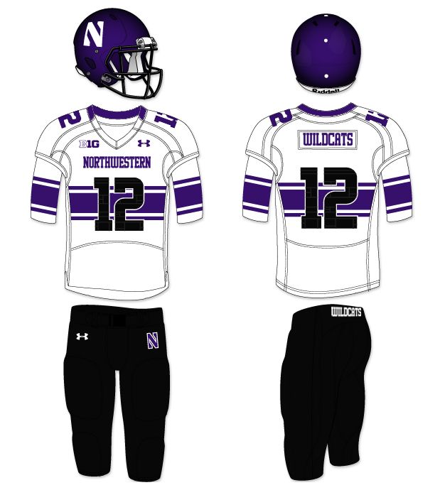
Purple/White/Black: 2-0 22 PFPG 16.5 PAPG
The clear road uniform leader in the clubhouse. I still hope to see purple pants on the road next season, but the black is a nice look with ties to the successful recent past.
Purple Helmet: 7-2 30.8 PFPG 24.1 PAPG
The classic, standard Northwestern helmet had a helluva season. Not the most successful on offense or defense, the helmet had a somewhat unremarkable season. However, it's still the best lid the 'Cats wear, in my book.
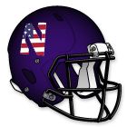
America Helmet: 1-0 23 PFPG 13 PAPG
As said above, this was the Vanderbilt game. It's just not a good logo. Please dump it.
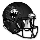
Black Cat Helmet: 1-1 39 PFPG 21.5 PAPG
In it's two appearances, the outcomes could not have been different: A blown lead against Nebraska and blowout against Illinois. The 'Cats were going to beat Illinois if they came out of the locker room naked, so really this helmet should be judged by its performance against the Huskers. Not good. Retire it.
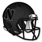
Black 'N' Helmet: 1-0 34 PFPG 20 PAPG
You can't argue with the first bowl victory in 64 years, can you? It's not a bad helmet, but it isn't as good as it could be. Helluva win though...
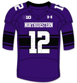
Purple Jersey: 6-0 31.8 PFPG 16.5 PAPG
Both undefeated and the best defensive jersey. The purple jersey is both successful and one of the best new jerseys of 2012. Highlights include the bowl win, two victories over SEC teams and a points for to points allowed ratio of almost two to one. Tough to beat out the Purple as Northwestern's best new jersey.
Black Jersey: 1-1 39 PFPG 21.5 PAPG
While the most offensively explosive jersey, the black jersey was a mixed bag this season. Just like the Black Cat helmet, this jersey was there for a season high and a season low. Now, if the 'Cats were to pair this jersey with the purple helmet and pants, I could almost root for that to be the dominant home set, but alas, we'll have to wait until next season to see if my dream comes true.
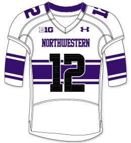
White Jersey: 3-2 29 PFPG 30.2 PAPG
Worn for every road game, I think any 'Cat fan can take away a few lessons:
1. The black pants saved this jersey's record.
2. If at all possible, don't play road games.
Obviously, the points for to points against ratio is bad, but it's tough to win on the road. This jersey should be commended for it's boldness, unlike the other jerseys, the Northwestern Stripe is so bold it cannot be ignored. It's a great look and I can't wait to see it with the purple pants.
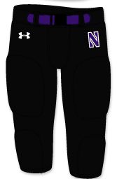
Black Pants: 8-1 29 PFPG 17.9 PAPG
Worn nine time, these pants have an amazing record. Their only loss is the Nebraska game, but we can blame that on the Black Cat helmet. This amazing record should be taken note when it comes to road games. I love the black pants, but they still aren't my favorite.
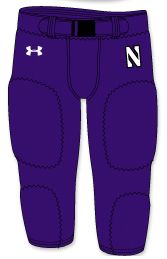
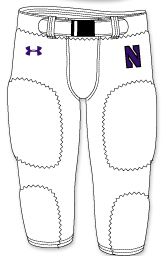
Purple Pants: 1-0 50 PFPG 14 PAPG
This is the Illinois game. The only time they were worn, the 'Cats played their most dominant game. Take note Fitz, the purple nickers need to be worn more often. These are the best pants of the bunch.
Purple Pants: 1-2 33.7 PFPG 39.3 PAPG
Worn only on the road, I wish we could've seen these at least once at home. Perhaps next season I'll get my wish...
Well, that's 2012-13 in a uniform. It was an amazing season in which things I hadn't ever seen from a Northwestern team seemed to happen every week - even before the season started - and that culminated in a dream come true: A Bowl Victory.
Go U Northwestern.
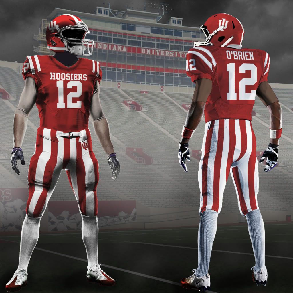
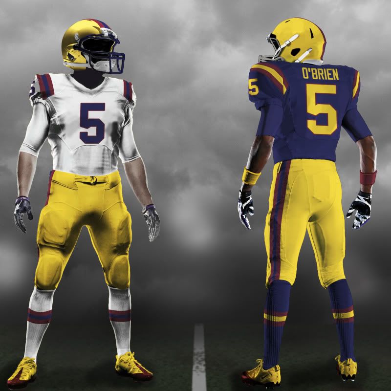
 Uniform Concepts