Entries in NBA (22)

Sunday
Mar062011

Weekend Work and Preview

You would think that since I'm unemployed, my weekends might be pretty lazy. Actually, I get a lot of work done on the days that start with S.

Speaking of S, remember the Seattle SuperSonics? Me too. And since they left for OKC and since people have been noticing that almost every team in the NBA has a basketball in either their primary or secondary logo I decided add a basketball logo into my Thunder rebrand.

So looking back at the Sonics (top right), I look forward to the OKC Thunder (below).

And when fooling around with that design I noticed that the lines on the basketball almost spelled out OKC.

So I made it spell out OKC.

And of course I had to change the court to fit the new logo (and I found bigger versions of the courts).

And here are the logos and court with the black/gray color scheme.

And since I found the new, bigger courts, I went back to Denver and Sacramento and did them again as well.

Next Week

Not sure what is going to be released when but here's a few hints at what I have lined up for next week, until then...

Thursday
Mar032011

Requests

Since the wonderful people over at UniWatchBlog.com highlighted my work with the OKC Thunder, I have received crazy amounts of page views, complements and even some requests.

Over the past few days I've tried to respond to all the emails and requests sent to me and here are some of what I have been working on.

First off, Dave N. writes:

I am 55 years old, and when I was a kid, I loved the LA Rams. The "Fearsome Foursome", Roman Gabriel, Jack Snow, Eddie Meador and so on. In the late 60's, they always seemed to battle out with the Colts for the Western Division crown.  Sadly, the Colts were always just that much better, or it could have been the Rams that lost to the Jets in Super Bowl III...!

Back then, the Rams were blue & white. No Yellow. Now I know historically there was yellow, or gold, but I used to love the look of the Rams in there white jerseys, pants & and white Ram logo on the helmets. It was a classic look. They very rarely wore there blue jerseys, and were a bit like the Cowboys in not liking to wear them.

Whenever I see Uniform tweaks, no one goes back to that classic era of blue & white. I for one, would love to see them do that.

Well Dave, ask and you shall receive. I like the white and blue color combo too but the Colts already 'own' that look, in my opinion, and the maze and blue is a classic football color combo missing in the NFL.

While I still prefer the yellow look in a redesign of the Rams unis but these beauteous throwbacks should be a go-to for your Rams

Next up Rob (I'm guessing from Ohio) asked me to take a look at OSU and the Bengals:

I am AN Ohio State alum and lifelong fanatic, and although I love the current football uniforms and feel they are nearly perfect, I've always thought the numbers on the home scarlet jerseys should be gray.  I also want some gray on the sleeve stripes, just like the road uniforms currently feature.  I think this is an even better idea now that Nebraska is joining the Big 10.  We already have similar jerseys to Wisconsin and now the Huskers come in wearing bold red.  The extra gray would set OSU apart, especially for the fans who don't walk around wearing gray helmets and football pants to differentiate themselves like the players do.

Also, unfortunately, I'm a Bengals fan.  Your concepts for them are definitely a huge improvement over the current clown suits they call uniforms.  I'd like to see some more subtle designs and I think they should retire the stripes.  Since burnt orange is closer to the actual color of a Bengal tiger, I think helmets of that color with the growling tiger head logo they have on the side (and maybe a single black stripe down the middle) would look great.  Simple, classic jerseys and pants featuring burnt orange, black, and white trim would look awesome.

With OSU, I removed almost all the white and replaced it with gray - except for the road jersey's main color.

As for the Bungles, I made the shoulder and helmet stripes a bit 'tiger-y' and gave them the standard NFL stripe (color on either side of white) on the pants.

Forrest P. comes in next with a few ideas for Michigan State:

I was wondering if you could do a set of msu football jerseys with the new color and font and maybe a pro combat alt.   I am terrible with photoshop, but i always thought using the new bronze on their jerseys for the helmet (ie: the movie 300) and going off a similar motif from the movie.

Here is the dark green and new font:

As for the 300 inspired unis, Forrest touched a nerve with me. One of my closest friends is a Sparty fan and I am a Greek history buff. I have always wondered how a team named after Spartans can wear any color other than red when the ancient Spartans were famous for donning the color (and Sparty himself wears a the garb of Roman Centurion, I mean come on...).

I took some liberties with what you might have thought in terms of coloring and accuracy to 300 but I think  they turned out well.

Kyle D. came looking for some IPFW Mastodons ideas:

Like your work. Anyway you could put together a basketball uniform concept for the IPFW Mastodons? Thanks!

In my concepts, I took the Mastodons' logo (which features a triangle symbolizing the convergence of Indiana Purdue and Fort Wayne) and modified it for the front of the jersey.

Finally, Bryan B. gave me a heads up on this contest to design an Oklahoma fan t-shirt. My alma mater, Indiana, did something like this a few years back and the shirt ended up sucking. For the Sooners, I flipped OK on its side and made it look like a foam finger (and if you click on the image you can read all of the contest stipulations).

Well, that's it for now, I think I have a few more NBA concepts coming in the next week but if you have any requests feel free to shoot me an email here.

Update:

Many people suggested I put the front uni numbers on my road Thunder concepts in between 'Oklahoma' and 'City'. So once again, ask and you shall receive:

Thursday
Feb242011

Tidbits and Nuggets

Melo's gone. It's time to reload in Denver.

And how do you reload best? That's right, by letting me redo your logos. unis and court.

Yay.

Once again, I find history calling to me. The logo to the right is from 70s and 80s and went along with this uniform. I decided to bring both back but update them a bit.

Unfortunately those colors, purple and yellow and red and blue, completely clash, so I decided to make both the logo and uniforms match.

The colors I chose? Midnight blue and an orange-y old gold

I just love that miner but this font is where it's at.

As for the unis, like I said, I'm just updating that classic look linked above.

But there were also some fun alternate ideas with this color scheme. In fact, I think I like this blue uni better than the one above.

As for the Pepsi Center, I think the color scheme looks fine and dandy in this mock-up.

But just updating a classic uni is so boring, especially when you're dealing with an organization that wore this for years. With that in mind i looked up Denver's city flag...

Wow. How could you not get inspired?

Well, those are my Nuggets conepts, tell me what your ideas in the comments.

† If you enjoy this rebrand, please check out my other uniform ideas in my Uniform Concept page. I'm always willing to take critiques, praise or requests (which this was).

Thursday
Feb242011

The Emperors' New Clothes

The Sacramento Kings have problems. I thought Mike Bibby was the best player on their team but he just got traded to the Washington Wizards.

...from the Atlanta Hawks. Whoops.

Word came to me recently that the Kings have other problems, like the aging ARCO Arena.

With relocation a probability, it's the perfect time for a rebrand.

Now, looking back at the Kings' history we can see some pretty fantastic design but as of recent their uniforms have been tragically hideous.

In the future, we may not know where the Kings will be but I have a few ideas no matter where they end up.

Looking back to the great 70s logo of the Kings (seen above) I took that logo into 2011 by updating the ball, fixing (IMO) the crown and matching the font (Bauhaus 93) with the 60s/70s feel of the logo.

If the Kings decide to stay in The Sac they may choose to keep their current color scheme.

If they do, a simplistic faux-back design may work and instead of an all black alternate, the alternate matches the color order of the logo.

Now if the Kings decide they would prefer to play with the Ducks in The Pond, they may choose to go back to an older color scheme.

Simplistic but still better than what they wear now.


And to go even more 60s/70s feel, lets throw in some kick ass 70s striping.

But really, who knows where the Kings will be next year, odds are they stay somewhere in California so why give them the exact same color scheme as the Clippers (and because what's more Kingly than royal blue and the color of royalty)?

Mash the old and the new together and you got yourself one dandy color combo, if I do say so myself.

But my pièce de résistance comes from when you add the color scheme to the 60s/70s stripes.


Now that's one helluva uni.

And of course, here is the Kings' court (get it?).

Well, those are my ideas, tell me what you think in the comments.

† If you enjoy this rebrand, please check out my other uniform ideas in my Uniform Concept page. I'm always willing to take critiques, praise or requests (which this was).

Monday
Feb212011

Thunder Up(date)

Over the past few years, I have had two friends of mine try to convince me that the Thunder are the greatest team of all time.

Little did they know, I could've cared less about the NBA.

But recently I've started to get back into basketball and while the Chicago Bulls will always be my team, the Thunder do seem to be one helluva fun team.

Part of the rekindling of my interest in the NBA comes from my recent purchase of NBA 2K11.

Part of the reason I am falling for the Thunder is because my 'create-a-player' was traded to the Thunder and has been flourishing ever since.

Unfortunately for the Thunder, their team identity sucks.

No, it's not the players - how could you not love KD, Westbrook, Ibaka and D.J. White? And no, their players don't have gun possession charges - or worse.

Their problem stems from their shitty logo (and I'm not the only one who thinks so).

The Thunder's current logo means nothing, signifies nothing and doesn't come close to evoking Oklahoma or thunder.

Failure.

So, being that I have free time and enjoy this sort of thing I took it upon myself to rebrand the Thunder.

Logo

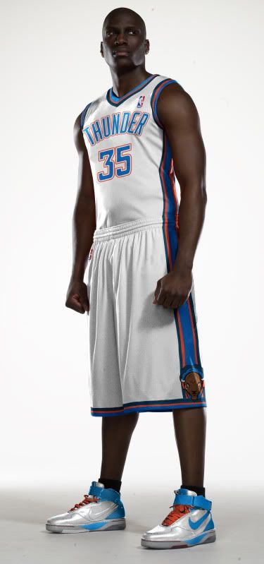
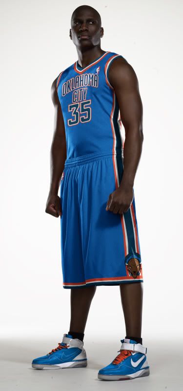
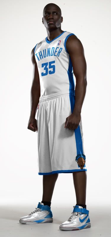
A random basketball, a shitton of colors, two bizarre streaks of color and an 'OKC' that is so oddly placed it's a surprise it's actually a part of the logo. None of that works, none of that screams Oklahoma City and none of that epitomizes or even symbolizes thunder.

So how to correct this? Well, I thought about the thundering herds of bison that used to roam Oklahoma and the west. Herds so large, they would kick up clouds of dust, and that's where my idea takes off:

As you can see, I kept the Thunder font and three out of the four colors they currently use (sorry yellow, there were just too many damn colors). The buffalo head incorporates the theme of lightning bolts and the eyes are the orange/red of the team colors.

Here is just the head and cloud logo by itself.

And here is an alternate logo where the buffalo is at an angle kicking up dirt into the clouds.
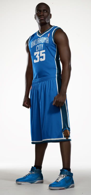
Uniforms

And being that I got rid of a color and changed the logo, that calls for a uniform edit - although I really like the current Thunder uniform set. I tried to keep the unis as similar to the current set as possible.


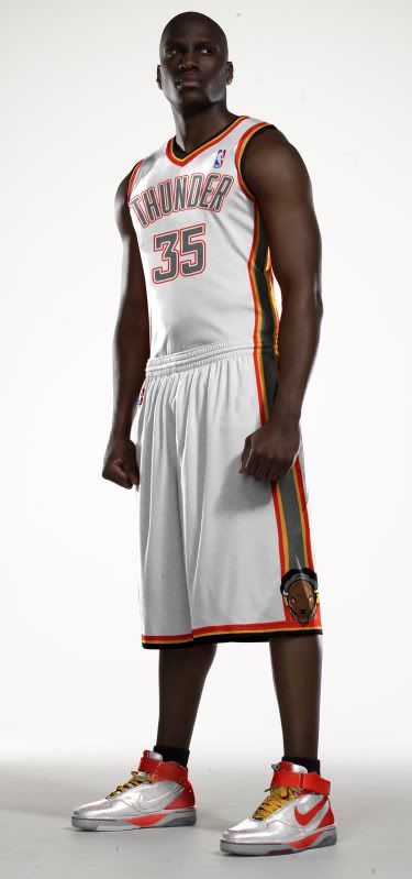
And just for Shits'n'Gigs I created some faux-backs for the Thunder.
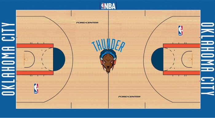
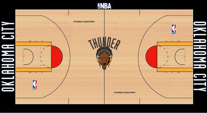
   

Court

And of course, if you change the logo, you have to change the court.
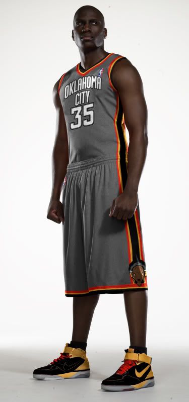
Recolorization

And I figured if we're going to change the image of the team, we might as well take a whack at changing the team colors. I ditched the shades of Oklahoma State flag blue in favor of black and gray - like storm clouds - and the accent colors are red/orange and yellow to evoke lightning, fire and explosiveness.

Logos:

Unis:


Court:

Well, those are my ideas, tell me what you think in the comments.

*If you enjoy this rebrand, please check out my other uniform ideas in my Uniform Concept page. I'm always willing to take critiques, praise or requests.

**Full Disclosure: While I was influenced by Marshall's buffalo logo, I created these logos from scratch using Photoshop CS5.