Entries in NHL (8)

Wednesday
Jun152011

Soaring High

Recently, the people over at Uni-Watch.com and ESPN.com announced a contest to rebrand the Atlanta Thrashers for their move to Winnipeg. While I came up with a pair of concepts, my design of the "Manitoba Falcons" made it to the reader voting level.

What follows is an in-depth look at my design of the Manitoba Falcons:

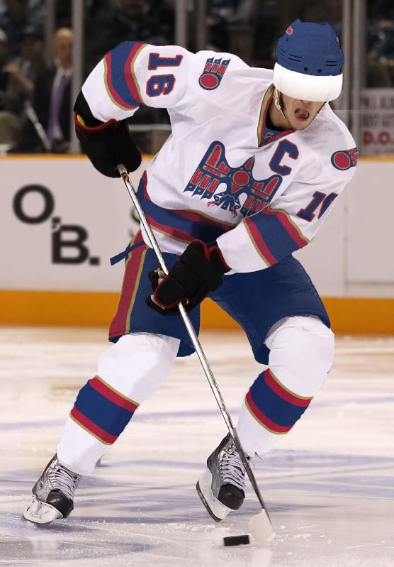
I based my primary logo design on art styles from the indigenous Haida people of Canada and specifically on their depictions of raptors (eagles, hawks, Falcons, etc.).

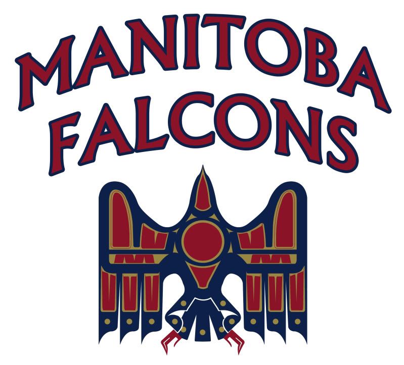
With my falcon logo, I tried to convey an image that is uniquely Canadian. This falcon is meant to appear in flight - which is why we do not see its face - to represent both the freedom of the Great White North and the fluidity and constant movement in hockey.

Its wings and body vaguely form the shape of an M - for Manitoba - and also have smaller, traditional designs that resemble Ms. In the center of the falcon is a red puck. The symbolism here is clear: Hockey is the lifeblood of Canada and at the heart of Canadian culture. On either side of the puck is a hockey stick.

As for the Secondary logo, the red puck makes a return with addition of feathers from the primary design. Not too much symbolism behind the flying puck...

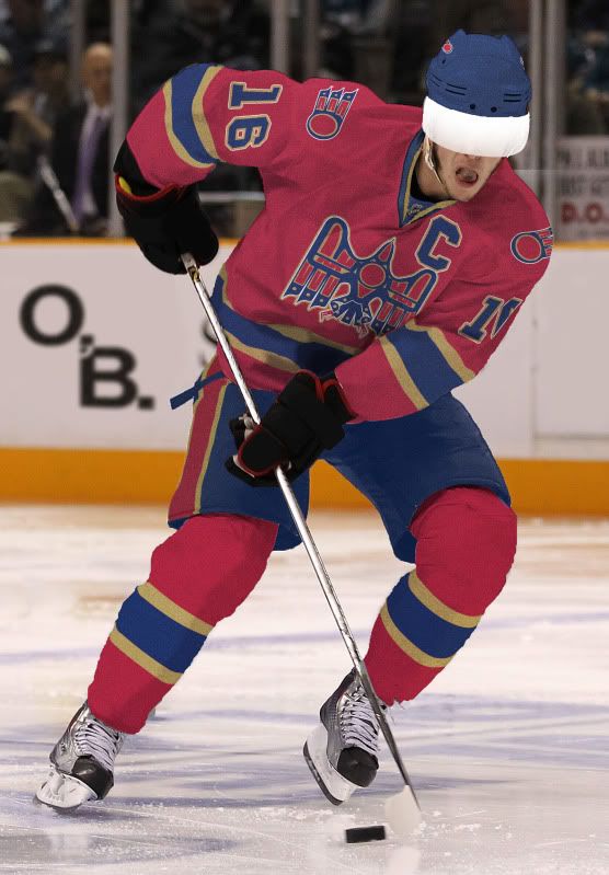
Before I get to the uniforms, I'd first like to explain that the design (bird motif) and color scheme (blue and red) are an homage to both Atlanta and Winnipeg. The gold should remind Winnipeggers of their once beloved Moose without hitting them over their head.

The Home Uniform: A classic red - almost burgundy - jersey is contrasted with blue pants and helmet. The socks are also burgundy and feature the same classic striping that graces the jersey.

The Road Uniform: The road white jersey is paired up with matching socks but the blue helmet and pants are here to stay. I added a thin gold stripe to the outside of the jersey and socks striping to incorporate the gold onto the road uni. Other than that, the roadies look good.

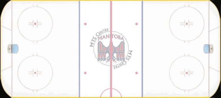
...And MTS Centre is gunna look good, too.

If you like my design, go here and vote for my submission to win the Uni Watch contest.

Saturday
Jun042011

Cross-Dressing Revisited

It's been a while, but I assure you, I have been very busy.

Over the next few weeks, I'll have more concepts and work to post but much of it is either tied up in Uni-Watch.com projects or isn't quite ready to be unfurled.

But today I bring you a quick-hitter revisiting the idea of taking a team from one professional league and dressing them up in another.

All of today's teams are going to MLB (coming from the NFL and NHL) and - I think - they all turned out pretty well.

Let's get to it:

Bears - Home, Home Alt, Road - So these aren't how they wear the whites in the NFL, but this is a MLB project. Not a huge fan of the dark pants but Bears tradition says you can get rid of them.

Blackhawks - Home, Road, Road Alt - So these aren't how they wear the whites in the NHL either, but like I said above, this is a MLB project. Unfortunately the dark pants are the only option in the NHL but i think the crest as a heart patch works nicely.

Chiefs - Home, Home Alt, Road - I think this Chiefs design may have turned out the best out of all of them. It's clean, simple and very translatable to baseball.

Patriots - Home, Road - And this is where the idea doesn't go so well. Too much white, cheesy wordmark and a guy holding a football. I guess I could've gone with Flying Elvis but I just don't like that uniform/design.

Finally, the requester asked me to explain how I create these 2D MLB concepts. Well, without knowing what program people use, it basically goes like this:

  • First, I download the template I need from places like SportsLogos.net.
  • Next, I download the logos I need from SportsLogos.
  • I open up the template in my image editing program (personally I use PhotoShop) and I draw on the colors and stripes.
  • Penultimately, I place and resize the logos where I want them and then,
  • Finally, I save the whole thing a a JPEG file and upload it to the internets.

Pretty simple stuff.

Happy tweaking, and until next time...

Tuesday
Apr262011

Cross-Dressing 

I've been gone for a week, miss me?

The other day, I was inventorying some of my graphic design and sports concept works when I stumbled upon this.

That Chicago Blackhawks football uni predates all my IU concepts, my NFL concepts and  my NBA Concepts. That was one of the first designs I ever did using the Nike Pro Combat template (Though I'm not quite sure why I gave Pat Kane the Captain's C, why not just put #19?).

When I was reminiscing about my early uni-tweak days, I came across the page of Majestic NHL baseball jerseys. Well, and idea immediately came to mind: What If I redesigned teams' uniforms to fit other sports' jerseys?

I decided to switch around all of Chicago's major sports teams (sorry Fire). My Rules were basic, first, I arbitrarily started but whatever uniform template I dealt with (i.e. basketball), that Chicago team (i.e. the Bulls) would be the next design I would do. This will become clearer soon.

Next, if only because cuts of jerseys are so different, some changes to every uniform had to be made. Most changes fall into one of two categories:

  1. The design doesn't fit on the template. Or,
  2. The design change fits the template's sport better than a copy/paste version of the uniform.

Some look better than others - much better - but I think this is a fun idea to play around with uniform design.

On to the Cross-Dressing.

Bears in the NHL - Home and Road - This quickly turned into my favorite design. Old football uniforms and modern NHL uniforms actually have similar cuts. Hell, they look closer than old NFL unis and current NFL unis do. I decided to put the Bear's head logo on the front of the uni to go with the hockey theme but also because it's a great but underutilized logo. The Bears' 'C' makes a perfect captaincy patch.

Blackhawks in the NBA - Home and Road - I decided to put the Hawks in the NBA this time since I had already created NFL unis a while back. In contrast to the Bears in the NFL, I think these concepts are probably the worst in the bunch.

Different colored shorts don't really work in the NBA and the jersey striping is just upsetting but, hey, they can't all be winners. (also, I didn't include their third jerseys since they are featured in the NFL design above)

Bulls in the MLB - Home, Road and Alternate - These I think you'll either love or loath. Now the only real change to the Bulls uniform design is the that front number is moved off-center to fit better with the MLB template. The Bulls' unis actually used to feature off-center front numbers, so it's not even unheard of.

No road grays for obvious reasons and solid color road and alternates may make some baseball purists ill but you could always mix and match pants and jerseys. And with the Bulls playing in the MLB, maybe they bring back the pinstripes.

Cubs in the NFL - Home and Road and Alternates. With both Chicago baseball teams, they really only have three jerseys (home and road pants under the same colored top do not make two alternates) so with the Cubs a brought back the old Blue on Blue pinstripes as a road alternate option.

I also brought back an old 'CHICAGO' font and the old Cub's head logo is on all the left sleeves.

White Sox in the NFL - Home and Road and Alternates. Now I cannot claim this idea as my own, but having two black alternates, one base on the home jersey and the other on the road jersey, is a great way for the Sox to diversify their uniforms (they wear their current black alt for most home and road games - it's getting a bit old).

The thing I liked most about doing these baseball uniforms for a football template was how it shows that a football uniform doesn't just need to be a uni number and that's it. I don't think I'd recomend pinstripes anytime soon but this shows that there's room for design change in football.

Well, that's all for today. As always, I hope you enjoy something and feel free to leave comments or questions.

Page 1 2