Entries in NFL (8)

Thursday
Mar032011

Requests

Since the wonderful people over at UniWatchBlog.com highlighted my work with the OKC Thunder, I have received crazy amounts of page views, complements and even some requests.

Over the past few days I've tried to respond to all the emails and requests sent to me and here are some of what I have been working on.

First off, Dave N. writes:

I am 55 years old, and when I was a kid, I loved the LA Rams. The "Fearsome Foursome", Roman Gabriel, Jack Snow, Eddie Meador and so on. In the late 60's, they always seemed to battle out with the Colts for the Western Division crown.  Sadly, the Colts were always just that much better, or it could have been the Rams that lost to the Jets in Super Bowl III...!

Back then, the Rams were blue & white. No Yellow. Now I know historically there was yellow, or gold, but I used to love the look of the Rams in there white jerseys, pants & and white Ram logo on the helmets. It was a classic look. They very rarely wore there blue jerseys, and were a bit like the Cowboys in not liking to wear them.

Whenever I see Uniform tweaks, no one goes back to that classic era of blue & white. I for one, would love to see them do that.

Well Dave, ask and you shall receive. I like the white and blue color combo too but the Colts already 'own' that look, in my opinion, and the maze and blue is a classic football color combo missing in the NFL.

While I still prefer the yellow look in a redesign of the Rams unis but these beauteous throwbacks should be a go-to for your Rams

Next up Rob (I'm guessing from Ohio) asked me to take a look at OSU and the Bengals:

I am AN Ohio State alum and lifelong fanatic, and although I love the current football uniforms and feel they are nearly perfect, I've always thought the numbers on the home scarlet jerseys should be gray.  I also want some gray on the sleeve stripes, just like the road uniforms currently feature.  I think this is an even better idea now that Nebraska is joining the Big 10.  We already have similar jerseys to Wisconsin and now the Huskers come in wearing bold red.  The extra gray would set OSU apart, especially for the fans who don't walk around wearing gray helmets and football pants to differentiate themselves like the players do.

Also, unfortunately, I'm a Bengals fan.  Your concepts for them are definitely a huge improvement over the current clown suits they call uniforms.  I'd like to see some more subtle designs and I think they should retire the stripes.  Since burnt orange is closer to the actual color of a Bengal tiger, I think helmets of that color with the growling tiger head logo they have on the side (and maybe a single black stripe down the middle) would look great.  Simple, classic jerseys and pants featuring burnt orange, black, and white trim would look awesome.

With OSU, I removed almost all the white and replaced it with gray - except for the road jersey's main color.

As for the Bungles, I made the shoulder and helmet stripes a bit 'tiger-y' and gave them the standard NFL stripe (color on either side of white) on the pants.

Forrest P. comes in next with a few ideas for Michigan State:

I was wondering if you could do a set of msu football jerseys with the new color and font and maybe a pro combat alt.   I am terrible with photoshop, but i always thought using the new bronze on their jerseys for the helmet (ie: the movie 300) and going off a similar motif from the movie.

Here is the dark green and new font:

As for the 300 inspired unis, Forrest touched a nerve with me. One of my closest friends is a Sparty fan and I am a Greek history buff. I have always wondered how a team named after Spartans can wear any color other than red when the ancient Spartans were famous for donning the color (and Sparty himself wears a the garb of Roman Centurion, I mean come on...).

I took some liberties with what you might have thought in terms of coloring and accuracy to 300 but I think  they turned out well.

Kyle D. came looking for some IPFW Mastodons ideas:

Like your work. Anyway you could put together a basketball uniform concept for the IPFW Mastodons? Thanks!

In my concepts, I took the Mastodons' logo (which features a triangle symbolizing the convergence of Indiana Purdue and Fort Wayne) and modified it for the front of the jersey.

Finally, Bryan B. gave me a heads up on this contest to design an Oklahoma fan t-shirt. My alma mater, Indiana, did something like this a few years back and the shirt ended up sucking. For the Sooners, I flipped OK on its side and made it look like a foam finger (and if you click on the image you can read all of the contest stipulations).

Well, that's it for now, I think I have a few more NBA concepts coming in the next week but if you have any requests feel free to shoot me an email here.

Update:

Many people suggested I put the front uni numbers on my road Thunder concepts in between 'Oklahoma' and 'City'. So once again, ask and you shall receive:

Monday
Jan172011

2012: NFL Concepts

Click to see all my uniform concepts as a slideshow

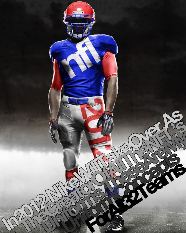
In 2012, Nike will take over as the official licensee of all NFL apparel - including the team uniforms.

With this change comes the reputation Nike has earned in the collegiate game over the past few years, of creative and unusual design.

Much of this 'creativity' comes from Nike's new Pro Combat Uniform style. This new style incorporates an undershirt that can allow uniform designers to bring back arm stripes that have disappeared in recent years.

With this in mind, I recently decided to embark on a project to design new uniforms - using the Nike Pro Combat template - for all 32 NFL teams. Some team's uniforms change drastically, some almost don't change at all but what follows are the 120 uniform combinations I would like to see in the NFL.

Teams are in alphabetical order and include a brief description of what I did. Also, if I altered a team's logo, it will appear in the linked uniform designs (Some old logos are included as well for no particular reason).

49ers: Home, Road - Not too much changed here but this is the perfect example of what the compression undershirt can do for sleeve stripes. Ever since the 9ers moved from back to this Montana-era look, the only thing wrong has been the lack of proper stripes. So voila...

Bears: Home, Road, Road Alt, Throwback - My Bears. These are one of the best uniforms in the league and a pure classic. I threw in the white pants with the white jersey cause they pop up every few seasons and they used to be the norm in the 70s and 80s and I also brought back the gray facemask 'cause it just looks good. I also kept this year's throwback because that shit is baller. Add the retro brown pants and the white 'C' on the helmet and, baby, you've got yourself a stew goin'...

Bengals: Home, Road, Road Alt, Orange Alt - This was my first real test. In order to make the uniform design feel viable, I tried to make sure the stripped area of the jersey was contained withing the shoulder segments of the uniform. The Bengals' lid is classic and Ochocinco made the uni number font iconic so those stayed. The pants stripping is similar to the current pants only it isn't truncated and is only orange and black.

Bills: Home, Road, Road Alt, Red Alt, Patriotic Alt - This one is kind of retro. While I took the modern logo and flipped the colors to echo the old logo, the uniform comes almost directly from the past. I threw in a red alternate for good measure though.

Broncos: Home, Road, Road Alt - The Broncos are supposed to wear orange. And check out those stripes...

Browns: Home, Road, Home Alt, Road Alt - These are almost unchanged, just more room for the stripes. I brought back orange pants but I can't remember how they turned out in real life but I thought I'd give 'em a shot as the alternate.

Buccaneers: Home, Road, Alternate - Everyone seems to love the 'Creamsicles' but I think they were uglier than some choose to remember. I did add the creamy orange to the great modern logo (check out the football in the logo) and added it as a secondary color. I kept the modern helmet and pants (although now they're sans-stripe) because they remind me more of a swashbuckler's pantaloons than a freeze pop, and I think that's a good thing.

Cardinals: Home, Road - This one is old school. The pants stripping is super old. The helmet is really old. The Arizona flag is kinda old. Combine all the elements with super thin stripes and you have a really modern yet classic uniform.

Chargers: Home, Road, Road Alt, Dark Alt - San Diego, which is German for 'a whale's vagina', got it right with when they went back to the white helmets and the powder blues. Unfortunately, those are the Chargers current alternates. I switch them to the main uniforms and leave them pretty much unchanged.

Chiefs: Home, Road, Road Alt - Just wider stripes on the sleeves and socks as well as incorporating yellow into the logo.

Colts: Home, Road - Classic uniform. All I added were some sock stripes.

Cowboys: Home, Road, Alternate - I went a bit retro here. The Boys wear white at home and blue when forced to on the road so I went back to a 60s look for a more classic appeal. However, Dallas has this weird idiosyncratic uniform quirk where their pants paired with their white jersey have a teal tint to them and don't match their helmet. I like that quirk, so I kept it. But then I got rid of it in the alternate...

Dolphins: Home, Road, Home Alt, Road Alt, Orange Alt 1, Orange Alt 2 - This is an instance where I dropped the drop shadow. Miami has classic Floridian uniforms, so I brought them back to their peak of greatness when Marino was just beginning to do his thang. I also tweaked the logo so there was no more dark blue in it (which was also taken out of the uni striping).

Eagles: Home, Road, Home Alt, Road Alt 1, Road Alt 2, Road Alt 3 - Everyone loved the Iggles throwbacks this year, so I say drop the drop shadow, keep the number font, logo and new age helmet wings and add the Kelly green. Then I found these sleeves from the Ron Jaworski era - how can you not love 'em?

Falcons: Home, Road, Road Alt, Red Alt - Simple. Go back to the throwback. Keep the modern logo, just add a gold beak to match the retro helmet (Georgia's colors are red, white and black and the Falcons didn't want to disrespect Georgia Tech, so they added gold piping to their helmet stripe) and you have a perfect logo for a great uniform.

Giants: Home, Road, Alternate - Same as they wear today. No stripes on either color jersey and big red Northwestern stripe on the white one.

Jaguars: Home, Road, Home Alt, Road Alt, Black Alt 1, Black Alt 2 - This one was one of the last I did. I knew I wanted to do something interesting with them but I just wasn't sure what. The shoulder stripes arise from the whiskers on the logo jaguar's face and the spots - well, those are self explanatory. I'm not sure even I like the spots all that much, but its an interesting idea for a compression shirt.

Jets: Home, Road, Home Alt, Road Alt - The Jets, in recent years, have made their green darker. My concept reverses that trend. And since we're going back to old school colors, why don't we go back to the old school stripes - they're so damn funky.

Lions: Home, Road - Barry Sanders colors (No Black.) with Ndamukong Suh rounded numbers (well, without the weird cutaways in the number like at the top of the inside of the 0 and 9). Same goes for the logo's colors.

Packers: Home, Road - With the full compression sleeves, the Pack can go back to their classic sleeve stripes and sock stripes. Here's my inspiration: Home, Road.

Panthers: Home, Road, Home Alt, Road Alt, Blue Alt 1, Blue Alt 2 - I love that the Panthers' logo is an all black panther outlined in that blue. In that vein, I made the Panthers all black outlined in blue at home. I also kept the Panthers' semi-iconic shoulder stripes.

Patriots: Home, Road, Alternate - Everyone love Patriot Pat and his old school uniforms. Stop fighting it New England, go back to them. I even gave you a blue alternate.

Raiders: Home, Road, Road Alt - Classic. Can't improve on perfection.

Rams: Home, Road, Road Alt - The old school Rams uniforms were so great and with the maze and blue, they remind you of Michigan. It just doesn't get more 'classic football' than that.

Ravens: Home, Road, Home Alt, Road Alt, Black Alt 1, Black Alt 2 - I did not drop the drop shadow. There's just something about Poe and Ravens - the shadow fits. I made the helmet stripe solid and purple and added a solid purple stripe to the black pants.

Redskins: Home, Road, Home Throwback, Road Throwback - The Skins got it right with the yellow pants this year, now they just need put the asymmetrical stripe on their helmet and back to wearing those killer throwbacks.

Saints: Home, Road, Home Alt, Road Alt - Pretty much unchanged except that the black pants manage to maintain the helmet and gold pants striping by adding a gold piping around it.

Seahawks: Home, Road, Dark Alt - A major overhaul while keeping the modern logo. The home jersey color comes from the lighter color on the logo and the sleeve, pants and sock stripping comes from the neck of the seahawk but is outlined in the emerald from his eye (I mean it is the Emerald City).

Steelers: Home, Road, Throwback - Perfect unis. Even their throwbacks are great.

Texans: Home, Road, Road Alt, Red Alt - I don't think I'm the first to say the Texans should have a white helmet (that logo was built for a white helmet) and I don't think I'll be the last. Hopefully they'll take the hint. As for the jerseys, I got rid of the stupid modern stripe and - since it is the Lone Star State - I added a lone star to each sleeve.

Titans: Home, Road, Home Alt, Road Alt, Sky Blue Alt 1, Sky Blue Alt 2 - A lot of people would say, go back to the Houston Oilers jerseys. I say, the Houston Oilers sucked and the Tennessee Titans have had much more success in their short history in these modern classics. Just go back to the dark blue with light blue highlights as the home jersey and maybe throw in some modern socks and we has a great set of unis.

Vikings: Home, Road, Road Alt - A throwback to a classic is never a bad idea, home or away.

Wednesday
Dec012010

Obsessive? Certainly. Compulsive? Not Yet.

I have an unhealthy obsession with sports uniforms.

Well, not so much unhealthy as unusual...

Ever since I was a little kid, I've been critiquing, sketching and creating new logos and jerseys for my favorite teams. Whenever an NFL team would roll out a new uniform design, it would immediately catch my imagination. This is probably why the Denver Broncos, Tennessee Titans and Atlanta Falcons all became my favorite non-Bears football team shortly after they redesigned their uniforms and logos.

I went so far as to own a road Eddie George Jersey, a red Mike Vick jersey and a black customized Falcons jersey (O Brien #16, of course).

My favorite part about each new Madden or NCAA Football video game was the create your own team feature. You could do anything, make the Bears in college, the NU Wildcats in the NFL. Hell, you could even make your high school.

Now, the mere fact that this feature existed seems to say that uniform creation was and is popular, but I took this to the next level. To create teams, I would study photographs and histories to come up with the most accurate depiction in games. It became obsessive.

But then - seemingly out of nowhere - the feature to create uniforms either vanished from all games or was reduced to such a pitiful state that it wasn't fun anymore. And so my obsession went away.

While in college, I happened to come across an ESPN.com article titled Uni Watch. To my delectation, the entire article - authored by self-acknowledged uni-phile Paul Lukas - was devoted to the minutia of uniform stripes, logos, color scheme inconsistencies and other wonderfully banal uniform tedium that I adore and others abhor - or just don't give a shit about.

Ever since then, Lukas' periodic ESPN articles and his uniform blog, uniwatchblog.com has been a refuge for people like me who think this is inane, this is hideous and this is beautiful.

If that were not enough EA Sports made up for the few years where their games did not have good - or any - uniform or logo creation modes with TeamBuilder.

Based on the simple idea that people want to be able to edit and create uniforms with maximum customization and their own uniforms, the game developer created a website that has allowed them to make the most in depth uniform editor ever while allowing their games to focus on gameplay and graphics. Now all you have to do is create to you heart's content and then download the team to your game system.

I have gone a bit nuts with it since I found it, mostly because it has resparked my interest in uniform design. Here are just some of what I have done:

My version of the Hoosiers: Home Away

What the Hoosiers might look like with some blue in their uniforms: Idea 1 Idea 2

If the Blackhawks played football: Home Away Home Alternate Away Alternate

My theoretical fantasy football team: Home Away Alternate

Unis for the sports blog I write for: Home Away Home Alternate Away Alternate

And that last set brings me to something else, the rekindled obsession with uniform creation has meant football was not enough. The only problem with this is that I have to do other sports uniforms by hand in Photoshop, which is much harder to do since that's not what the program is ideally made for.

Take these basketball unis I did for the sports blog. This and This were the starting points which evolved into This This and This and that last one led to This and This and after I found a better mold I came up with these: Home Away

I'm even doing this for teams I don't care about, like the Ottawa Senators.

It's a drug and it's killing my free time.

The funniest part about all this is how many odd looks I get from people when I notice things uniform based - Like how I know what a Northwestern stripe is and I'm glad Northwestern is wearing them again this year. My defense to these unwarranted stares has always been that I watch these teams for hours every week, days every year and I know what it aesthetically pleasing and I certainly know what isn't. This obsession is an extension of my love of these teams and sports.

Just a few weeks back I was watching a Bears game and Fox cut to a highlight of the Vikings who were wearing all purple which I think - as I noted aloud - makes your team look like their wearing unitards. Emphasis on the Tards.

I got strange looks and one of my hosts just said, "Uh, Tim, is there something you need to tell us?"

Yes. Yes there is: That looks stupid.

Page 1 2