
The Wizards is messin' my shit up! (almost)
My penchant for impeccable timing combined with my severe laziness allowed me to avoid looking foolish.
this past weekend, I wrapped up a redesign of the Washington Wizards. I was set on releasing that post on Monday because of my JVBackups.com post that normally comes out on Tuesdays but I just didn't get around to doing it.
So when I awoke today to see this uni-news, I breathed a sigh of relief and got to work retooling my rebrand.
So as it turns out, I'm not the only one who thinks the Wizards need a rebrand. Since I found out the Wizards are probably changing their colors and 'considering' changing their name back to the Bullets, I have three redesign plans; Blackout, Wizards Are America And So Can You and Washington Reload.
So without further ado...
Blackout
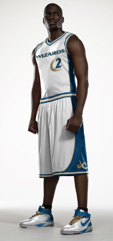
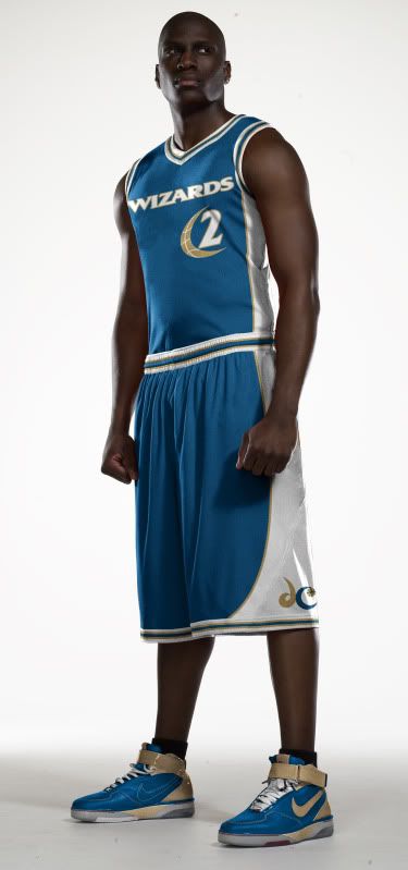
You guessed it, we're taking the black out of the current color scheme.
![]()
Less black = better color scheme
![]()
As far as the unis go, I redesigned the entire front with their better font and I used the 'Moon-ball' to frame the numbers. I did, however keep the asymmetrical striping that only appears on the players' left side.
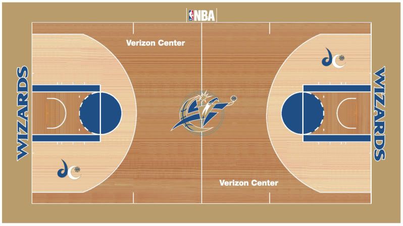
And we have to take the black out of the court too,
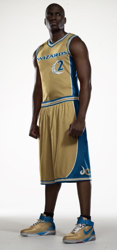
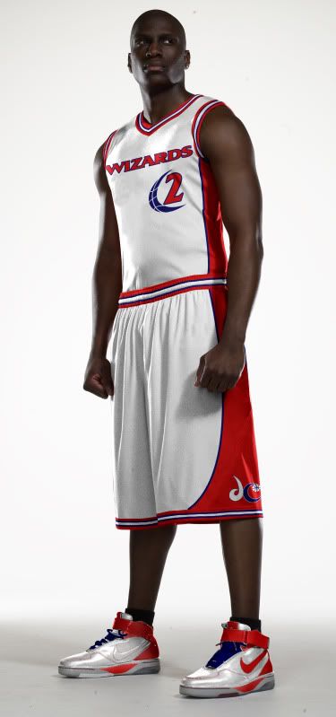
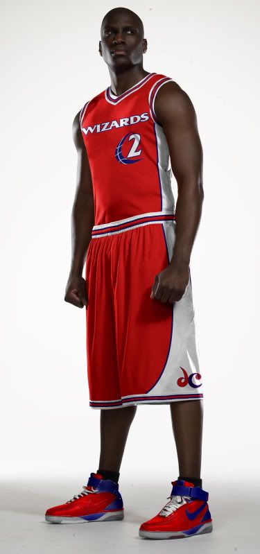
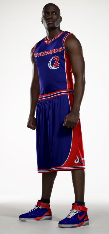
Wizards Are America And So Can You
What's more American than being from D.C.? Wearing red, white and blue.
![]()
According to the link at the top of the page, this appears to be what the Wizards main logo will be next year, so what will the D.C. secondary logo look like?
![]()
The WAAASCY uni set is the same as my previous redesign only in red, white and blue, just like the logos.
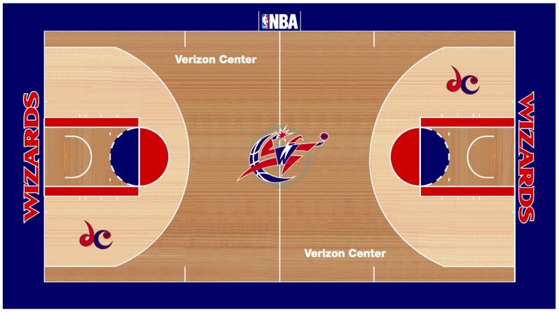
And I went America all over the Verizon Center's ass.
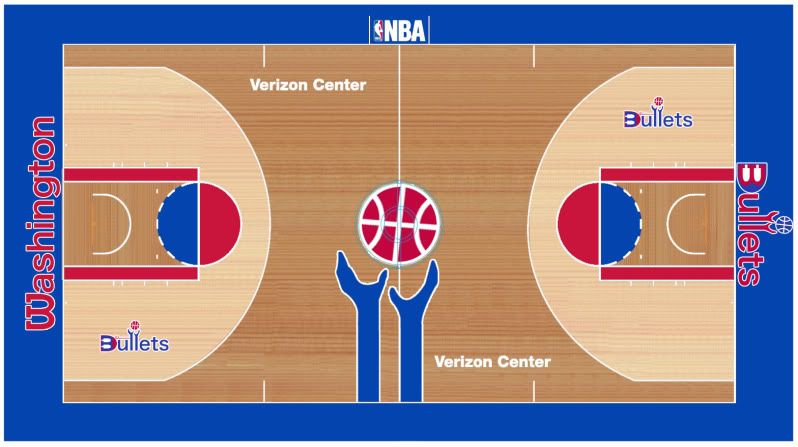
Washington Reload
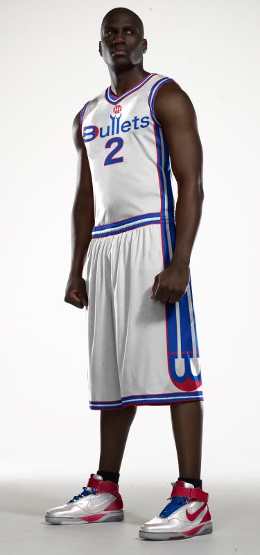
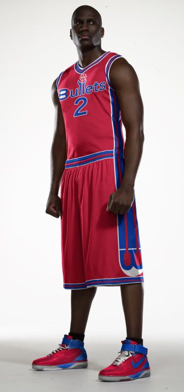
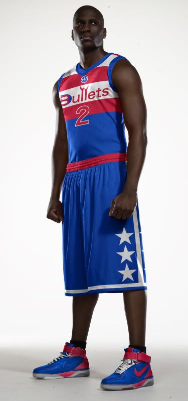
What's more Washington D.C. than Wizards? Bullets!
![]()
OK, that may not be PC but come on, The Bullets sounds so much better than The Wizards. My logo is a bit of an update on the old Bullets logo and the secondary logo is brand new with a B that's also a W (just turn your head) and has at least three bullets built into the design.
![]()
The secondary logo led to the side striping on the Home and Road uniforms. The alternate uni is a throwback with my modern logo.
And as for the court, I couldn't decide, so I'll leave that to you...
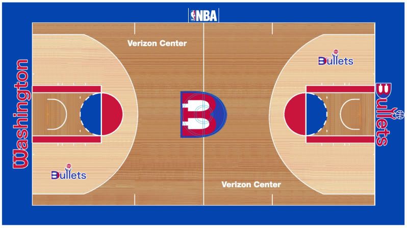
Personally I love the hands coming onto the court...
Well, that's it for my Wizards/Bullets rebrand, more to come later in the week.